NGO Service and Product Design for Premier Disaster Relief App Used Nationwide
Strategic, thoughtful service and product design for an organization’s flagship application to deliver high-quality services to people impacted by disaster.

While Principal Service Designer for one organization, I had the opportunity to build a brand new design practice as its first-in-history designer. One service design touchpoint I designed was the organization’s flagship application used by 16k users daily to deliver disaster relief services. In addition to design strategy, I had many complex problems to solve for the product and service design touchpoints. Complexity and purpose are my favorite kinds of design problems!
Design Processes Aren’t Linear
As an experienced designer, I am comfortable with flexing the right design approach and applying my skills at the right time for the work to be done. This empowers me to navigate the problems to solve and explore the solution space. I’m always interested in trying new approaches during the design process. It’s exciting!
The design process is not linear. Instead of sharing one aspect of a design process and a few problems solved, this page shows a sample of different design approaches I introduced to the team. This work was done by me at various points in time as part of designing the product and its related services. I was also guiding other designers on the team with their projects to ensure top quality.
When I take a moment to pause and look back, these are techniques I’m proud of introducing to the team and accomplishing over more than three years of designing an incredibly complex and important public service.
Design Opportunities Are Everywhere
In addition to the overall service and product design strategy I planned, I also created artifacts for facilitating discussions around emergent opportunities. This helped during stakeholder and team conversations and decision-making.
On this Page
There’s a lot of work I’m proud to share. Continue to browse through or go to a section:
Understanding Problem Spaces
Cultivating Relationships with Users and Stakeholders
Understanding Solution Spaces
Collaborating with Stakeholders, Solution Architects, and Developers
Understanding Problem Spaces
Cultivating Relationships with Users and Stakeholders
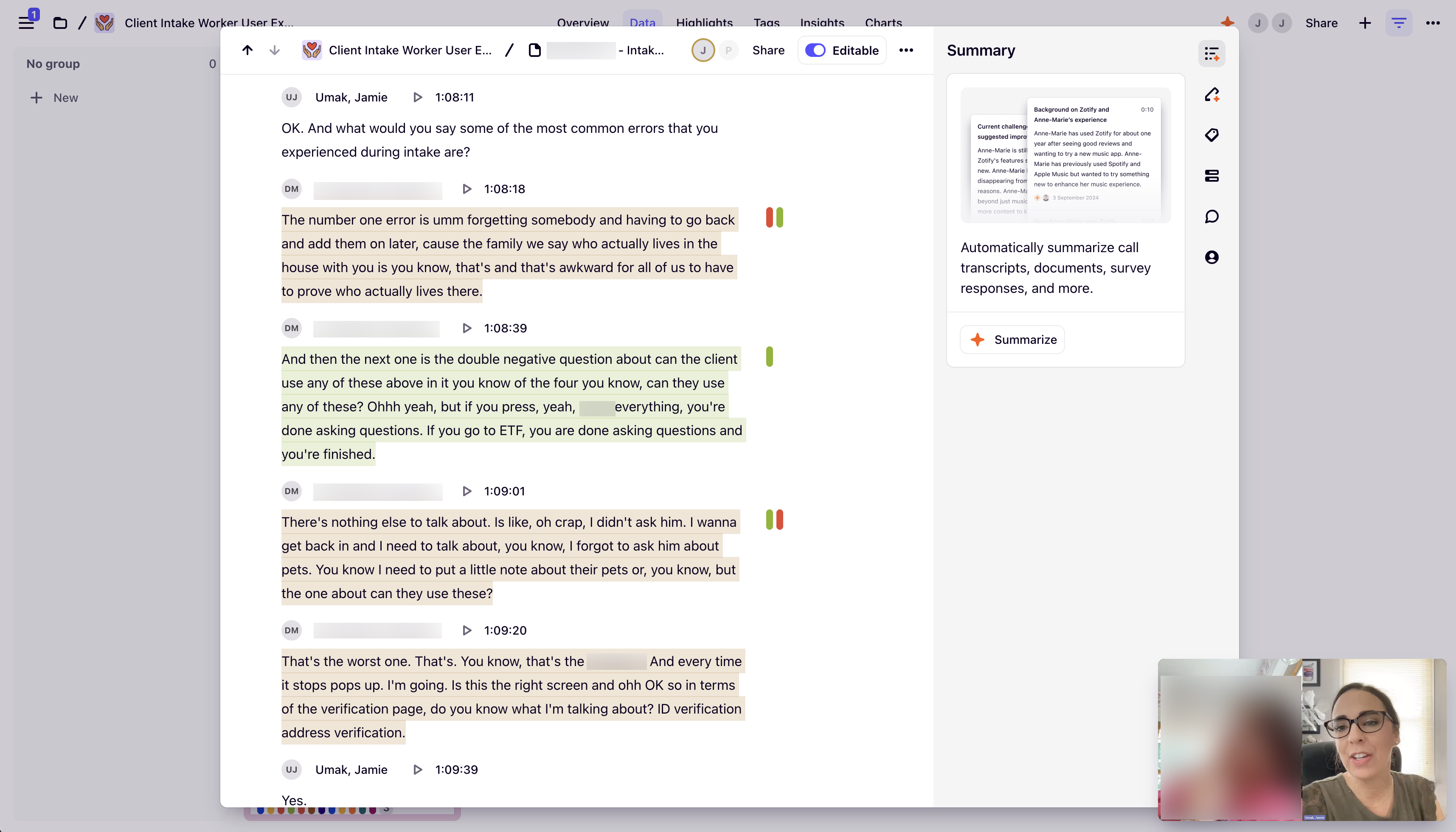
User Interviews
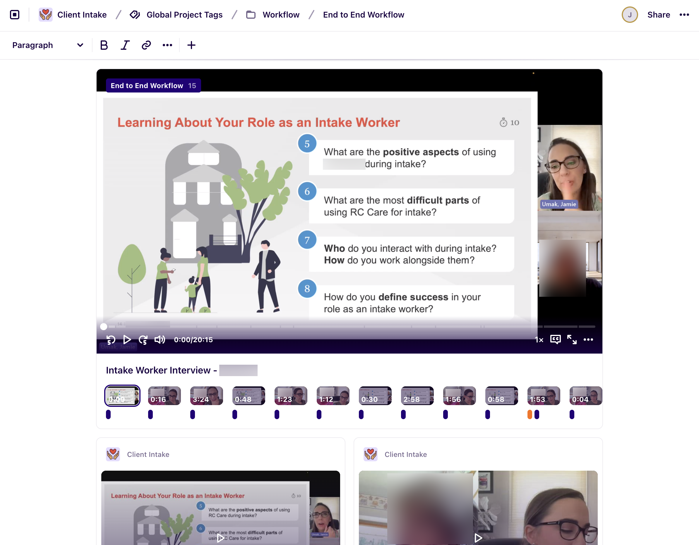
Screenshot from Dovetail Picturing Me Interviewing a Responder
After each interview, I tagged each transcript using structured coding in Dovetail in preparation to write personas and create other artifacts.
Disaster responders are a core persona of how the org delivers services to clients. To learn more about them I planned, recruited, scheduled, and facilitated a series of user interviews with multiple people. Participants were recruited with different backgrounds so I could get a well rounded understanding of responders who were experienced in their role versus others who were new to disaster response.
Sample Questions:
- What is your role and responsibilities like?
- What skills do you feel are required for a person to do intake?
- How do you keep organized during the intake process?
- What are the positive / difficult aspects of using the system during intake?
- Who do you interact with during intake? How do you work alongside them?
- What other systems or resources do you use during intake?
- How would you describe your current service delivery experience?
- What are the most common errors you experience?
- What workarounds have you made on your own to help your intake process?
- Walk me through your intake steps. What’s first? Next?
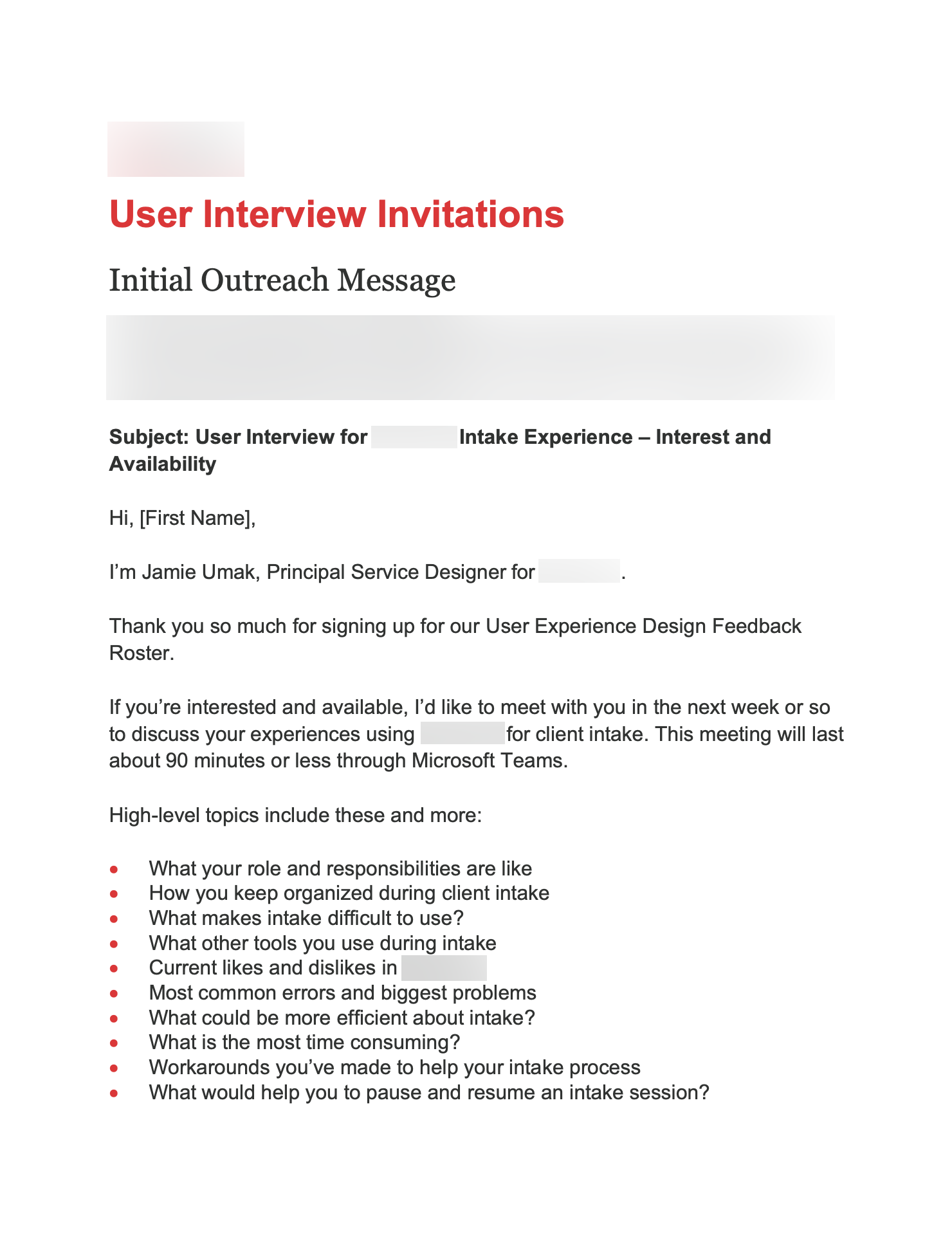
Screenshot of Initial Outreach Message
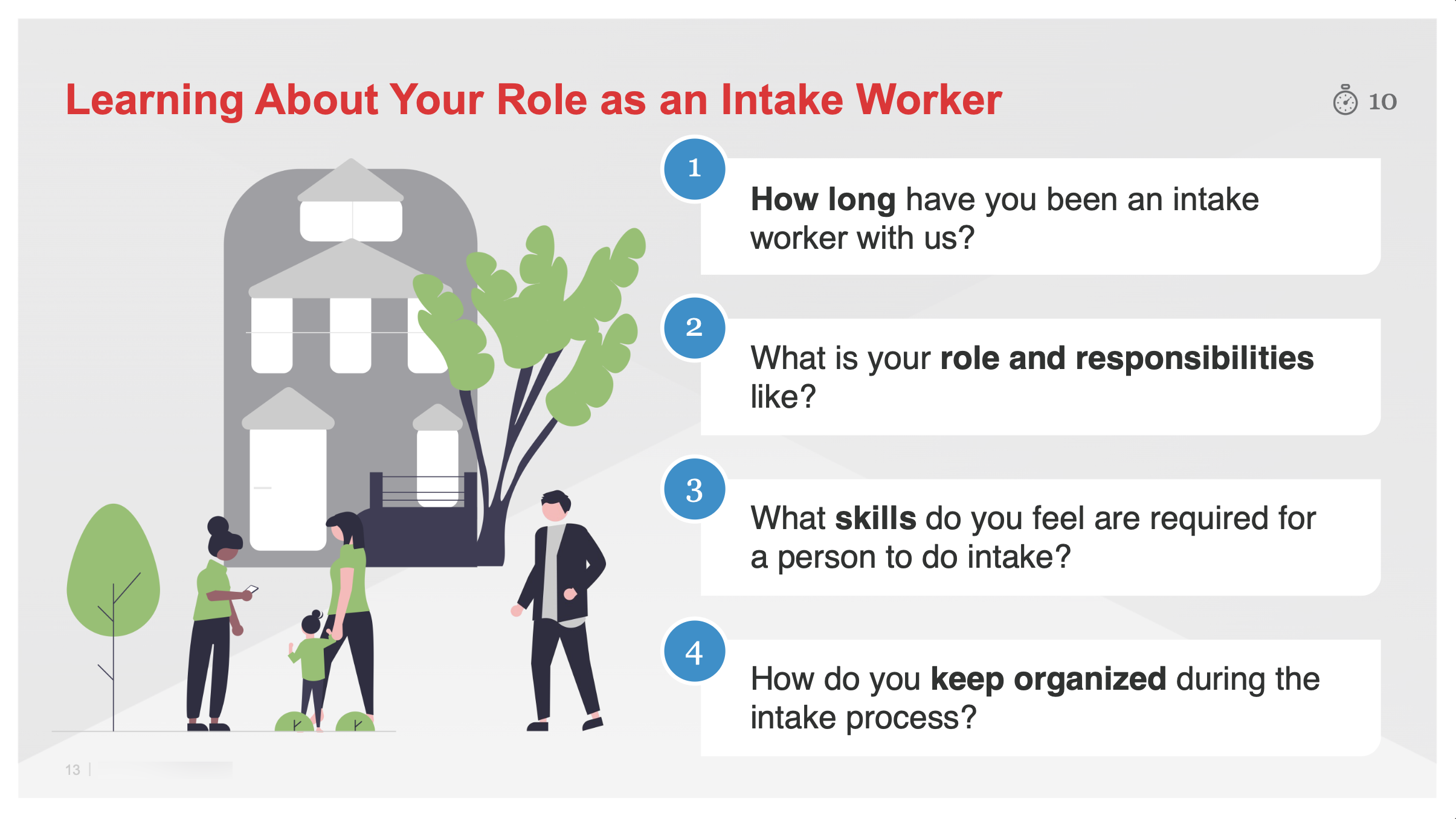
Screenshot of Presentation Slide from Interview
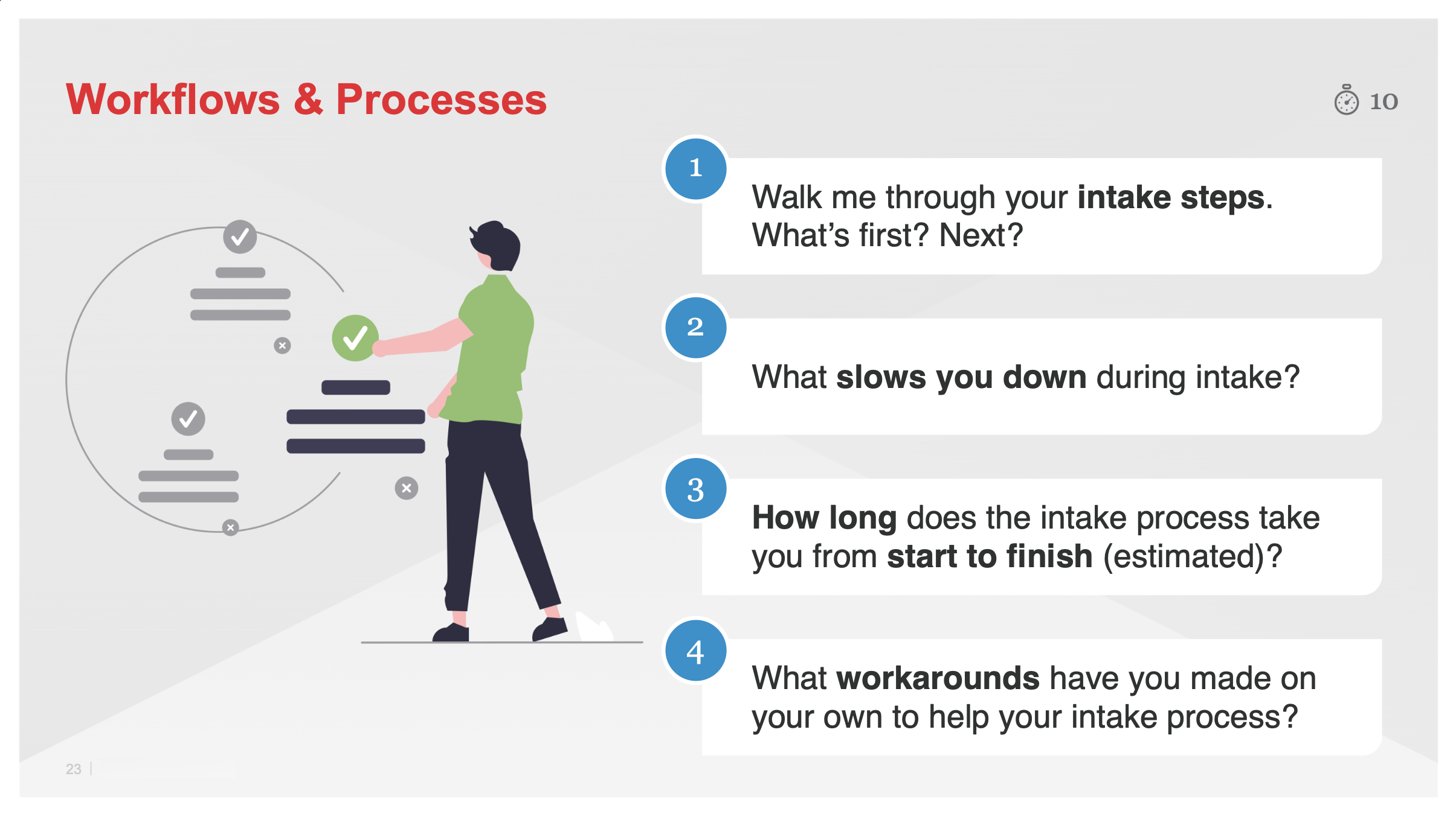
Screenshot from of Presentaion Slide from Interview About Workflows and Processes
Screenshot from Dovetail with Transcription
Empathy Maps

Empathy Map for Intake Worker

Empathy Map for Client

Empathy Map for Shelter Caseworker
Empathy maps are helpful to communicate short bits of information to the larger team outside of design. By utilizing user interview transcripts and other conversations with responders, I created an empathy map for the role of an intake worker. These empathy maps shows actual quotes from conversations I had, organized into what they say, do, see, feel, hear, and think.
I also created an empathy map for the client persona to communicate key points about the people that responders deliver service to. To create it, I performed desk research referencing real news reports and public social media posts.
The empathy map also describes the role and the situation they are in along with the context of their actions and decisions they make.
At the bottom of the map there are:
- Pains: The frustrations, obstacles, and fears they experience
- Gains: What would help them succeed in their role
- Goals: What responders want to achieve
Personas

Intake Worker (Experienced) Persona
There was a lot of confusion on our team about the tasks and goals that intake workers have in their role. Using my research from interviews, I wrote a persona for an intake worker with experience.
- Always ready to respond, no matter what time of day
- Goes above and beyond their role with kindness and vast knowledge
- Creates own intake materials like checklists, paper forms, and online forms
- Provides comfort and meets client’s immediate needs
- Instill confidence in themselves and the organization
- Work through the intake process as quickly and efficiently as possible
- Ensures client assistance card is working before departure
- Many pain points make their role extremely difficult and leaves them feeling overwhelmed and undervalued, leading to high turnover

Intake Worker (Beginner) Persona – Work in Progress
Out of scope for the work at hand, my future goal was to create a persona for new intake workers who are beginners at service delivery. I started this persona by capturing traits mentioned to me in interviews with other roles such as trainers about the people they onboard and the struggles they experience. A focused research initiative is required to learn more.
- Takes training and wants to get familiar with system before using it “for real”
- Wants to learn how to successfully perform intake on scene
- On-the-job training is required to feel confident during service delivery
- Frustration with confusing systems and processes
- New responders can be served through design by meeting usability standards to decrease learning curve and training time
- Training new responders can be improved by providing accurate, streamlined learning materials and resources
Postcards from the Field
As a supplement to personas, I created Postcards from the Field artifacts to distill high-level insights from each user interview I facilitated. This was a fun and quick way to get insights to the larger team as conversations were happening. At meetings I would update the team on how interviews were going and share what’s “in our mail bag” to build momentum on sharing insights.

“Postcard” from an Intake Worker

“Postcard” from a Caseworker Who Uses Intake

“Postcard” from an Intake Worker

“Postcard” from an Intake Worker
Journey Map

Top Part of Journey Map Showing Intake Worker Responding to Fire Scene
Using my research I created a comprehensive journey map of an experienced responder dispatching to a house fire to complete intake with a client.
Journey Map Depicts:
- Stage and steps of the journey
- Goal for each step and amount of time it takes
- Actions the responder takes for each step
- Lists of the touchpoints and devices the responder uses during each step
- What the responder is thinking and saying along with how they feel during the service delivery process
- The type of environment the responder is working in
- Service design and technical opportunities for each step
- A list of who the team can cross-collaborate with to solve problems
- Critical metrics teams use to measure outcomes of improved design

Full Journey Map Showing Intake Worker Responding to Fire Scene
This journey map is detailed, organizing information for service design reference.
Questionnaire and Affinity Map

Draft Intake Questionnaire Information Sent to Participants
Questionnaire for New Feature
Through user research and feedback, the team and I learned responders needed a way to save their work on scene. This could be due to many reasons, such as when they needed to pause the conversation or their internet connection was lost in a remote area.
In response to this feedback, our product team wanted to build functionality to enable users to save their work as a draft before submitting a client’s case. I created a questionnaire to learn what would make this new feature most beneficial to users. A few questions:
- Imagine you’re working on intake with a client after a fire. They get pulled away to speak with someone else, so you need to pause and save your intake progress. When they return, you need to resume intake. How do you think this process should work in the system?
- Imagine you’re completing client intake at a service center. What differences do you see in how the intake process might work at a service center compared to after a fire?
- What would you expect to be able to do when pausing, saving, and resuming intake?

Affinity Map Created Using Questionnaire Responses
Affinity Map
Sixty people completed the questionnaire and provided feedback on the new product feature to save draft cases. I coded all feedback received and organized each data point based on themes, including:
- Navigation
- Interface Content
- Resuming a Draft
- Multitasking
- Saving Progress
- Client Experience
- Need to Simplify
- Service Center Experience
This information helped to inform my discussions with product management. The feedback also informed my creation of problem statements as seen in the next section.
Point of View Problem Statements
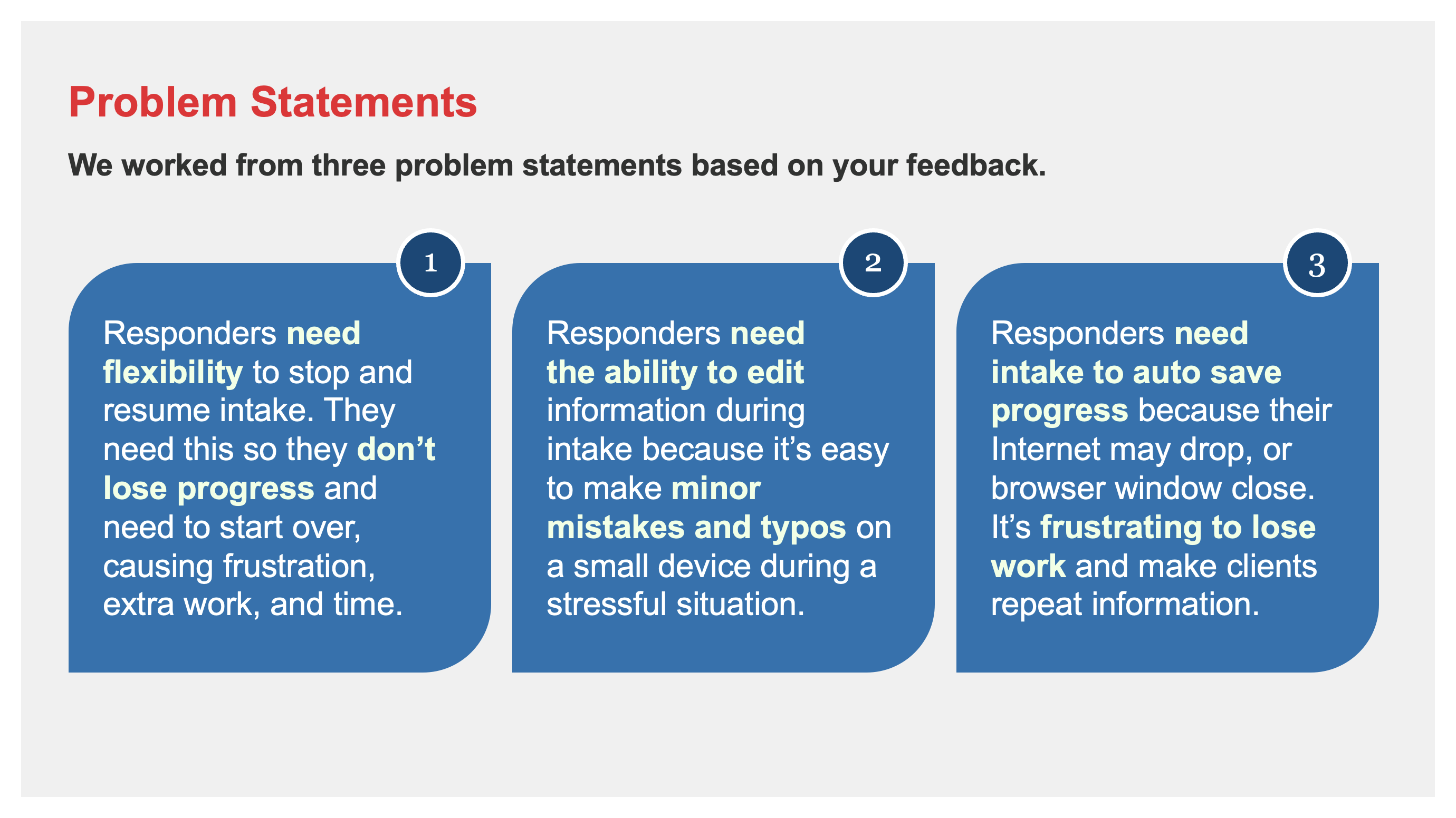
Simplified Problem Statements for Stakeholder Communications
Distilling Problems to Solve
During research activities I created several problem statements. I wrote these statements based on my research with intake responders. These problem statements are all tied back to user research, clearly documenting their needs and insights.
Problem statements are helpful in communicating to the team the problems we were solving for as we worked to introduce a new product capability to manage draft cases.
I first created a spreadsheet template in Excel to write detailed statements with more context and make them accessible to the wider team. Afterwards, I wrote simplified statements to be used in team presentations to frame product solutions to leadership stakeholders.
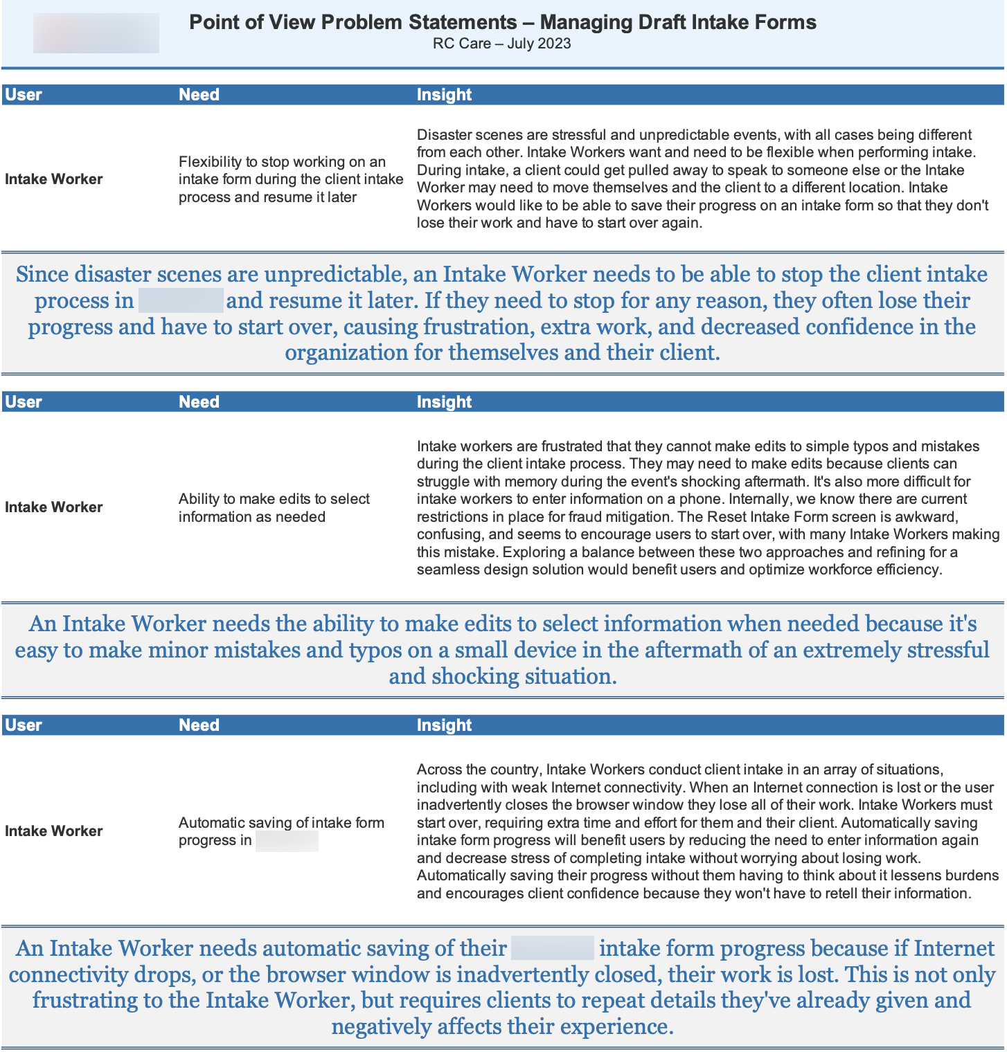
Screenshot of Detailed Problem Statements in Excel
Service Blueprint for New Disaster Program Outreach

Service Blueprint Depicting Two Outreach Pathways for New Program Launch
Planning Service Design Pathways for New Program Outreach
In September 2024, Hurricane Helene caused widespread damage from flooding, tornadoes, and wind. Areas across Florida, Georgia, North Carolina, and South Carolina were impacted.
This service blueprint outlines the client’s experience in requesting help from the organization in its aftermath. There were two possible paths:
- Client’s experience when they receive a postcard in the mail and registers online for disaster relief
- Client gets an outreach email or text message and calls the organization’s 1-800 number to enroll
Other Service Design Touchpoints I Designed and Prototyped:
- Postcard mailer content with visual suggestions (created by graphic design team)
- Online web form content and user interface design for public
- Call center script for 1-800 team agents to guide conversation and register people
- Service center poster content for shelter spaces (created by graphic design team)
Desk Research for Unknown User Languages
Sometimes there are problems to be solved that are entirely new without any baseline understanding from the team. This requires desk research from design and solution exploration from development.
For this aspect of the service’s design, we needed a way to communicate outreach messages to members of the public when we don’t know their language. I wrote a problem statement and conducted desk research to begin facilitating conversations with our leadership and development teams.
Solving and exploring solutions for this problem was both unique and interesting.
Opportunities for Service and Product Design
- Further expand outreach messages by providing communications in languages tailored to areas served, like Hawaii
- Address feedback about poor language support including languages not on the Census Bureau’s top five list
- Better prepare the org to deliver its mission to people who don’t speak English or Spanish in their homes
- Allow for better reporting and insights into client’s languages
- Simplify outreach messaging to be clear and concise in plain language
- Use proper character encoding for Spanish content and other languages
- By receiving consistent messaging in one’s own language, a person is less likely to perceive messages as spam or a scam and ignore them
- Introduce scalability for supporting more languages in the future
Since the organization serves the public, I found existing research available from federal government agencies, organizations, and business examples. These findings gave me a well rounded view to facilitate discussions with the team.
My desk research contained information about:
- Languages Other Than English in the United States
- Languages Spoken in Homes in the United States
- Languages Spoken in Homes in Hawaii

Solution Exploration Section in Desk Research Document
Public Examples for Discussion
- FCC Multilingual Emergency Alerts for Wireless Devices
- FEMA Guidelines for Communicating in an Emergency
- FEMA Integrated Public Alert & Warning System
- National Institute of Standards and Technology
- Notify.gov
Business Examples for Discussion
- Apple
- Samsung

Initial Interaction / Information Flows for People with Unknown Language Preferences
This screenshot illustrates my first pass at a potential interaction path and information flow including a concept with a multi-lingual web page beyond English & Spanish.

Final Version
After discussing with our business and technical teams I made several iterations. This final version accounts for an initial outreach message, reply options in English and Spanish, what happens if a user replies with non-standard text, and how the user can change their language if they’ve made an error or changed their mind.
Solution Exploration
- Considerations to be made
- Technical questions for solution architect
- Questions to be explored
- Technical research needed to understand constraints
Wireflow Sketches
- User flow when language is unknown
- User flow for selecting their language preference
- Messages user receives after selecting their language preference
Team Artifact Review

Lucidspark Board with Design Artifacts for Team Discussion
Research insights should be shared often with the wider team. Combined with being a large team and a hectic response-driven environment, it made sense to get everyone together to review artifacts.
I hosted a team artifact review as a great way to do this. It was amazing to see how everyone learned something new that they didn’t know previously, no matter what their role was.
The session included business stakeholders, project managers, product owners, developers, and our solution architect. Everyone left the session feeling included and inspired by new learnings.
For the conversation, I created a Lucidspark board and imported all of the research activities I had completed to that point (journey map, postcards, personas, and empathy map). I set a timer for 15 minutes to give everyone a chance to review the artifacts and add their observations to the board.
During the discussion I had everyone share:
- What top three insights did they learn
- What surprised them
- What did they want to learn a more about
- How they will apply the learnings to their work
- The opportunities they saw to support responders
Understanding Solution Spaces
Collaborating with Stakeholders, Solution Architects, and Developers
Gap Analysis
One service design had a few aspects with numerous pain points that were difficult for the team to understand and prioritize. I created a Gap Analysis board in Lucidspark, which I adapted from one of my favorite books, Universal Methods of Design.
In this example, I facilitated four working sessions with ten business stakeholders.
- First, I worked with product management to determine which aspects of the service we wanted to focus on.
- Next, I framed the current state with guided questions to our stakeholders.
- Afterwards, we discussed and speculated about the team’s preferred future state.
- When comparing the current state to the preferred future state, I helped the team identify what type of gaps exist between the two.
- Finally, we talked about ideas that might bridge the gap between current and future state.

Lucidspark Gap Analysis Board Used During Facilitation
These were intensive but excellent conversations to give myself and the team a comprehensive understanding of the problems needing solved. I really enjoy this template as a method for organizing conversations.
Priority Matrix

Multiple Priority Matrix Boards in Lucidspark
After I facilitated the gap analysis (above) I organized key aspects of the service into several priority matrices for discussion.
So much information was learned after I conducted the above gap analysis with business stakeholders. It was apparent that we needed a way to prioritize what we were working on. Otherwise, we would all be overwhelmed with where to start.
I created a priority matrix to facilitate discussions with the team about what is most important to resolve. A priority matrix is often used to rank features for product design and development. I adapted the concept to fit both service and product problems.

Close Up View of One Priority Matrix
This view shows one priority matrix about lodging and hotel room reservation management. From the gap analysis, six key themes emerged with pain points needing weighed for priority based on five different criteria.
Instead of making decisions based on the loudest voice in the room or personal feeling, the priority matrix weighs a set of criteria scores for each core problem. When the totals are calculated the aspects of the services are ranked based on the score.

Close Up View of Priority Matrix Ranking Across All Service Aspects
After weighing pain points and criteria across six priority matrices I created a chart displaying all of the areas ranked across all service aspects.
Wireflows

Part of a Wireflow for New Product Features
I enjoy the process of drawing ideas and concepts for discussion.
It’s incredibly helpful to draw wireflows as part of design ideation with solution architects and developers. An online whiteboard like Lucidspark is perfect for this! It’s amazing to see the evolution of product features over time.
Product Design Prototypes
After creating a sketch or wireflow to discuss a product design concept and functionality, I create an interactive, high-fidelity prototype.
Prototypes are true to form, nearly identical to a fully developed solution. All interaction design is drafted for discussion with solution architects and developers. I like to iterate continuously as new information is learned to deliver design value in each sprint.
Mobile Application
Video of Mobile Product Design Interactive Prototype
I closely collaborated with solution architects on new workflows as we worked to build a stronger and more resilient infrastructure.
Desktop Application
Video of Desktop Product Design Interactive Prototype
The mobile application scales gracefully to desktop and tablet devices, providing a flexible solution for varied user needs, their working environment, and technology preference.

Screenshot of Taxonomy for Program Eligibility Terms
What is the difference between verification, confirmation, and validation? These are all terms used in the system to describe different meanings. I outlined these definitions for the team so we could all understand their differences.
Incorporates Structured Taxonomy and Plain Language for Clarity:
- Wrote all content to be plain language at grade 6 or lower reading level
- Created user interface taxonomy guides for complex features
- Established and maintained a coherent information architecture
- Utilized the design system and introduced new components as needed based on Salesforce’s baseline
- Incorporated warmth, meaning, and clarity into a system users describe as extremely complex and stressful
- Built an interactive prototype in Axure to demonstrate realistic system functionality for usability testing and developer collaboration
Service Design Prototypes
I also collaborated with different teams to consult with them on designing other service touchpoints related to the product, including:
- Postcard mailers with QR codes to inform and help the public register for programs
- Posters about registering for a service at a shelter or service center
- Website information and interfaces to register for immediate disaster relief in the aftermath of a recent disaster
- Call center scripts for agents registering callers for assistance by phone
Usability Testing

Screenshot from Dovetail of Me Running a Usability Test
Usability testing is one of my favorite activities because I’m intrigued by how people understand design concepts and how to improve them.
One of the largest usability testing initiatives for the product’s design involved 18 hours of usability testing with 10 people. This effort was spent testing multiple aspects of a new product concept to save work progress in the system.
Pictured in this section are several screenshots from my 70-slide usability report. This report was helpful as I continued to iterate on the design with our solution architect and team. Some areas of the current state did not perform well in testing. This confirmed our assumptions and built the case for design enhancement as part of this work.
Usability Testing Report Contents
- Executive Summary
- Methodology
- User Profiles
- Evaluation Scope
- Data Overview
- Task and Walkthrough
- User Feedback
- Next Steps

Screenshot from Dovetail of My Transcription Tags
Different tags organized by category for transcriptions.

Usability Report Presentation with Task List
List of tasks that were part of usability testing scope.

Task Success Rate by User
List of usability test tasks and each person’s performance.

Confusion Rate by Intake Page (1–12)
For non-tasks, the confusion rate was captured by page.

Task #1
User is asked to find a draft case to continue their work.

Postitive Quotations
Feedback was largely positive with many quotes featured in the report.

Usability Report Presentation with Executive Summary
This slide is at the beginning with a high-level overview of usability findings.

Task Success Rate for All Users
List of usability test tasks with average success rate.

Confusion Rate by Task
List of usability test tasks and the number of confusions for each one (all users).

Confusion Rate by Intake Page (13–23)
For non-tasks, the confusion rate was captured by page.

Task #2
User is asked to go back and add a person’s phone number.

Negative Quotations
A few participants wanted their feedback considered. All feedback is appreciated.
UI Library and Design System

UI Library Landing Page
The original version of the product did not have any visual design applied to it, only default Salesforce components. In my heuristic analysis, the application failed on many fronts especially with regards to color contrast and extremely small text size.
To meet accessibility requirements and expedite product design prototyping, I created the first UI design library in Axure. The library consists of 180+ components that utilize the org’s visual brand guidelines for Salesforce’s Lightning Design System.
Designers and developers can use the library and its design system to create building blocks for all product pages. The library was maintained over time as new features were designed and developed in an Agile sprint environment. It’s a great foundation for a future design system containing code.
UI Design Library Contents
- Welcome
- Color Palette
- Logos with variations and translations
- 180+ accessible components meeting WCAG 2.1 Level AA
- Accessibility standards
- Email templates
- Supported devices

UI Library Section – Buttons

UI Library Section – Input Fields

UI Library Section – Radio Group

UI Library Section – Typography
Measuring Success and Delivering Value
An enormous amount of work was done on this product and its related service designs. A few notable product achievements include:
Before
- Team did not have design support or processes in place
- Original system was extremely complex, requiring a lot of thinking at the worst time (disaster scenes)
- Product’s user interface did not meet accessibility standards
- Heuristic analysis of original product scored only 27% usable
- Users often had to perform duplicative work due to poor business process and system design
- Original product reading level scored grade 8+ or more, with many pages grade 13–15 resulting in difficult reading experiences
- Absence of specific opt-in mechanisms resulted in org risk
- No mention of client communication needs for equitable conversations and caseworker outreach preparations
- Original system poor workflow design resulted in unnecessary data transfer and resulting inquiry costs
- Terms and Conditions and Privacy Policies were presented to the user in difficult to read legalese
- Users didn’t understand information collected about them and why
- Original product felt cold, sterile, and cookie-cutter in an environment where warmth is needed
- Error messages were written in “tech speak” making them not understandable by users with no method to resolve them
- Users scored original satisfaction with product at only 36%
- Lacked support for new and intermittent system users
- Some users felt so overwhelmed with the system they decided to not be a responder anymore
Results Achieved
- Collaborated with principal solution architect to intentionally design with sophisticated infrastructure, eliminating development and design debt while preparing for scalability
- Reduced cognitive load for users by designing proactively, eliminating system burdens and offloading to business processes instead
- Met accessibility standards to make pages accessible to all
- Increased heuristic analysis score for usability from 27% to 89% (62% increase)
- Eliminated duplicative work in system through improved workflow designs
- Lowered average reading level to grade 4 by writing plain language (was grade 8+)
- Reduced risk by designing clear opt-in communication preferences
- Incorporated client communication needs into workflow for equity and help caseworkers prepare for conversations
- Save unnecessary inquiry costs and prevent unnecessary data verification through strategic workflow design
- Revise legalese to plain language for equitable understanding
- Provided clarity and transparency around information collected and why
- Improved accuracy and reporting of data for senior leadership through new feature designs
- Improved service design workflows for multiple user roles
- Introduce warmth and meaning into product to connect users with the mission and show appreciation
- Provide human-understandable error messages and design paths to easy resolution
- Over 3-years, improved user satisfaction score by 33% (69% very satisfied)
- Introduced conversational design to improve workflow support for people whether they experienced, beginner, or intermittent system users
Stakeholder Feedback
This is a significant improvement for mobile users. What you just showed is definitely a step in the right direction. The field has been asking exactly for this. Thank you!
I am so impressed by the level of detail you have captured.
I appreciate you synthesizing complex information into something simple. Thank you.