New Employee Onboarding Software App
Modernizing onboarding for 4,000 new hires annually in their first 90 days at a prime U.S. regional bank.
A top regional bank in the United States needed a streamlined process for onboarding new employees while welcoming and setting them up for success. The bank was using several separate systems for hires to complete paperwork and suffering from inconsistencies, lack of accountability, and barriers when starting a role. Our team was tasked with designing a new onboarding process in an engaging system to minimize the amount of time needed for a new employee to hit the ground running and get them excited about their new workplace.
Vision
The vision for this application was to transform the bank’s employee onboarding experience to simplify processes, expedite time to productivity, and improve engagement while creating a positive first impression and reducing turnover. Through the new portal, the bank focused on building a strong culture through a single system of interaction to reinforce a new hire’s confidence in their decision to become an employee.
Goals
- Automate processes and help managers stay organized during onboarding
- Reduce the amount of time spent on onboarding activities
- Increase time to productivity for new hires
- Reinforce a vibrant company culture
- Create positive first impressions to attract top employee talent
- Streamline communication and processes for all offices
UX Design Process
 On-Site Discovery Workshops
For project kickoff, our team travelled to the bank’s headquarters in Cleveland, Ohio to conduct requirement sessions. Over three days we worked with bank stakeholders and employees to analyze the existing systems, processes, and tools that needed to be improved and replaced. By modernizing the onboarding experience, the bank wanted to create a positive first impression for new employees, make them feel welcome, and reduce stress during a major life event.
Our Principal Consultant led the UX segment with about 50 people, including stakeholders, employees, and technologists. As workshop assistant, I captured user feedback, recorded detailed notes, made observations, and discussed design requirements with the bank’s UX department.
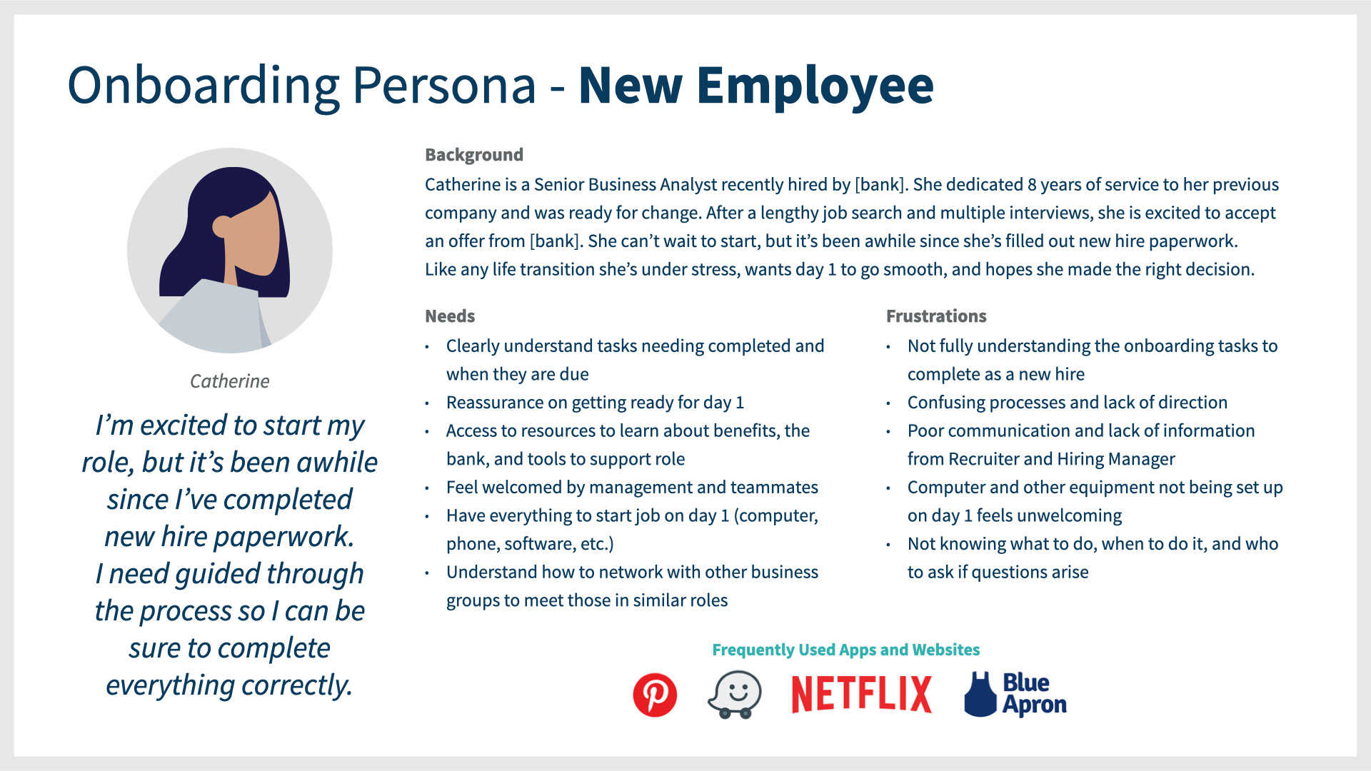
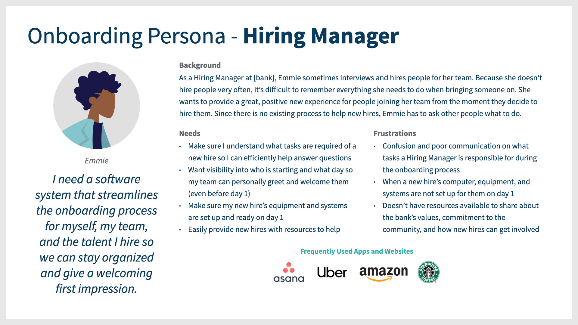
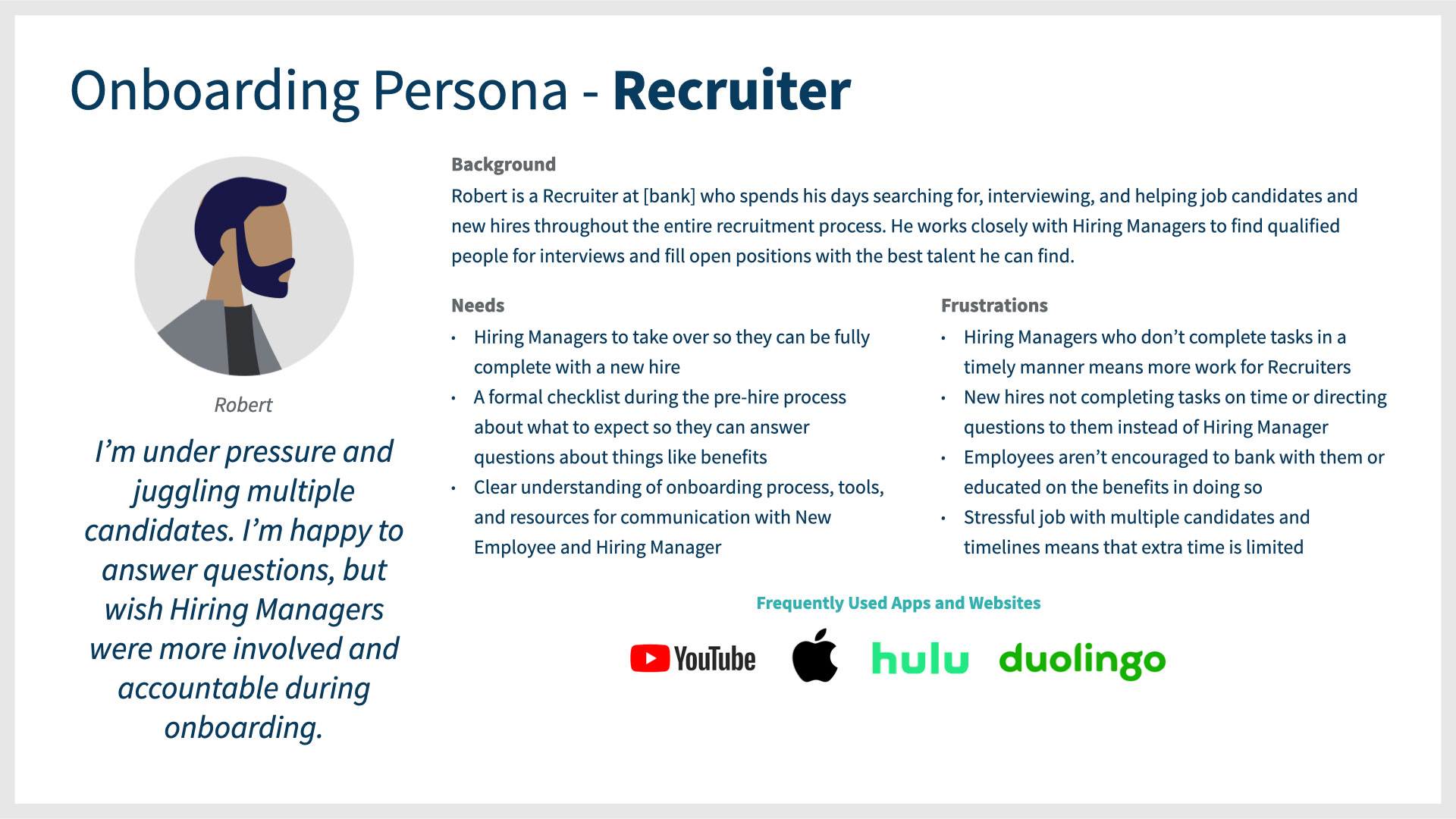
Throughout discussions, three core user personas were identified: New Hire, Hiring Manager, and Recruiter.
Our team learned there was no process in place for new hires to get help. Sometimes, managers weren’t doing their job well, causing new hires to reach out to their recruiter, subsequently resulting in communication problems and a negative first impression.
Many employees said company culture is positive and a differentiator, but felt the lack of process for new hires reflected negatively on the business. They were energized about the company’s messages around diversity, inclusiveness, physical and social wellbeing, caregiving support, stress management, concierge tools, and financial readiness, and wanted to see that be part of onboarding from Day 1.
How Employees Feel Most Connected to the Bank
- Strong environment of diversity and inclusion
- Being part of business networking groups
- Opportunities for growth, especially early career
How Might We Strengthen New Employee Engagement?
- Increase workplace satisfaction through efficient processes and tools
- Automate workflow tasks through software so employees can focus on real work
- Managers retaining and growing employees by making them future-ready with in-demand skill sets
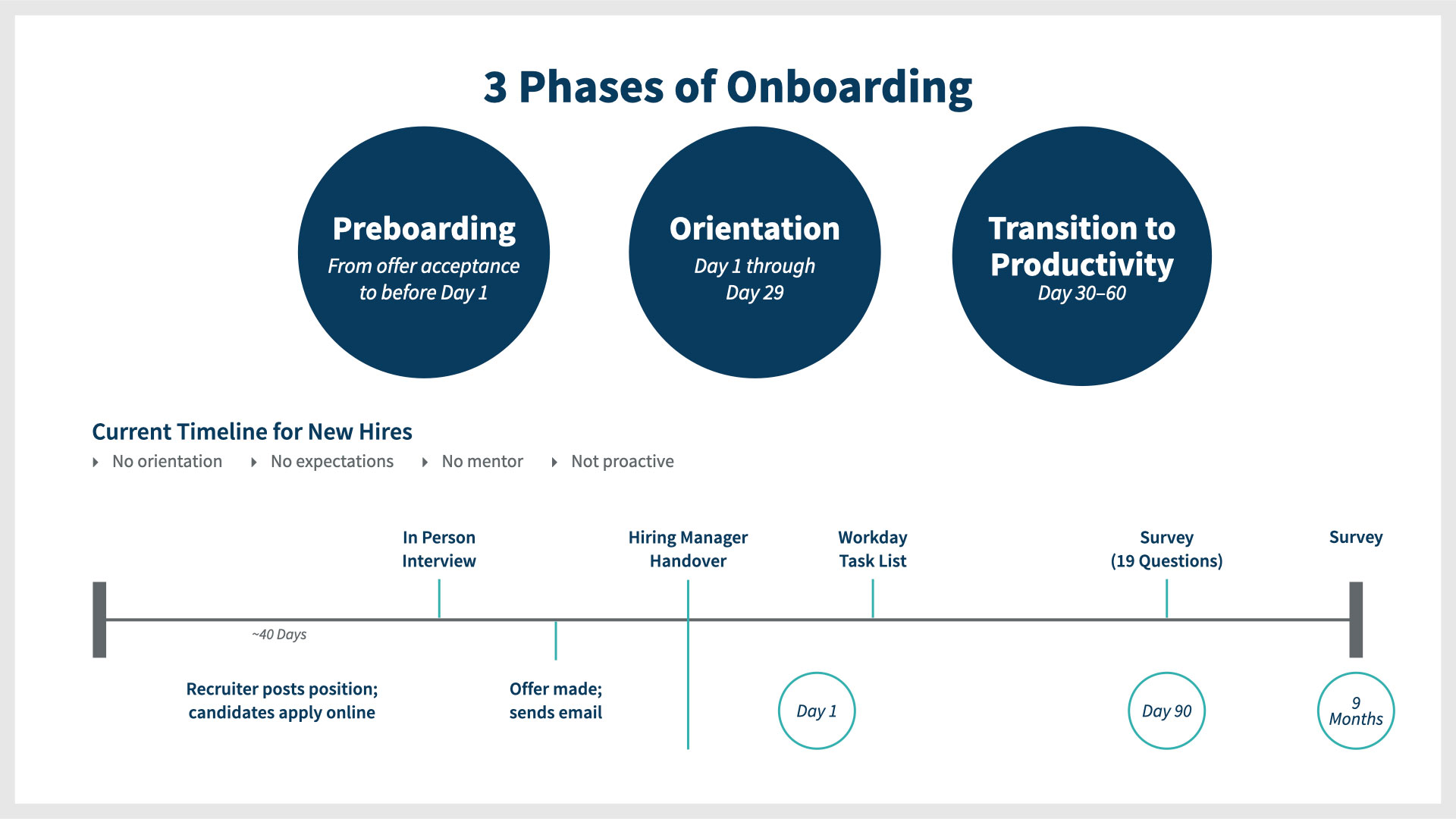
3 Phases of Onboarding and Current Timeline for New Hires
At the workshop, a timeline was captured to show the current process. The main idea was: “Make it easy to join, work, and grow.”
Workshop Brainstorm Activities
Throughout the day, our team learned what employees expect from an onboarding experience, what is most important on their journey, and the bank’s differentiators.
Likes and Dislikes About the Current Process
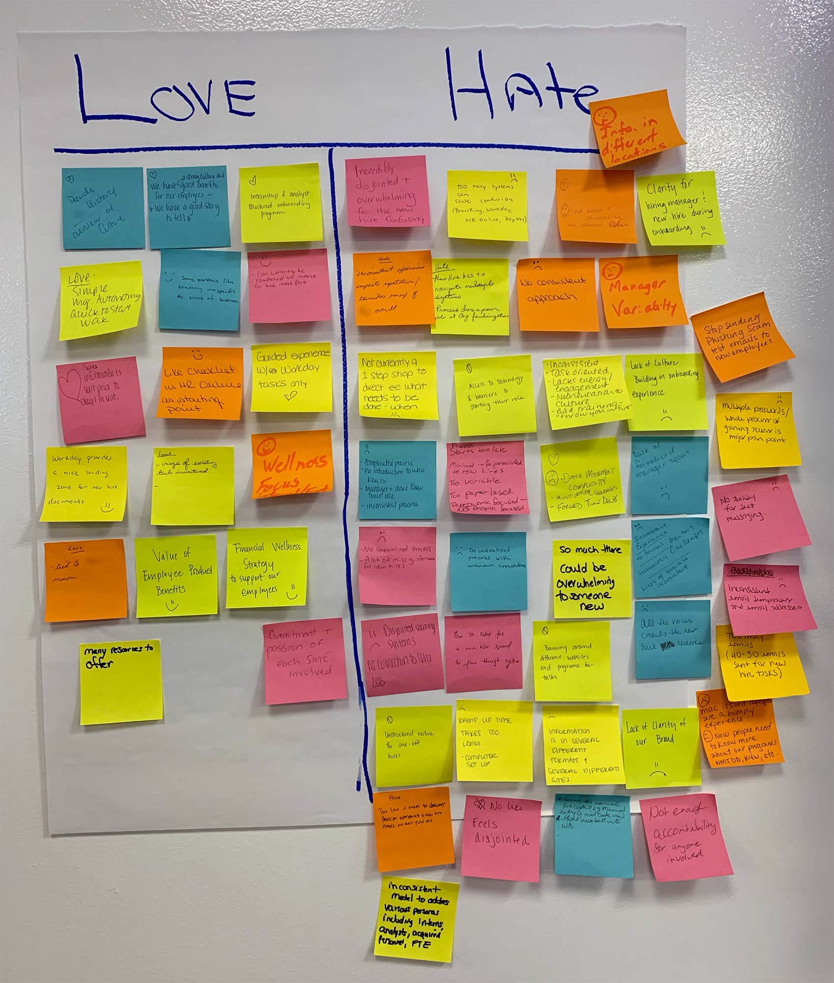
Side note: I don’t like using the word “hate.” This is not my handwriting :)
Expectations for a New Experience
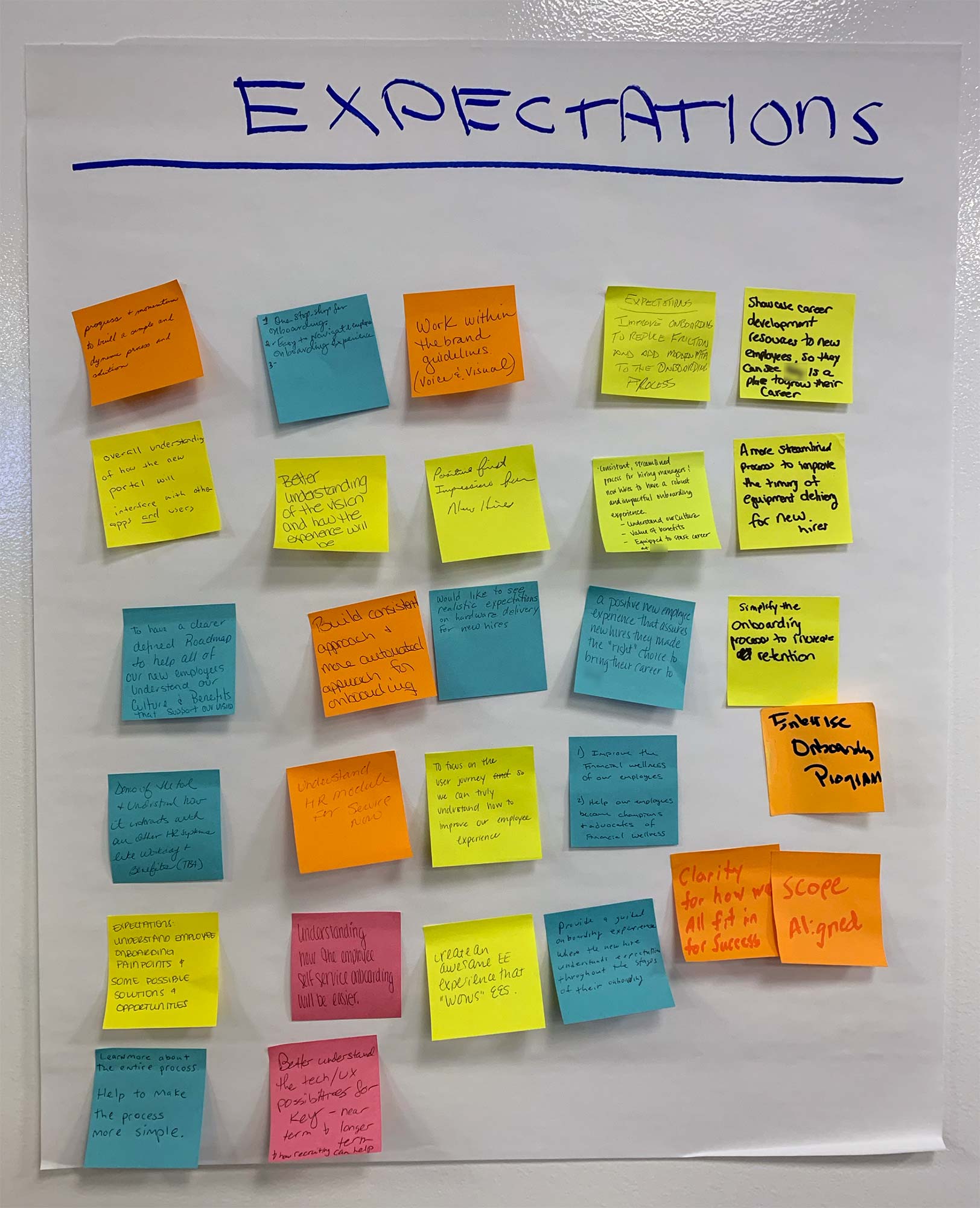
Employees had a lot of thoughts on what a new experience should be like. Simplification, clarity, and a defined roadmap were common themes.
How Might We Measure Success?
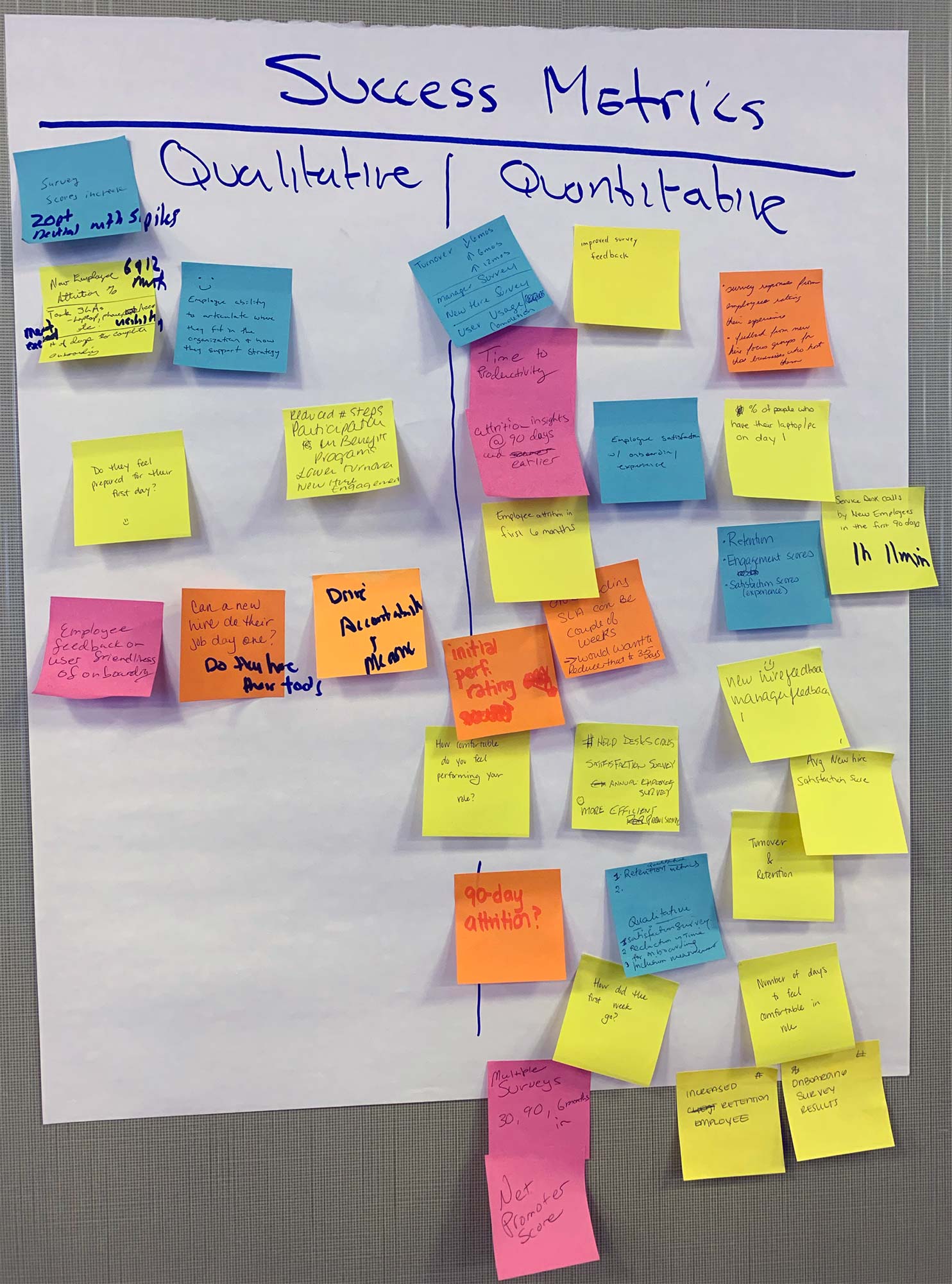
Focusing on employee satisfaction through surveys, increased retention, and whether or not a new hire can start their job on day 1 were top points of measure.
Onboarding Mind Map
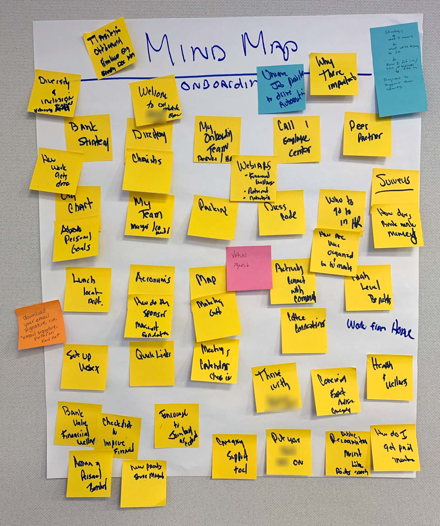
Employees wrote down key words they use to describe what a new onboarding experience should entail. We put them together to form a mind map.
Other Apps Employees Love to Use
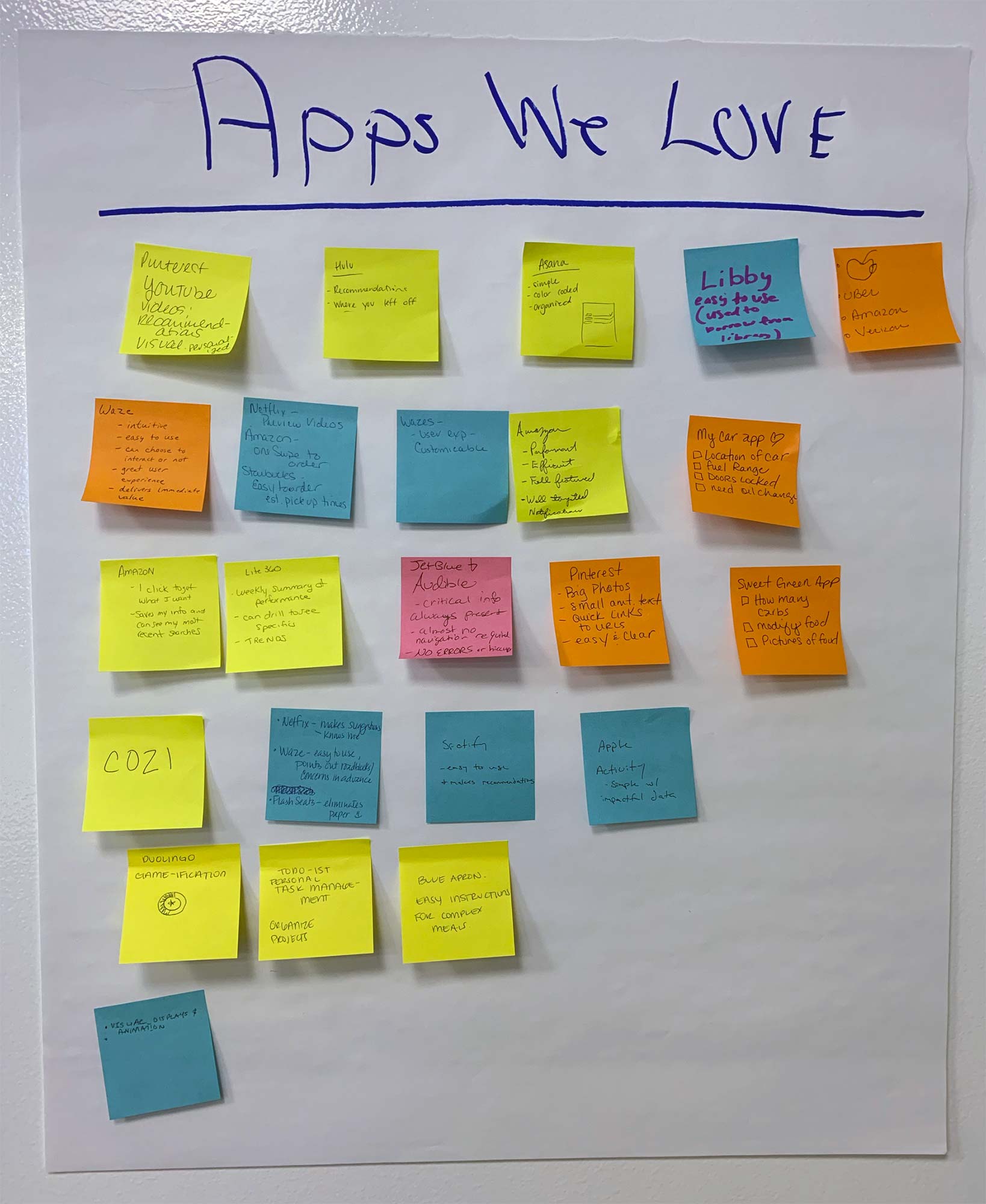
The “Apps We Love” exercise was the group ice breaker.
What I Wish We Did Differently
- I would have loved to have conducted user interviews with recently onboarded hires to gain their perspective. A workshop setting of 50 people meant that primarily the loudest voices were heard.
- People had to rely on memory of their own onboarding experience, potentially misremembering or forgetting what onboarding was like for them.
- With stakeholders in the room, people may not feel as inclined to provide opinions on where their employer should make improvements to the hiring process.
- It would have been helpful to get a demonstration from a user showing the existing workflow in place with distributed systems for context.
After returning from the workshop, we met as a team to discuss what we learned at the on-site sessions as well as technical requirements. Our Principal Consultant wrote an Experience Brief, containing project vision, goals, and learnings from the on-site.
 Feature Map
Through a collaborative effort a Feature Map was outlined with content scheduled to display based on where the new hire and Hiring Manager is during the process. Our HR Subject Matter Expert began writing a process guide, based on the onboarding timeline. The Solution Architect, who uses Feature Maps in their workflow, began organizing technical requirements and writing user stories.
Some areas were determined to be out of scope, but noted for future state: Office Calendar, Open Positions, Assigning a Personal Banker, Employee Goals, and Virtual Agent. The Feature Map went through four revisions prior to stakeholder approval.
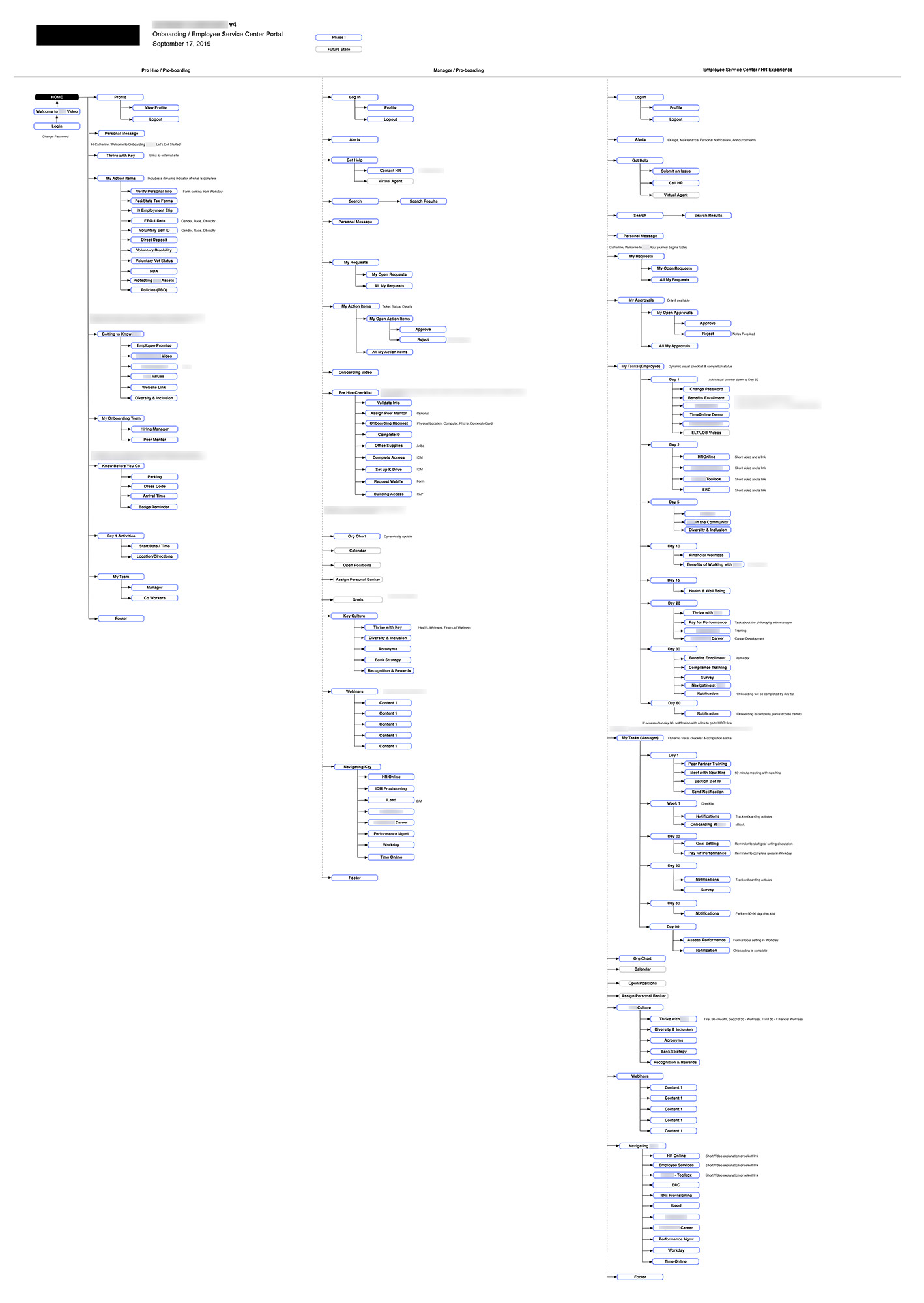
During the workshop, we learned the onboarding process was organized into different phases: Welcome (pre-boarding before Day 1 for both manager and employee), Orientation (Day 1–29), and On Your Way (Day 30–60). As part of these phases, I assisted our HR Subject Matter Expert with writing an email series to correspond with the portal.
 Interactive Wireframes
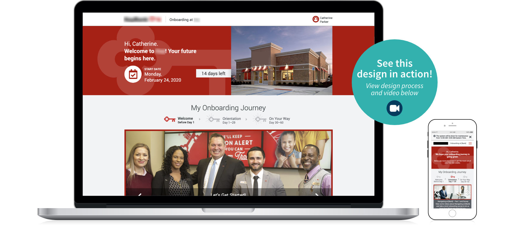
Using the Feature Maps framework, a series of wireframes were created to propose a new user journey for onboarding. The top banner welcomes the hire with an area below for My Action Items, a list of tasks to complete before Day 1.
Our stakeholders requested a checklist concept that would integrate with their cloud HR system, Workday, and check off the items in ServiceNow automatically as completed. The Principal Consultant suggested a carousel concept, which was used to solicit initial user feedback before ideating on other formats.
In the countdown to Day 1, the portal shows relevant information at specific times to increase engagement. One week before their start date, the Get Ready for Your First Day section displays, containing personalized details about parking, arrival time, dress code, building access, coworkers, and Day 1 activities. The My Onboarding Team section displays contact information for their Hiring Manager and Peer Mentor in case of questions. As part of the workflow management system, Hiring Managers have access and visibility into an individual’s onboarding process.
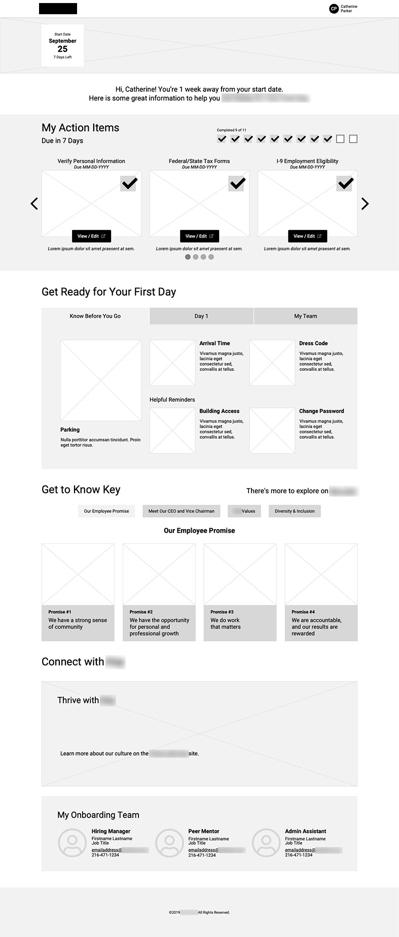
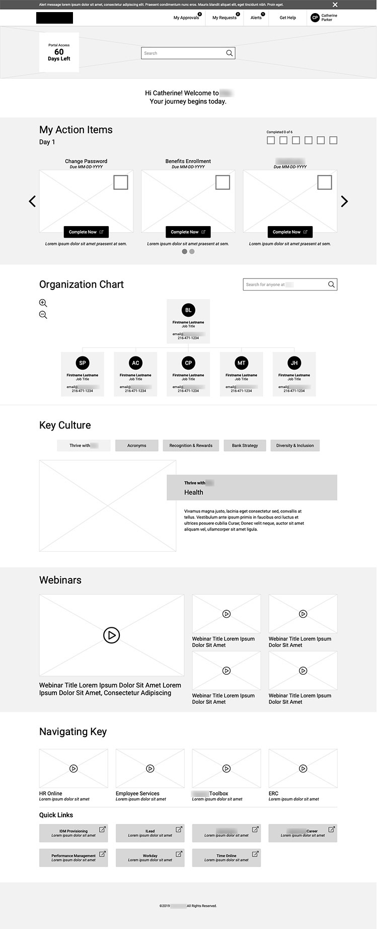
After a new hire receives their offer letter, there is information to submit before Day 1. In this format, the bank also addresses first day anxiety by proactively providing information to help them get ready with details about parking, arrival time, dress code, building access, and passwords.
 Employee Feedback Sessions
After making revisions to the wireframes with our stakeholders, we solicited feedback from current employees on how onboarding information was being presented for new hires. Right before the sessions, we found out that an integration with Workday would not be bilateral, meaning checkboxes in a checklist format would not automatically check off in the software. Going this route would be poor for usability. I started brainstorming workarounds.
Across two sessions, the wireframes were demoed with our stakeholders and 70 employees remotely. We wanted to know if the messaging was effective, their thoughts on a checklist concept, if they felt important information was missing, and if the sequence and content makes sense for someone new to the company.
The messages are pleasant, but not specific enough. It would be nice to see the content point out the goals for this phase of onboarding. Should we consider being more specific, and indicate the amount of time it will take to complete the tasks?
I think this is a lot of logins. In recruiting we struggle to get certain groups of candidates to complete the most basic tasks and this will require a high level of engagement. Will candidates know they are expected to sign on 8+ times?
A brief explanation of Action Items would be helpful. Would a personal document need to be handy and available to complete a given item?
Is there a way to have the checkbox complete itself once the individual has completed the form? If not, it needs more information so they know they need to manually check the box.
Not a fan of the tile based layout with scrolling left and right. My preference would be for a checklist based UI that shows all items in a single view. Agree items should check themselves off without user interaction required.
What I Wish We Did Differently
- I wish more time was scoped for ideation at this phase, along with enough time to conduct proper usability testing, rather than crowdsourced individual preferences through large groups.
- The feedback we received had value, but could have been maximized.
- It was a bummer to find out we couldn’t integrate Workday right before talking to users.
- We also learned there would no longer be functionality for new hires to pick out their computer before Day 1, which was one of the pain points mentioned.
- Learning these technical requirements after the wireframe concept was built put a wrench into the checklist concept and streamlining technology setup for new hires. The list format is what fit many employee’s mental models in how the tasks should be presented.
 Ideation and Sketches
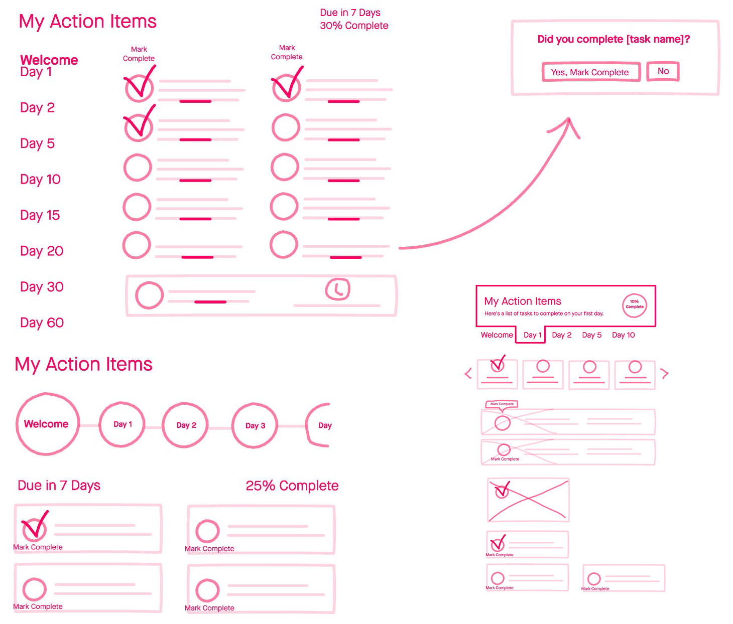
Using InVision Freehand during the design process, I made quick, rough sketches like these before and during the building of an interactive wireframe in Axure.
Pictured are a few sketches showing how the new hire’s My Action Items section might work in list, timeline, and tab-based formats The checklist with a modal window was an idea for a workaround.
 Interactive Design Prototyping
Using the wireframe as a base, there was enough time scoped to design three variations of the content presented in the original wireframe. I designed two and a UI designer created one.
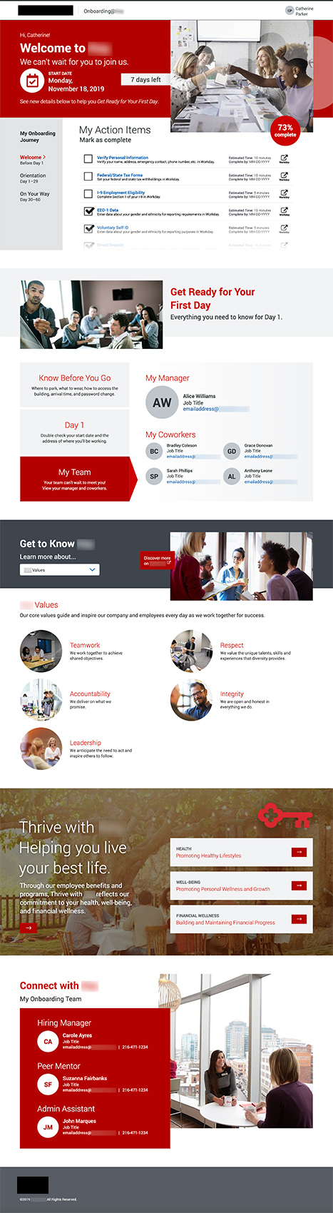
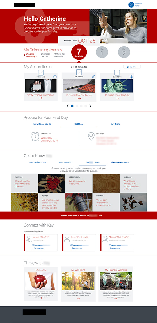
Design Option 1 (Me)
- Depicts a true and highly requested checklist format with time indicators for My Action Items.
- The “Mark as complete” direction added to the UI as a result of new technical constraints. I’m not a fan of including instructions in a UI, but this was the technical workaround.
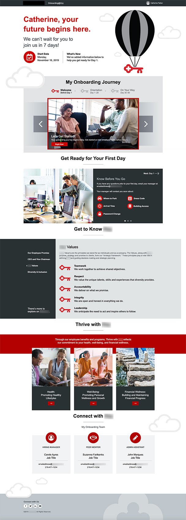
Design Option 2 (Me)
- Imaginative design represents the new employee aspirations, while preparing them to “lift off” in their career.
- I created the hot air balloon icon as an animated gif, gently moving up and down so the eye still notices while not being disruptive.
- My Action Items were featured in a larger carousel, different from the wireframes.
Design Option 3 (Other UI Designer)
- My Action Items within a horizontal timeline at the top that moves through the days as new information is populated into the portal.
- Uses a tab-based format for most content.
- The other designer and I collaborated on how to make this UI different from the other two.
What I Wish We Did Differently
- If we had usability tested during the wireframe phase, I would have measured what layout and information was most usable for employees to make iterations and base design decisions on data.
- Proper testing would position us to maximize design value by focusing on one visual design based on their design system, and not spending time creating three options.
 Focus Groups
After stakeholder approval, the interactive design prototypes were presented to 3 separate focus groups consisting of 125 people. These are the questions that were asked and which design ranked the highest:
Which concept do you like overall?
46% liked #1 and felt it was efficient, clean, and easy to follow.
What messaging is most welcoming and reinforces the brand?
50% liked #1 and felt the design was energetic and fun.
Which Start Date and Time Remaining stands out the most?
32% liked #2 with the red circles with the number of days remaining.
Which task navigation do you prefer?
59% liked #1, feeling it was more logical, simple, and captures everything.
How much information is helpful for My Action Items?
47% preferred #1, believing more details would help with less questions though dull but effective in appearance.
Which format of Get Ready for Your First Day and Get to Know [Bank] reinforces company culture?
46% preferred #1, believing the information stood out more and points the reader where they need to go.
Which format of Thrive with [Bank] is best for showcasing health, well-being, and financial wellness?
38% liked the simplicity of #2
Which Connect with [Bank] section formats information most effectively?
52% liked #1, feeling the red box and larger text makes the information stand out more.
I feel more efficient when I see the checkmark and that I have completed something.
When I went through onboarding, at times I felt a little lost on what I was doing or needed to do. A checklist is a good idea.
Visually pleasing and welcoming. I prefer more information, especially since new employees can have more questions.
I liked the co-branding at the top and the clear visual into the percent completion on tasks and better visualization of all tasks would be helpful for me.
Concept 3 doesn’t feel like a to-do list. It’s not clear that I have tasks to do, which is confusing for someone not familiar with the system. Design 1 is overwhelming with too many things to do.
Less fluff and more content. I know who I am and I know where I am going to work. Get me to the important details, please.
 Final Design
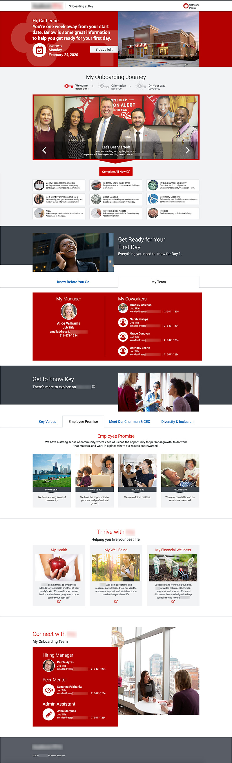
Design 1 was most well-received during focus groups. Using this design, a few edits were made:
- The messaging area was consolidated to follow the format of Design 2.
- Even though the checklist format for the tasks was the most well received, it wouldn’t be intuitive enough for users to have to manually check off the list themselves. Since the Workday integration was not bi-lateral, we couldn’t introduce checkboxes.
- For the task list, the My Onboarding Journey section from Design 2 was adapted to include a bigger image, more room for text, and a list of tasks along with a Complete All Now button that directs the user to one location in Workday to complete tasks.
- We also found out that the dynamic information about parking directions, dress code, and building access had to be revised to general text. Updating it for the user based on their location would be too time consuming for the administrator.
- The Thrive with [Bank] section was simplified to follow the format of Design 2.
Development
User stories were written by the Solution Architect; two Platform Engineers one front and one back developed the portal over eight development sprints. Our team held regular sprint demos with the client and collaborated closely with two internal Platform Engineers at the bank. Solid security requirements were a major development consideration. User acceptance testing was also conducted.
Desktop Application
Video showing the interface for a pre-hire completing tasks before day 1.
Video displaying the interface that a new hire sees, along with new content.
Mobile Application
Mobile view of the interface for a pre-hire, completing tasks on the go.
Mobile view of the new hire interface for accomplishing work from anywhere.
Metrics and Results
After releasing the new onboarding app, the bank sent a qualitative survey to 150 people who went through the process. These satisfaction ratings led to scoping additional software solutions for the bank.
- 100% of users said the portal made them feel welcome
- 97% felt the experience was seamless
- 90% believed they had everything they needed to increase their productivity from Day 1
- Out of 150 users only two minor issues were discovered post launch
Stakeholder Testimonial
Our team really likes this design and are very pleased with how tasks for new hires are incorporated. The internal feedback we’ve received is very positive and everyone is excited! This is a really great way to energize people. We are very happy!