Asset Management Software App
A powerful enterprise application that tracks, manages, reports on, and enables office sharing of 8,354 vehicles.
A federal client in Washington, D.C. was in need of modernizing an asset management enterprise software application that tracks and maintains their vehicle fleet throughout the entire United States. As part of this effort, our SAFe Agile team was tasked with improving its overall design, implementing an extensive backlog of enhancements, and improving upon technical issues.
Vision
The vision for this application was to design and build a powerful and usable application that tracks, manages, reports on, and enables office sharing of all vehicles in the system across 2,994 garages and 8,354 vehicles. In its first year of use, the application logged 54,969 vehicle reservations.
By making the application more user-friendly, intuitive, and efficient, our team implemented usability improvements for vehicle management across four personas: Drivers, Points of Contact, Vehicle Custodians, and Fleet Managers.
As the sole UX Designer on a product team consisting of 8 client stakeholders, 1 SAFe Agile coach, 1 product owner, and 7 platform engineers, I viewed this as a challenge and opportunity to design a user-friendly consumer-grade application that 35,000+ government workers could enjoy using as part of their daily work routine.
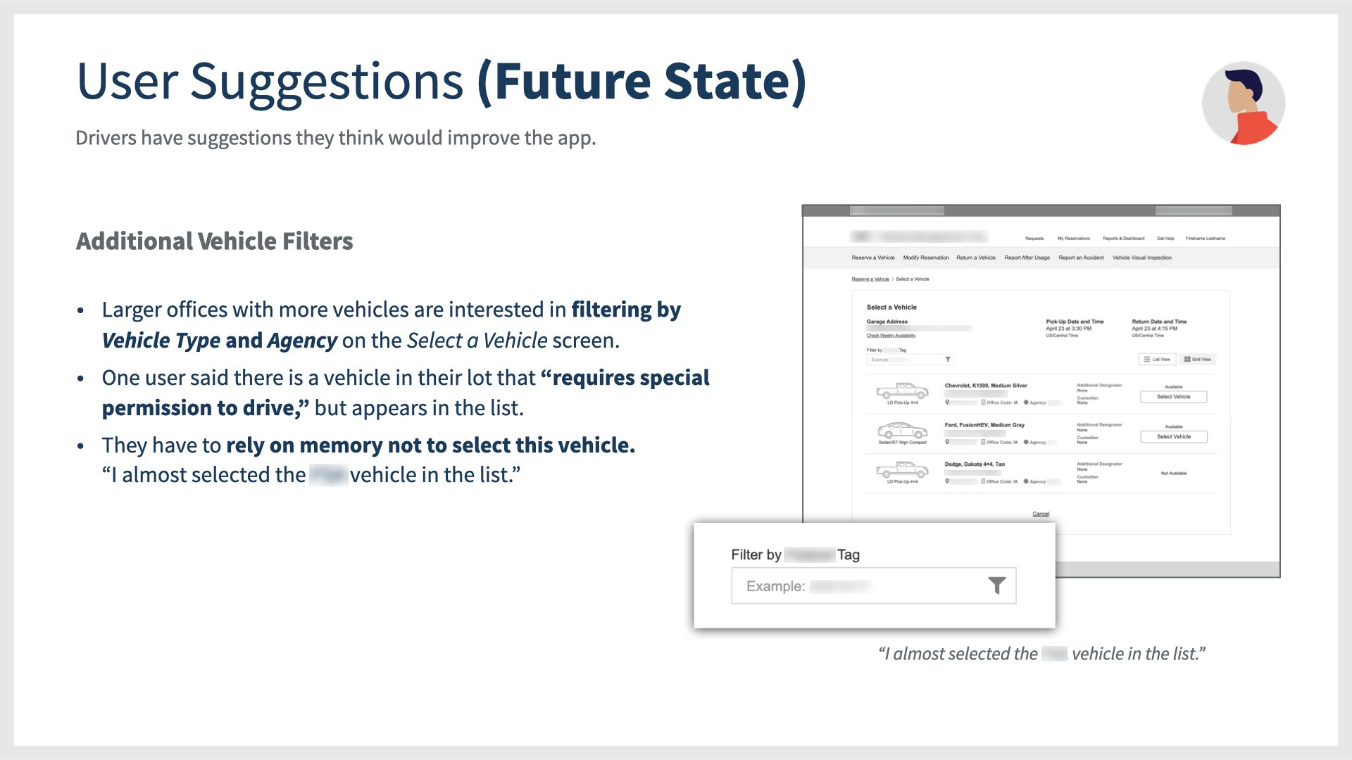
UX Design Process
Documenting Current State
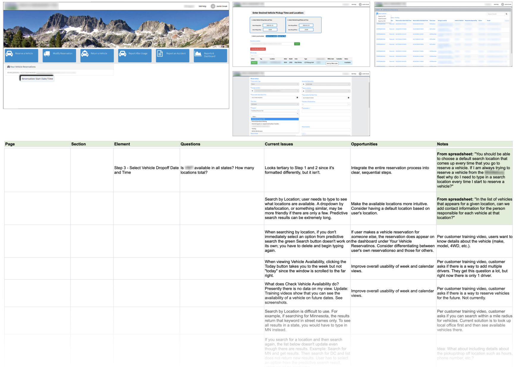
In a spreadsheet spanning 7 columns and 150 rows, I documented issues, questions, opportunities, and notes for every section, page, and element in the application. This gave me a great understanding of its current state.
Apart from its plain visual design and problems with accessibility and design patterns, the application was experiencing issues with search, form fields, irrelevant content, inefficient reservation steps, dead ends, slow performance, and confusing formats.
 Current State Assessment
At the project’s beginning, the Asset Management Software App had been part of user’s existing workflow for only one year. While our development team tackled stories in the backlog, I took a deep dive into the app’s current state. This was important to do this prior to conducting user interviews in order to familiarize myself with the application and document my initial reactions, questions, and ideas, as well as note existing usability and heuristic issues with the design.
A Holistic Understanding
In a comprehensive spreadsheet, I organized issues, questions, opportunities, and notes for every section, page, and element. I also sifted through IT issue logs, documentation, and watched hours of training videos to learn how users were being taught to use the application and hear their recorded questions. In addition to stakeholder conversations, this gave me great understanding of the different roles and access privileges these users have in their ServiceNow software instance.
After this stage, I was ready to begin one of my favorite parts of discovery—user interviews!
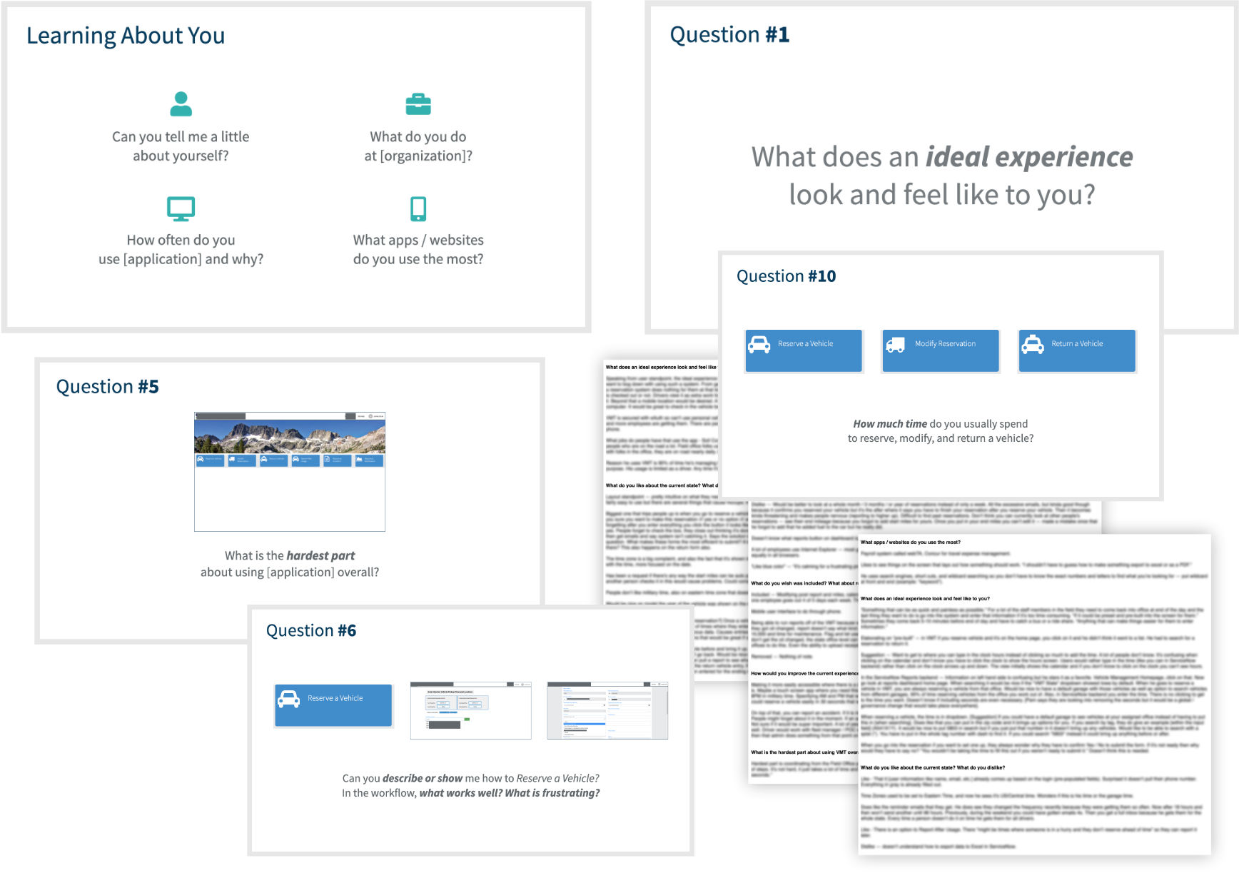
Structured User Interview Questions and Transcript Content
These user interviews were conducted remotely. I wrote a user interview script containing 16 open-ended questions and formatted them into a screen presentation.
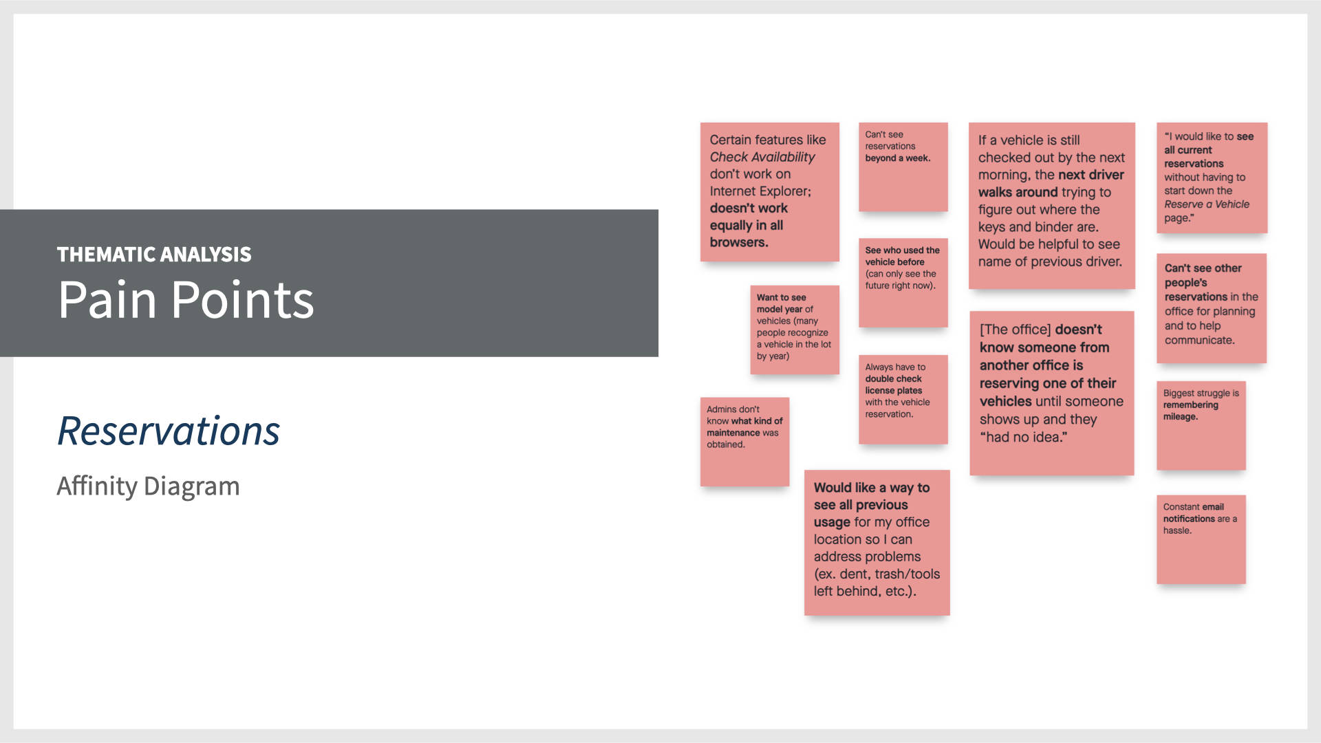
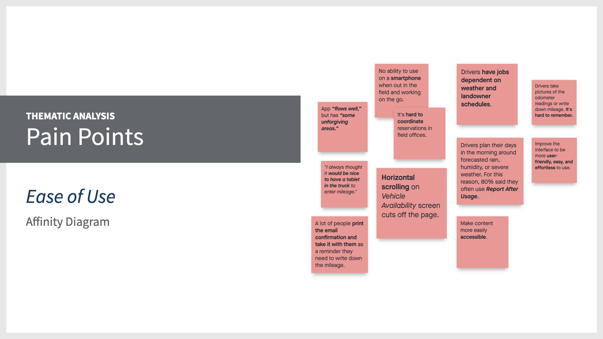
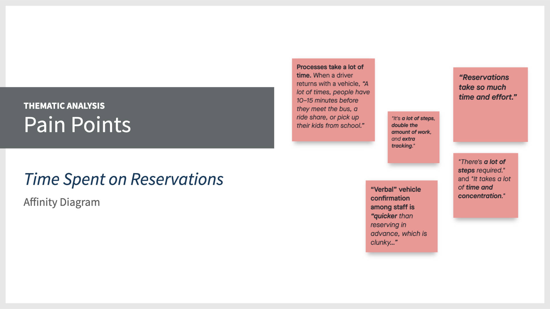
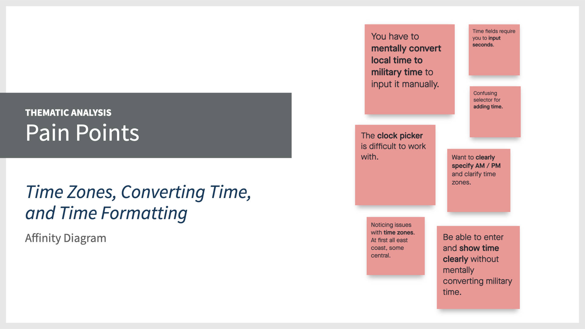
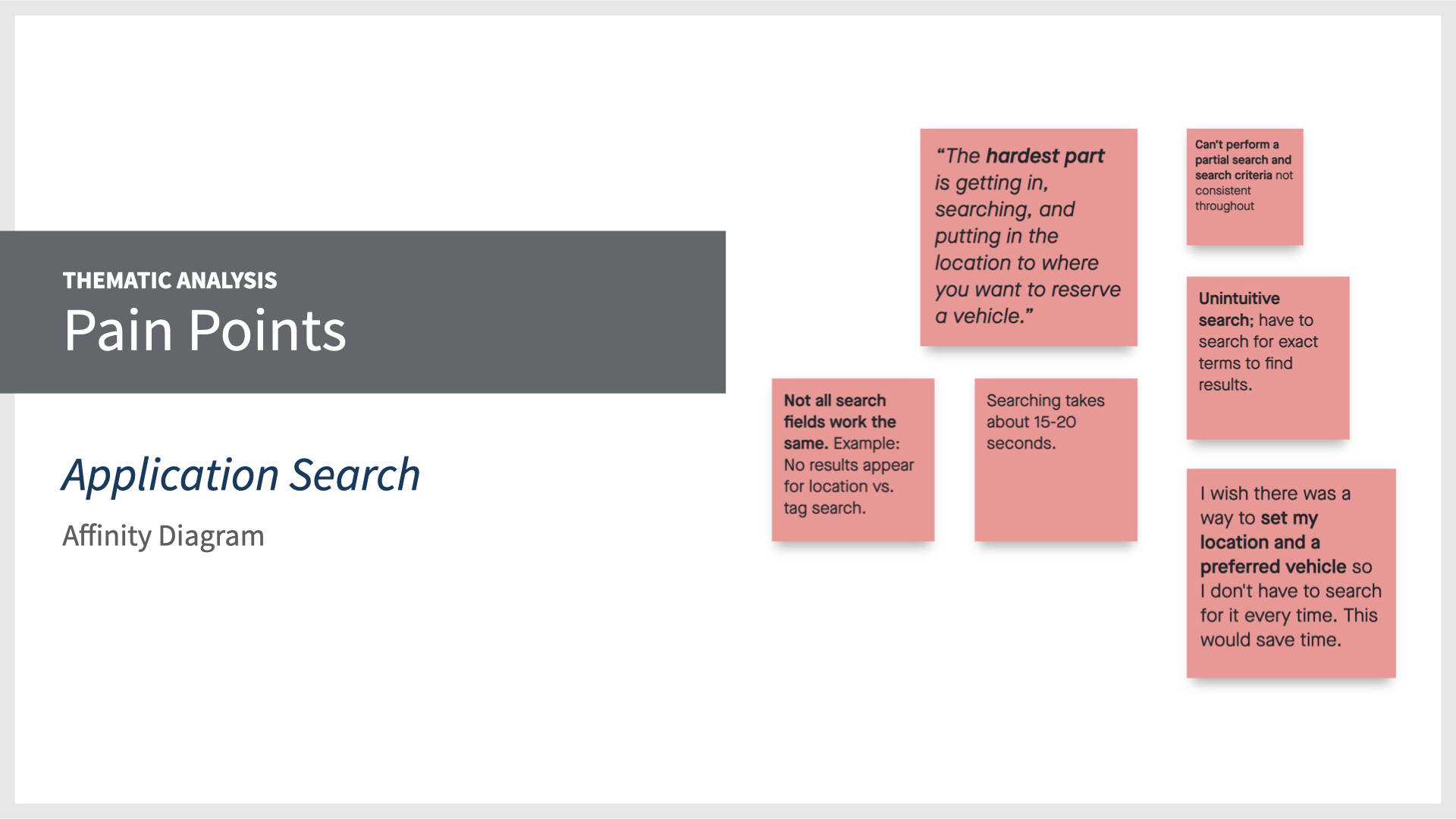
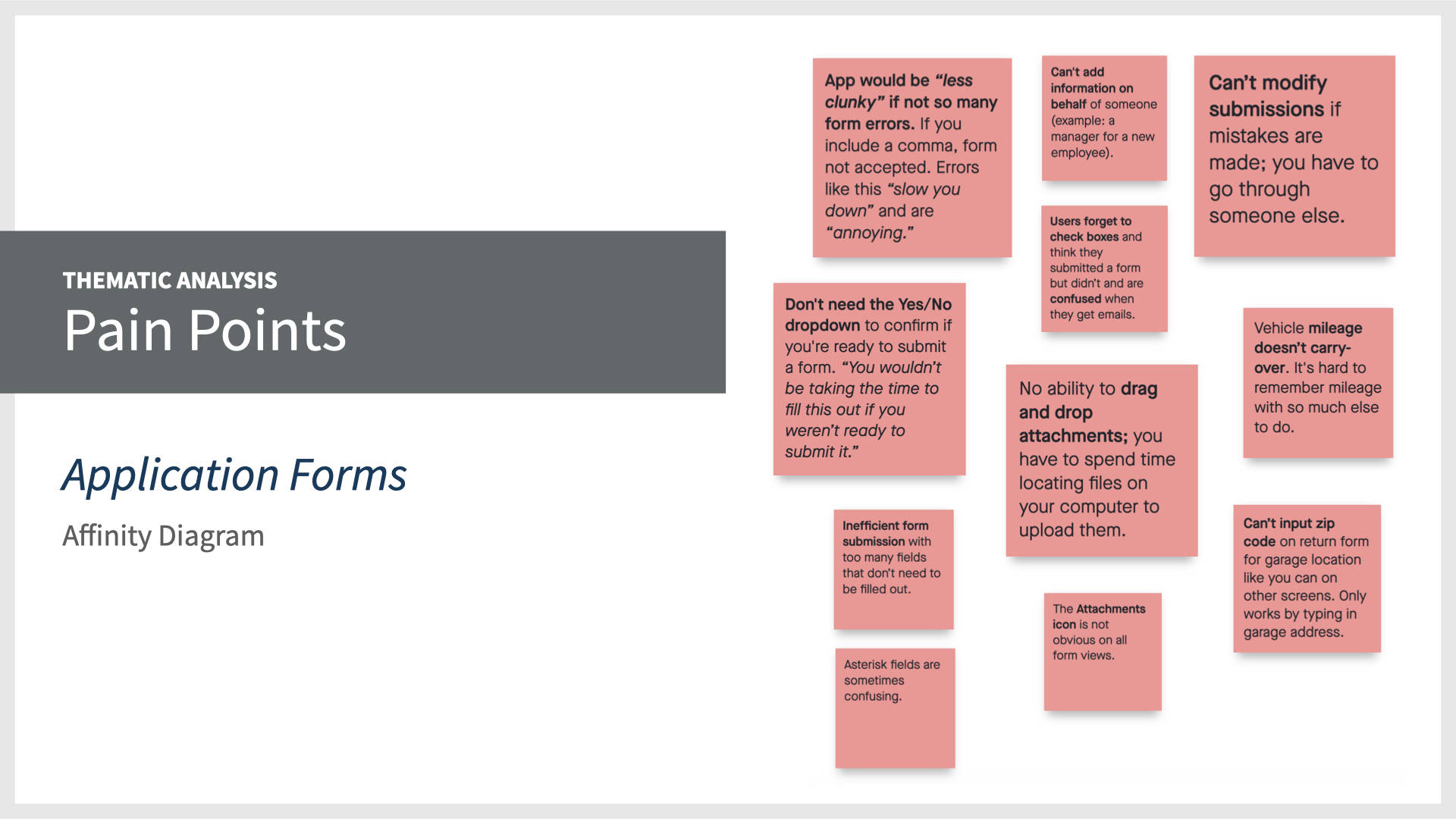
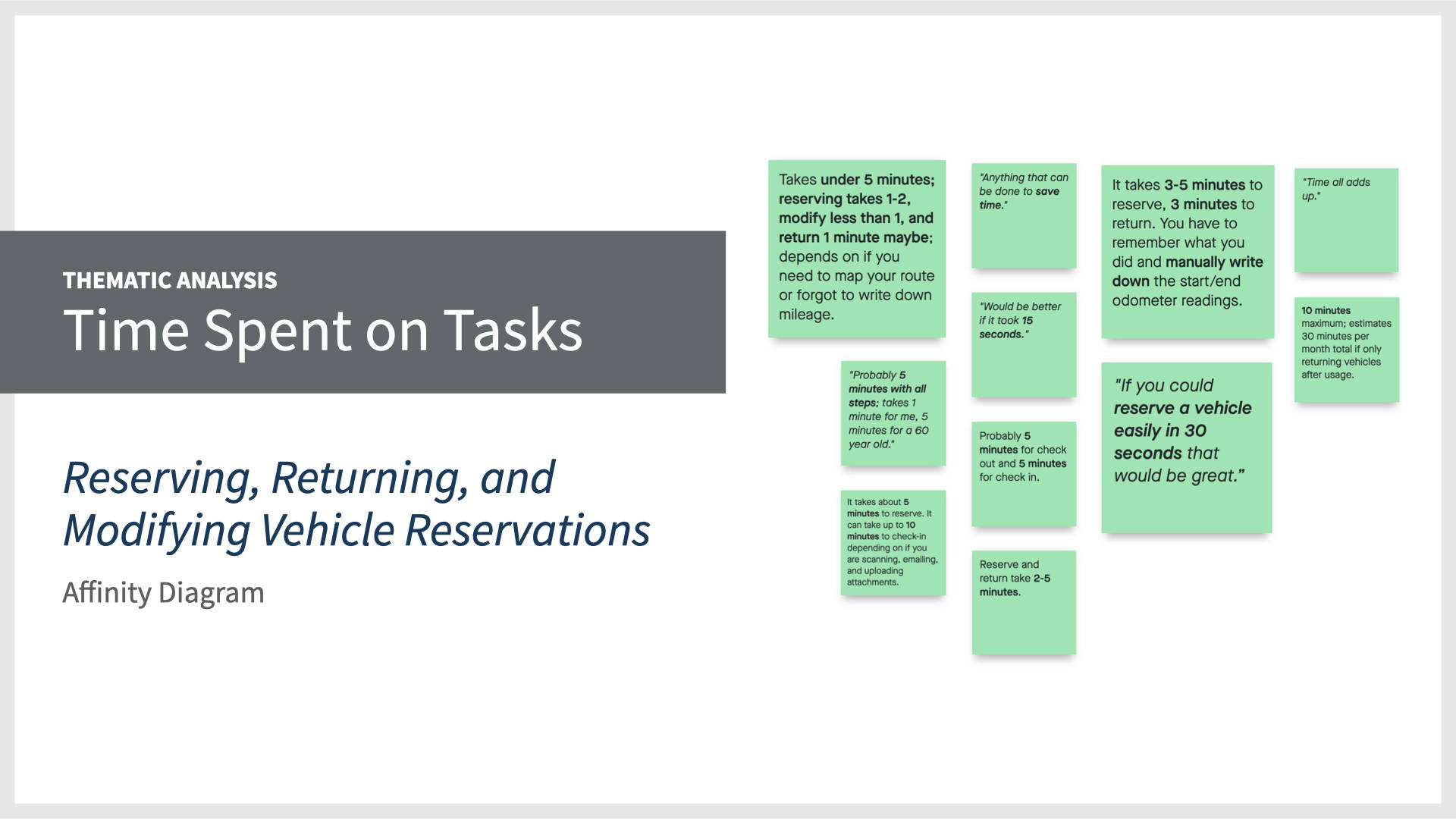
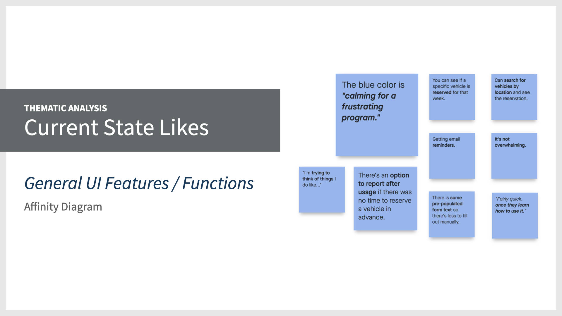
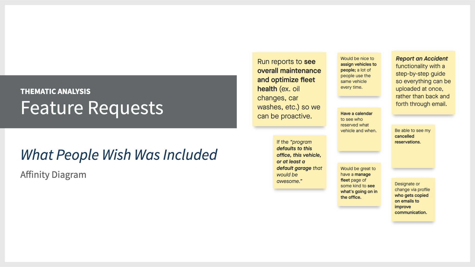
 Script Writing, User Interviews, Analyzing Themes, and Affinity Diagramming
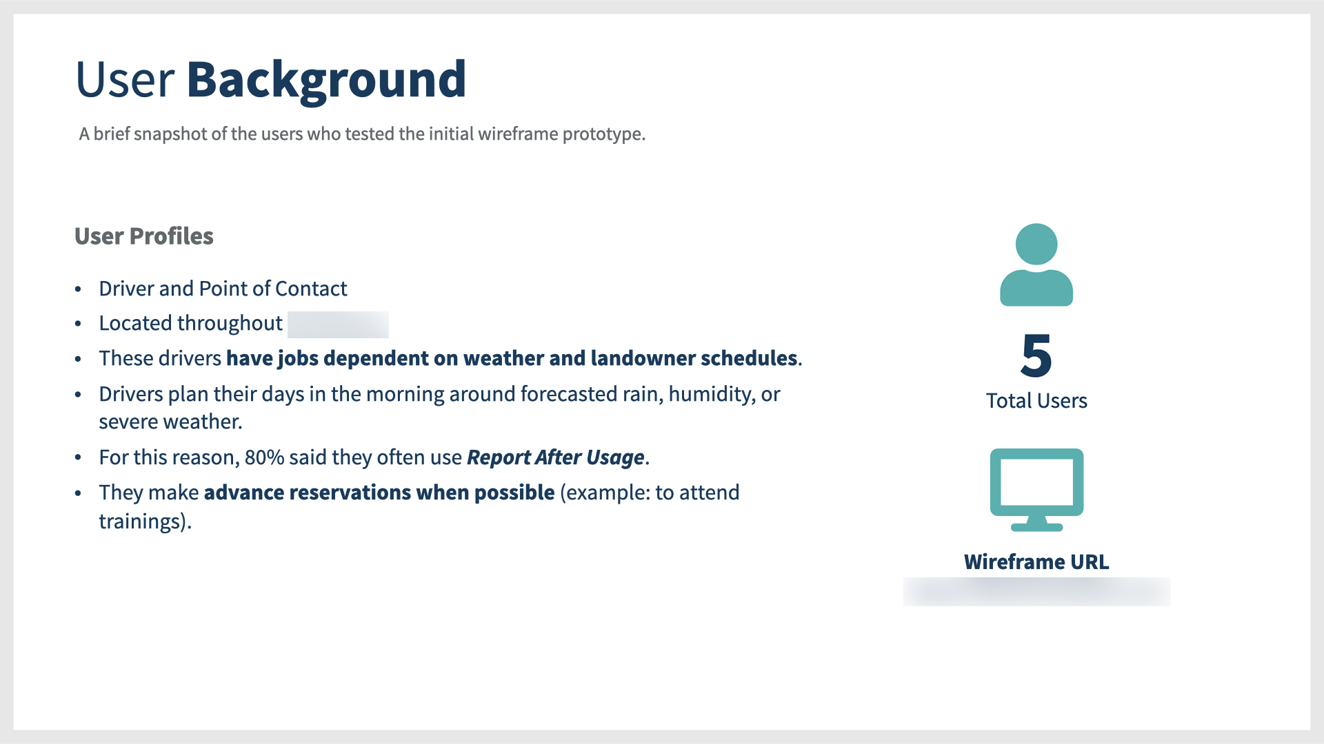
After conducting a current state assessment, I had a good idea of what issues people might be experiencing in the system, and wanted to dig deeper by meeting with real users. This prepared me to conduct a series of qualitative interviews with people having different system access privileges.
Writing a Script
To begin, I wrote a user interview script containing 16 open-ended questions to understand their usage of the application and their pain points. Each interview lasted one hour and yielded plenty of insights and ideas for future state consideration.
Afterwards, I went through my notes and searched for themes to catalog common findings discovered.
There were two big takeaways:
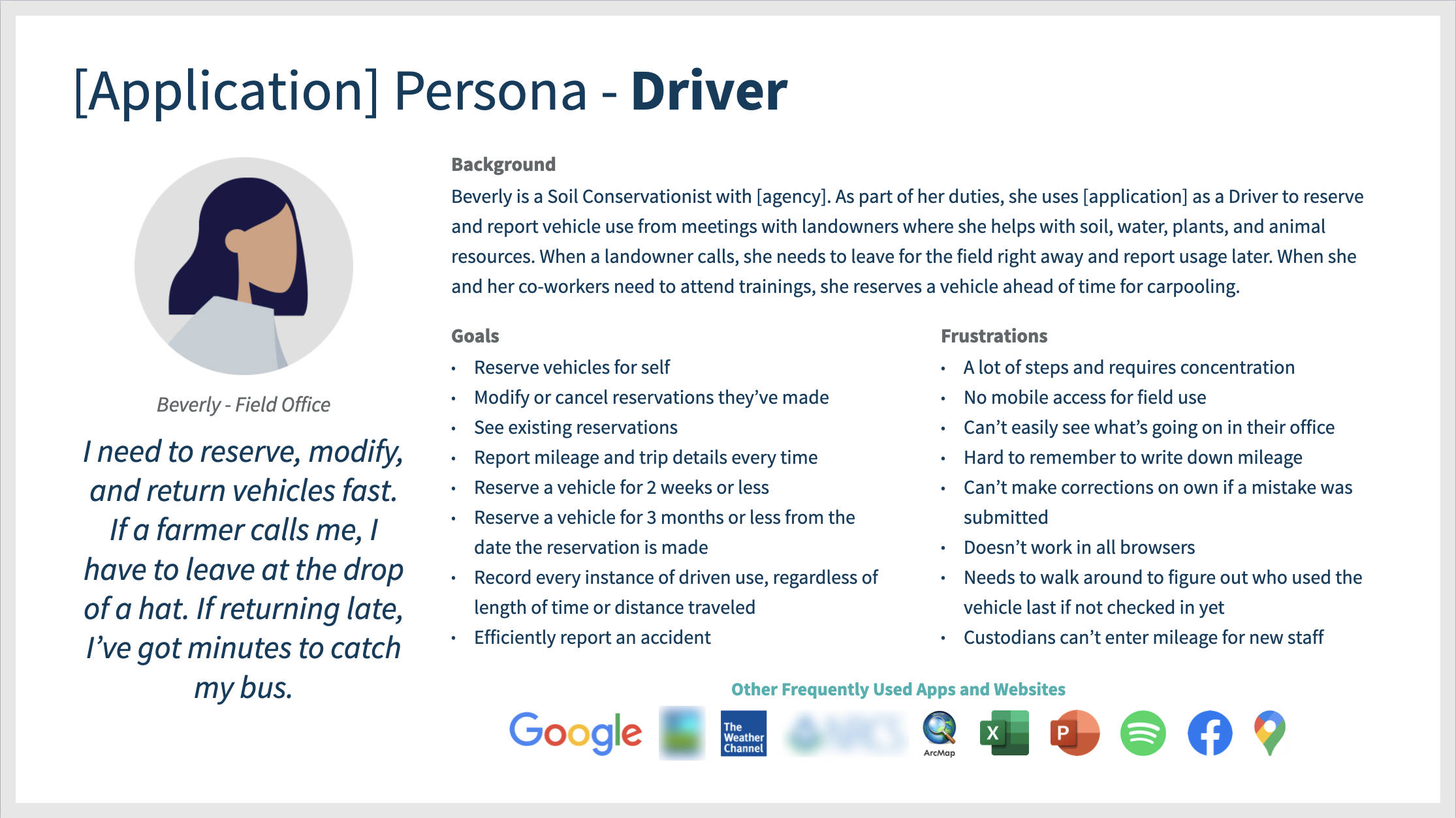
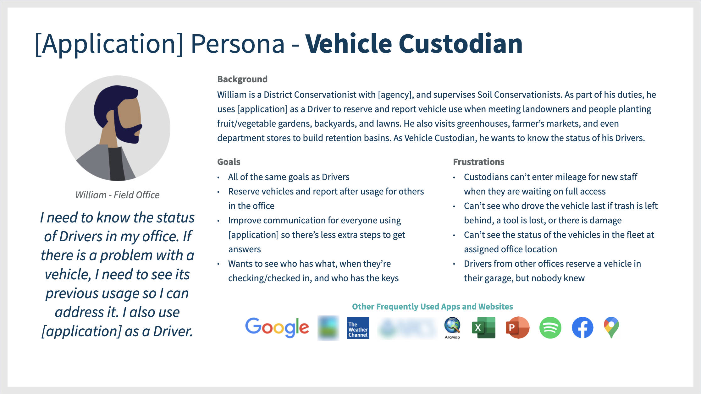
- First, talking to Drivers revealed a new persona that was distinctively different but had the same access privileges as a Driver: Vehicle Custodian. Vehicle Custodians are assigned at an office to be the person of contact for vehicles in the garage. This persona had a unique experience and I reported their future state suggestions to stakeholders. Even though they only had Driver access in the system, they wanted to understand what was going on in the office and who was coming and going with reservations.
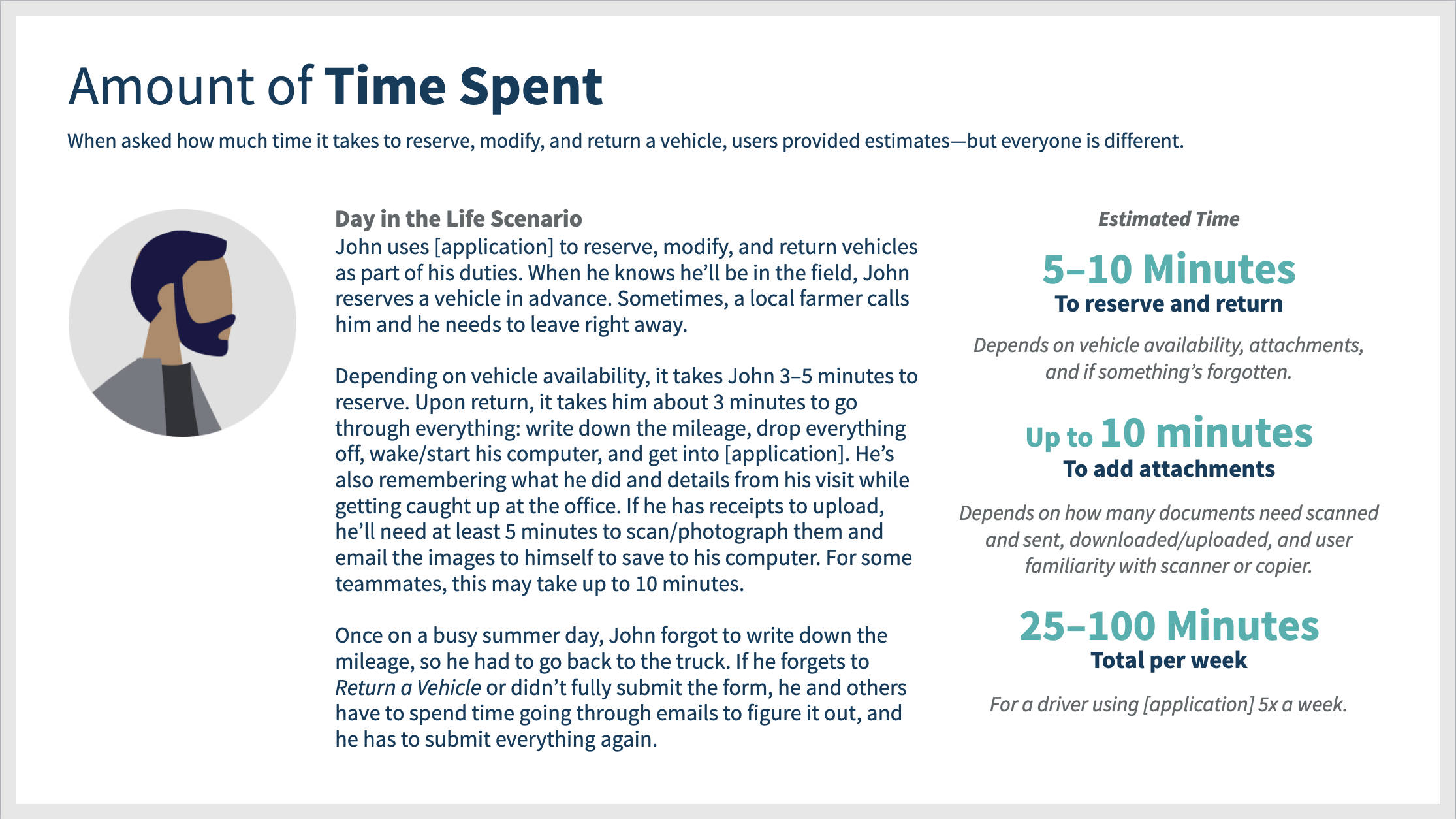
- The second takeaway was that the experience of how Drivers use the application at their office was vastly different than their management advised them to use the application. Consistently, every Driver reported that because they plan their workdays around the weather, making reservations in advance is extremely challenging. Because of that, they often use the Report After Usage feature.
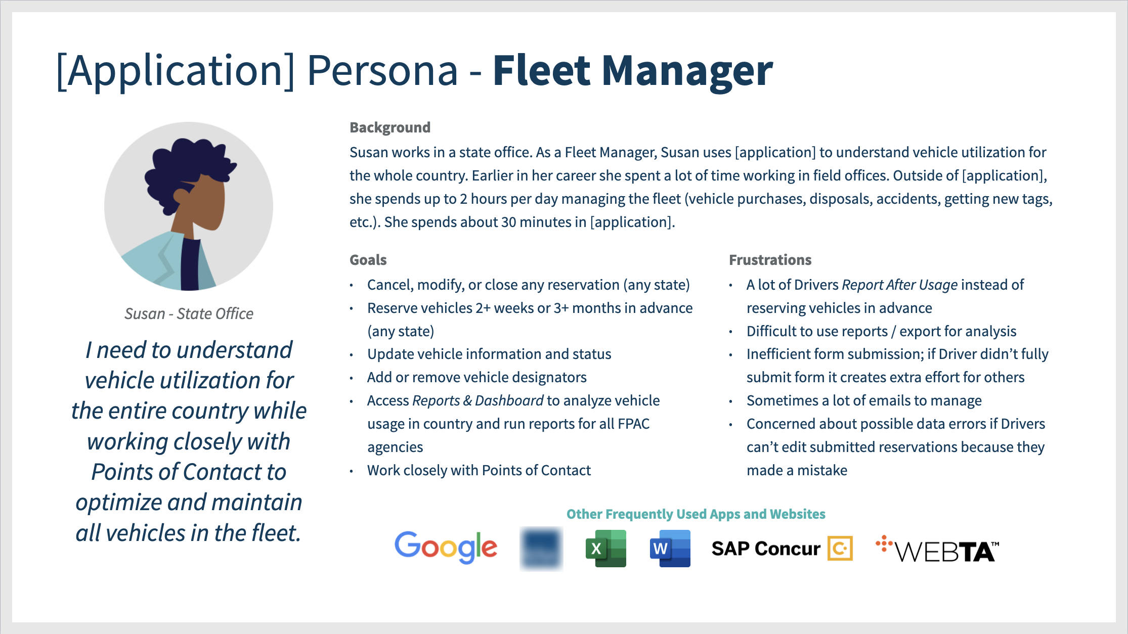
 Persona Creation and Day in the Life Story
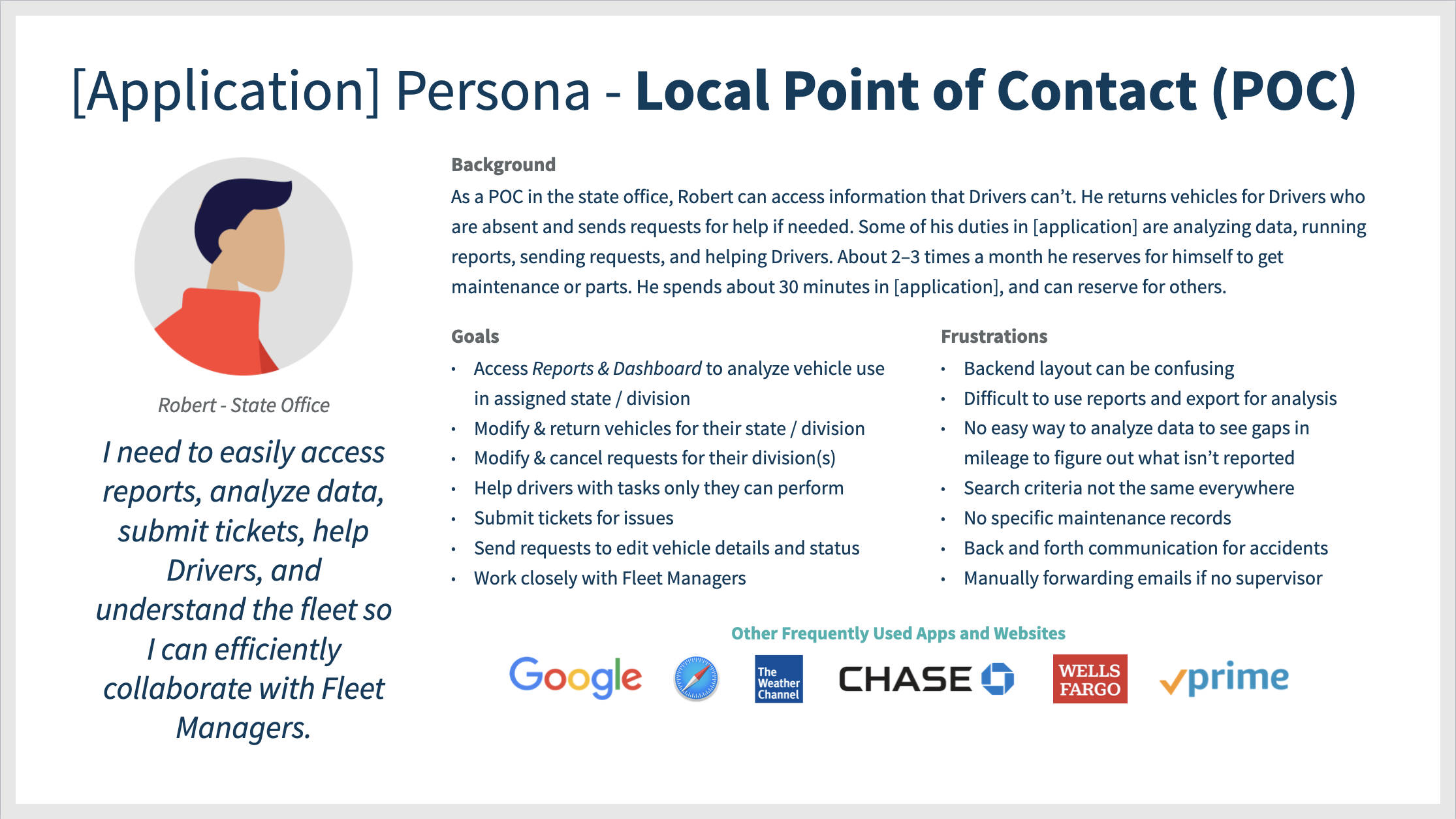
As part of one-on-one user interviews, I asked each person questions to learn about them as people, their attitudes and preferences towards technology, what their jobs are like, their goals and top tasks for using the application, and what their frustrations were in order to create four core personas and a day-in-the-life story surrounding the use of the application and the amount of time it takes to perform tasks.
 Program Increment Planning (Agile Software Development Lifecycle)
I combined the four personas and day in the life story that I wrote with my findings in a research report presentation. I presented this information in a client meeting at our Program Increment Planning event in Washington, D.C. While our platform engineers were writing user stories, the Product Owner and I worked directly with key stakeholders to prioritize features for the design, based on my research, to work on in the upcoming quarter.
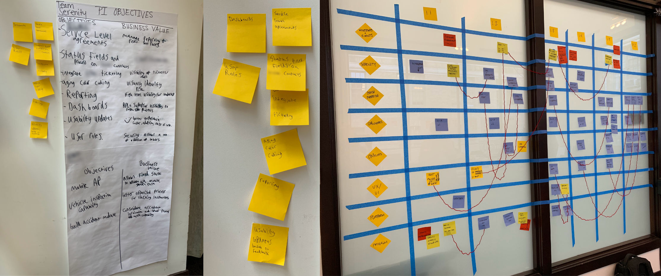
Scaled Agile Framework (SAFe) Program Boards
Left: Our platform engineers wrote a list of team objectives for the application.
Right: SAFe scaled Agile program board for multiple teams developing a suite of applications. The red string indicates areas where there are dependencies.
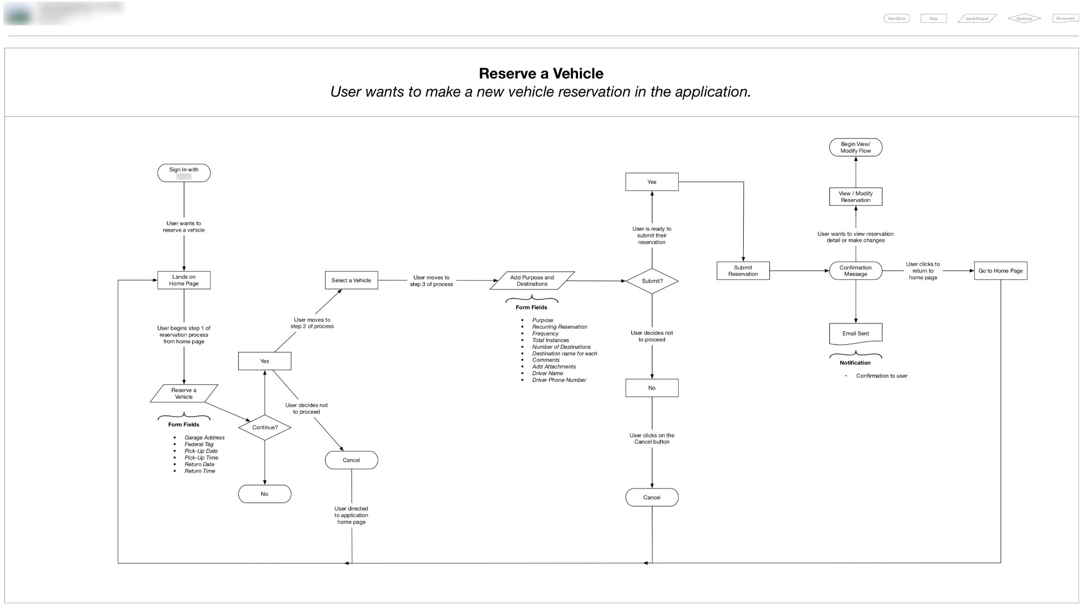
 User Flow Mapping
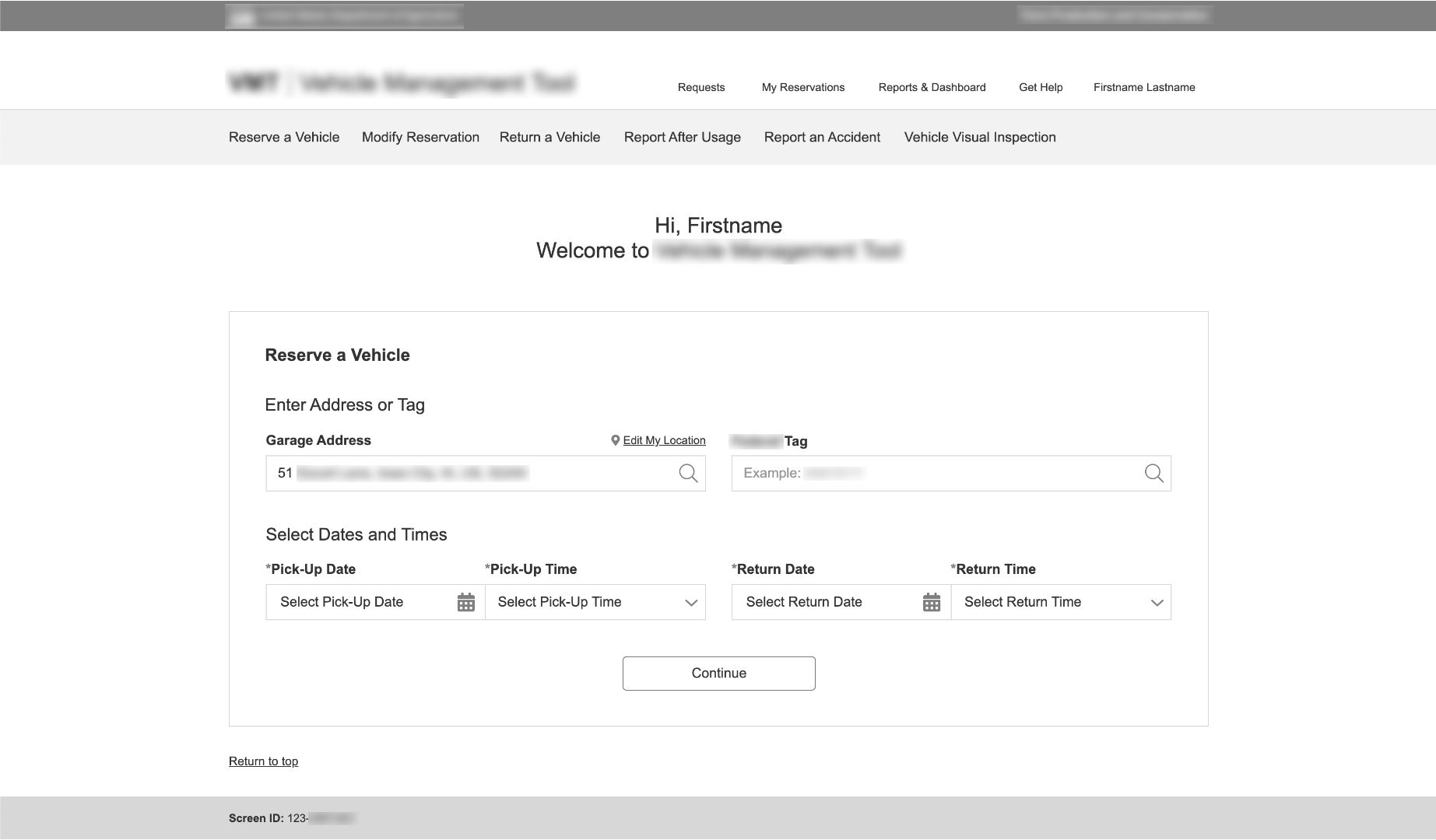
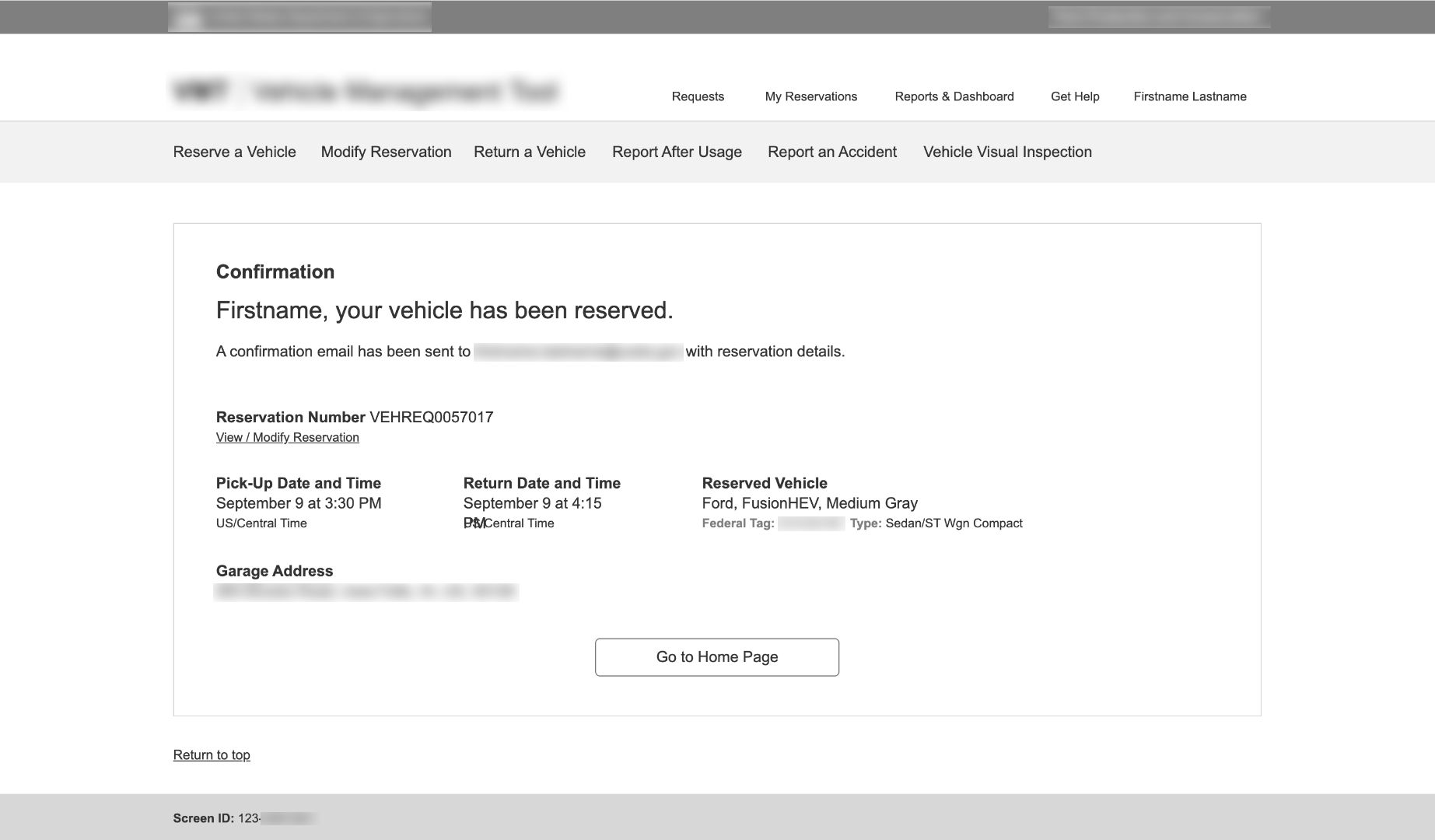
While at our Program Increment Planning event, our stakeholders wanted to focus on improving the overall design and vehicle reservation process, since one of the top findings from my research was that users reported there were too many steps and they were spending a significant amount of time maintaining their reservations in the system. What would be the best way to improve the design to help decrease the amount of time, effort, and concentration it takes? As I began the sketching phase, I also worked on mapping some potential user flows. The final flow is pictured.
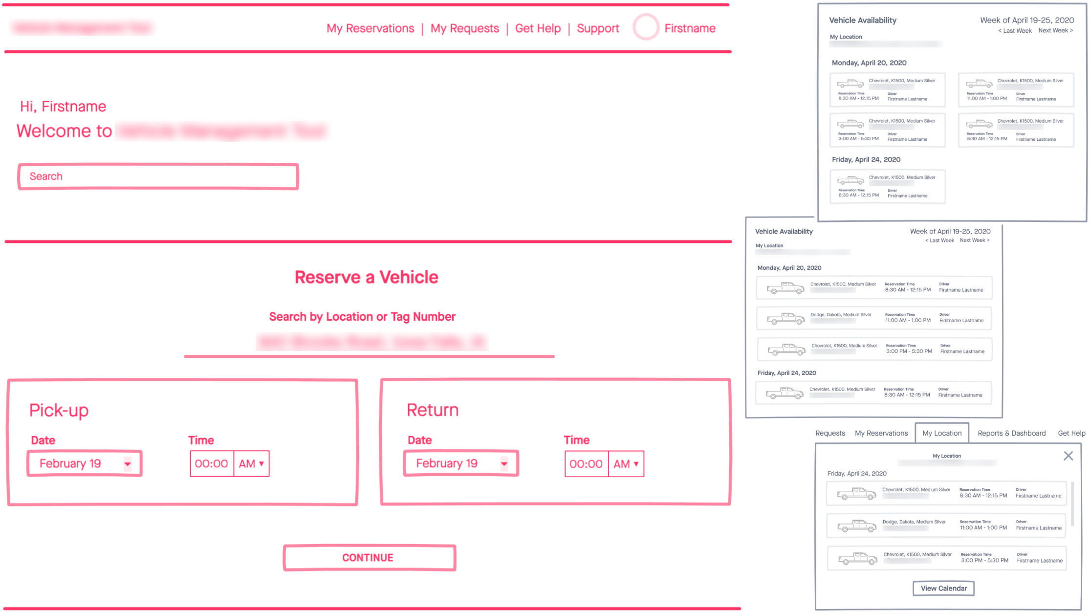
Sketches
Using InVision Freehand, I kicked off the design process by making quick, rough sketches like these before building an interactive wireframe in Axure.
 Ideation and Sketches
When it came time to begin sketching, our team decided one of the most efficient ways to start the reservation process might be to begin the reservation process right from the landing page, without having to look for it or navigate elsewhere. Our stakeholders liked the idea of exploring this approach.
After creating a series of sketches, I brought everything into Axure to build structured interactive wireframes with enough detail so they could be tested by real users.
 Interactive Wireframes
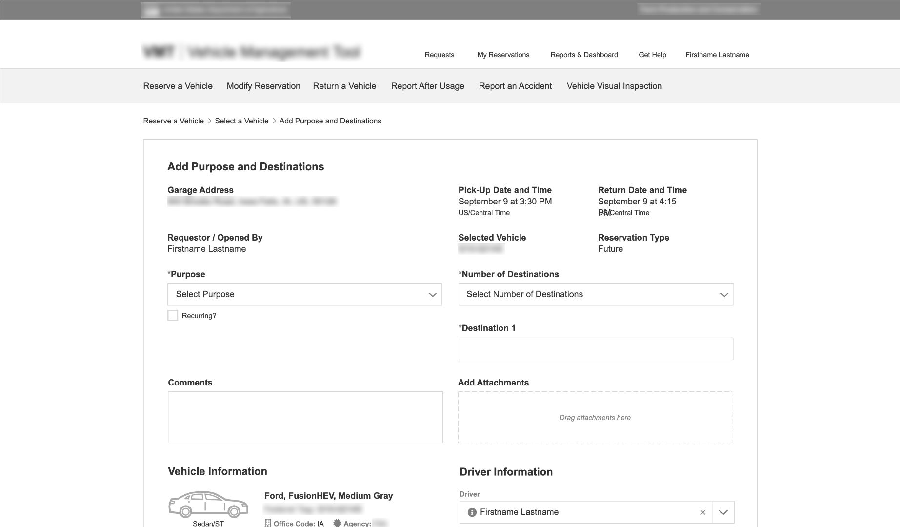
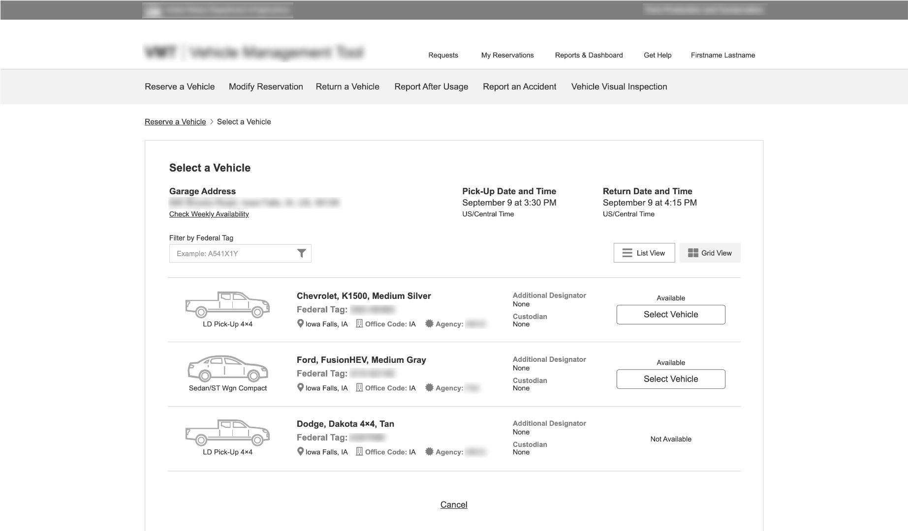
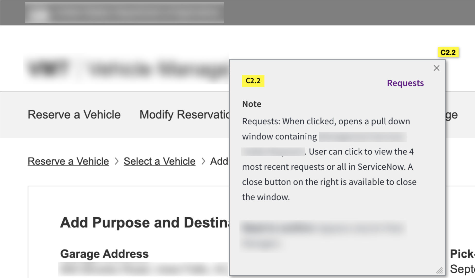
During the wireframing phase, I refined initial ideas and worked with development to see what was possible. To support documentation, I fully annotated all wireframes with notes about functionality and usability recommendations. After further edits and presentation to stakeholders, the wireframes were detailed enough to be put through usability testing.
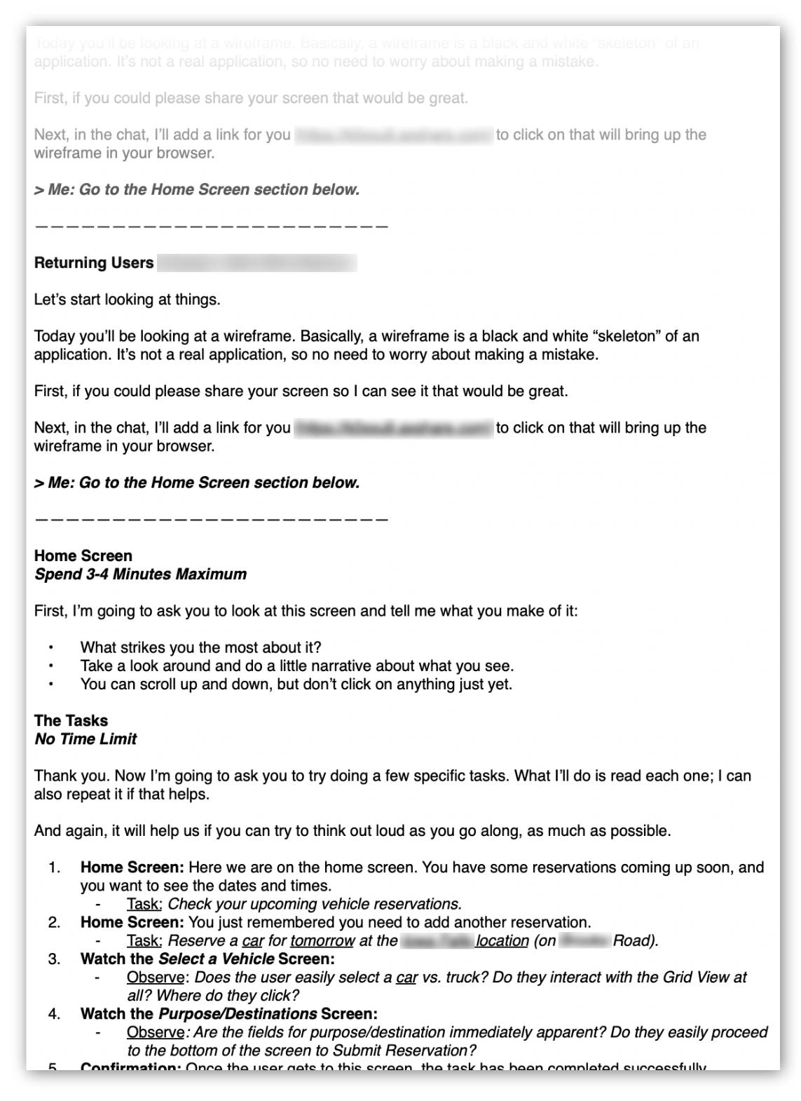
Usability Testing Script
Prior to usability testing, I wrote a script designed to test interface tasks. Of course I didn’t read it word for word, but writing out my part of the conversation got me in the right mindset and helped me structure my testing goals.
 Usability Testing - Script and Report Writing
I tested the interactive wireframe with users remotely. Since I had not previously met all of the users, I adapted my script from the user interview stage to learn about them and warm up prior to testing the tasks.
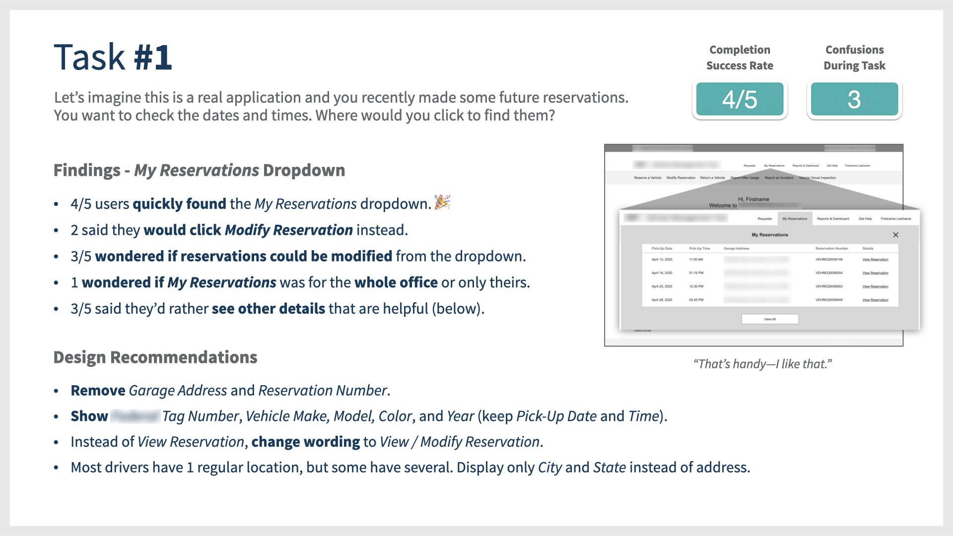
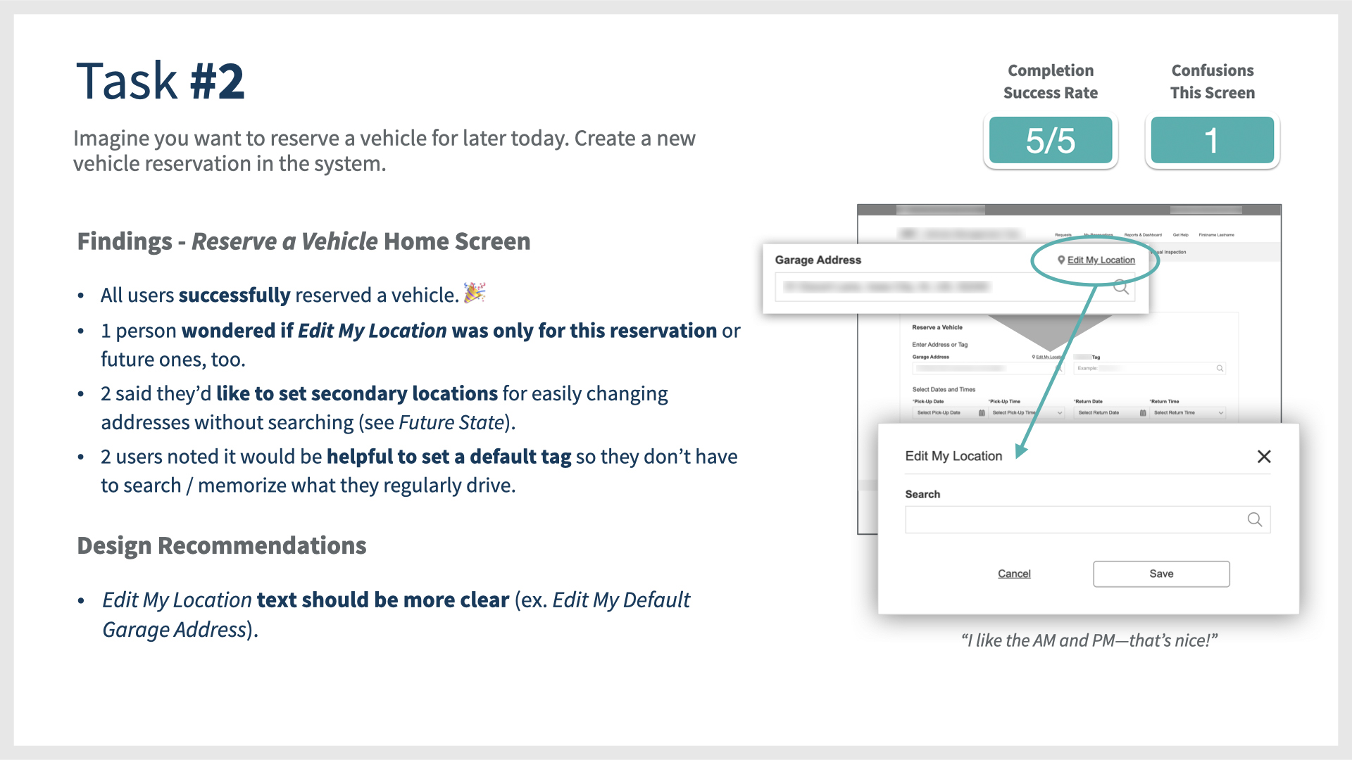
In their web browser, users walked through two basic tasks on their own, and spoke aloud about what they were thinking, seeing, and interacting with on the interface.
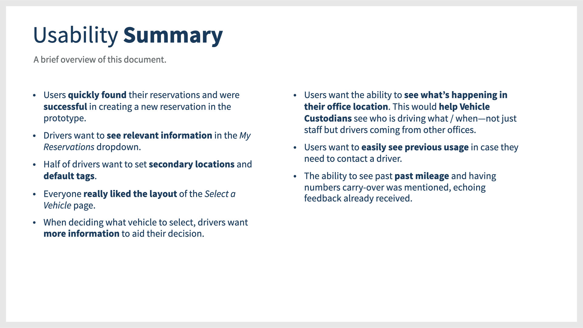
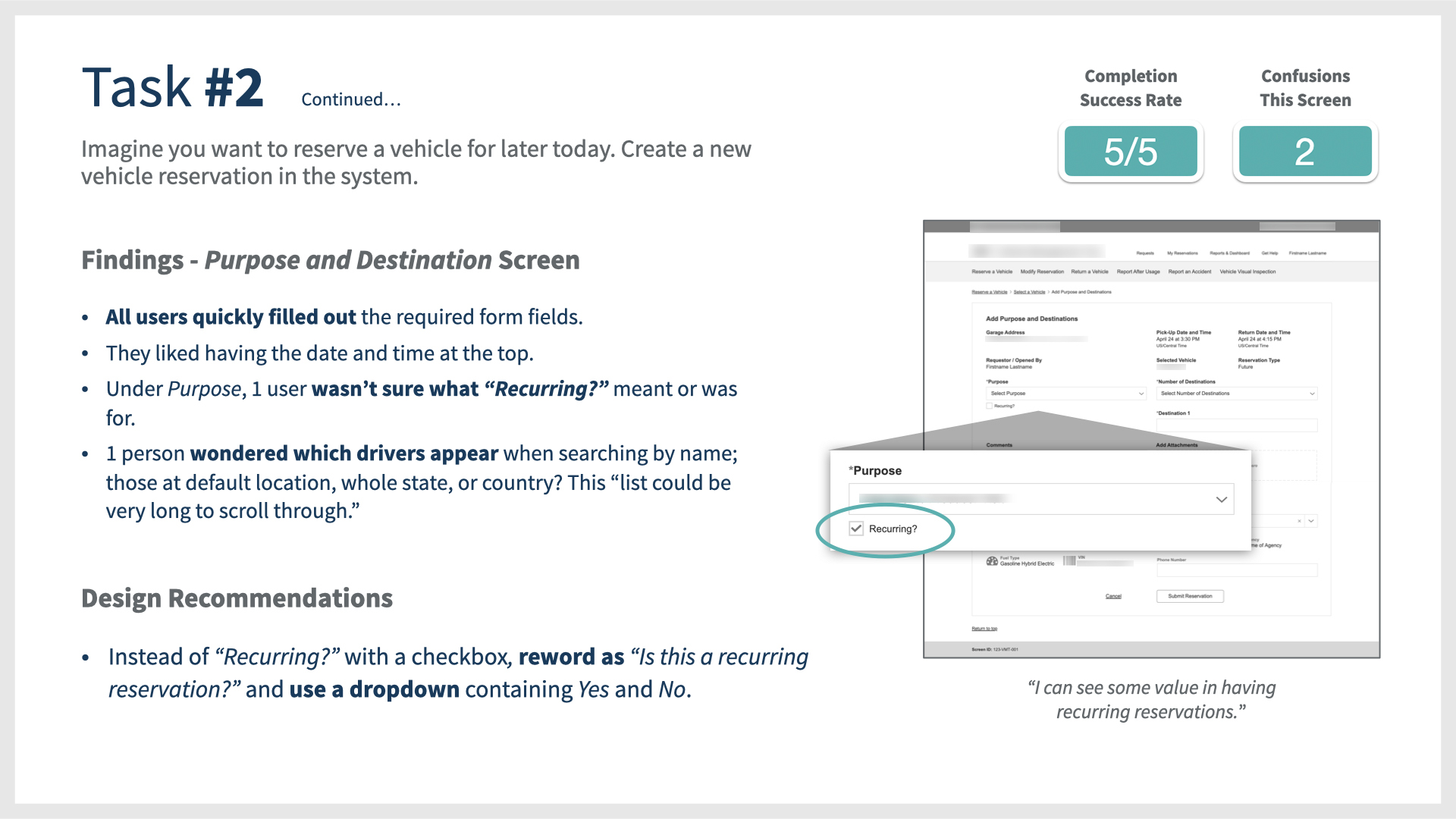
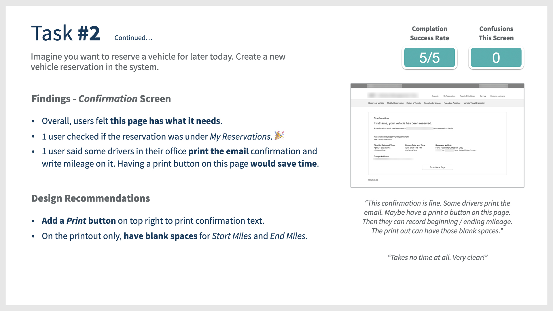
Task completion was successful, with everyone completing the tasks with ease. However, there were a couple of confusions—as well as design recommendations—that were highly valuable findings for our team. Any recommendations that were too much of a heavy lift during the quarter were documented as possibilities for future state. This gave our stakeholders and team ideas for future iterations.
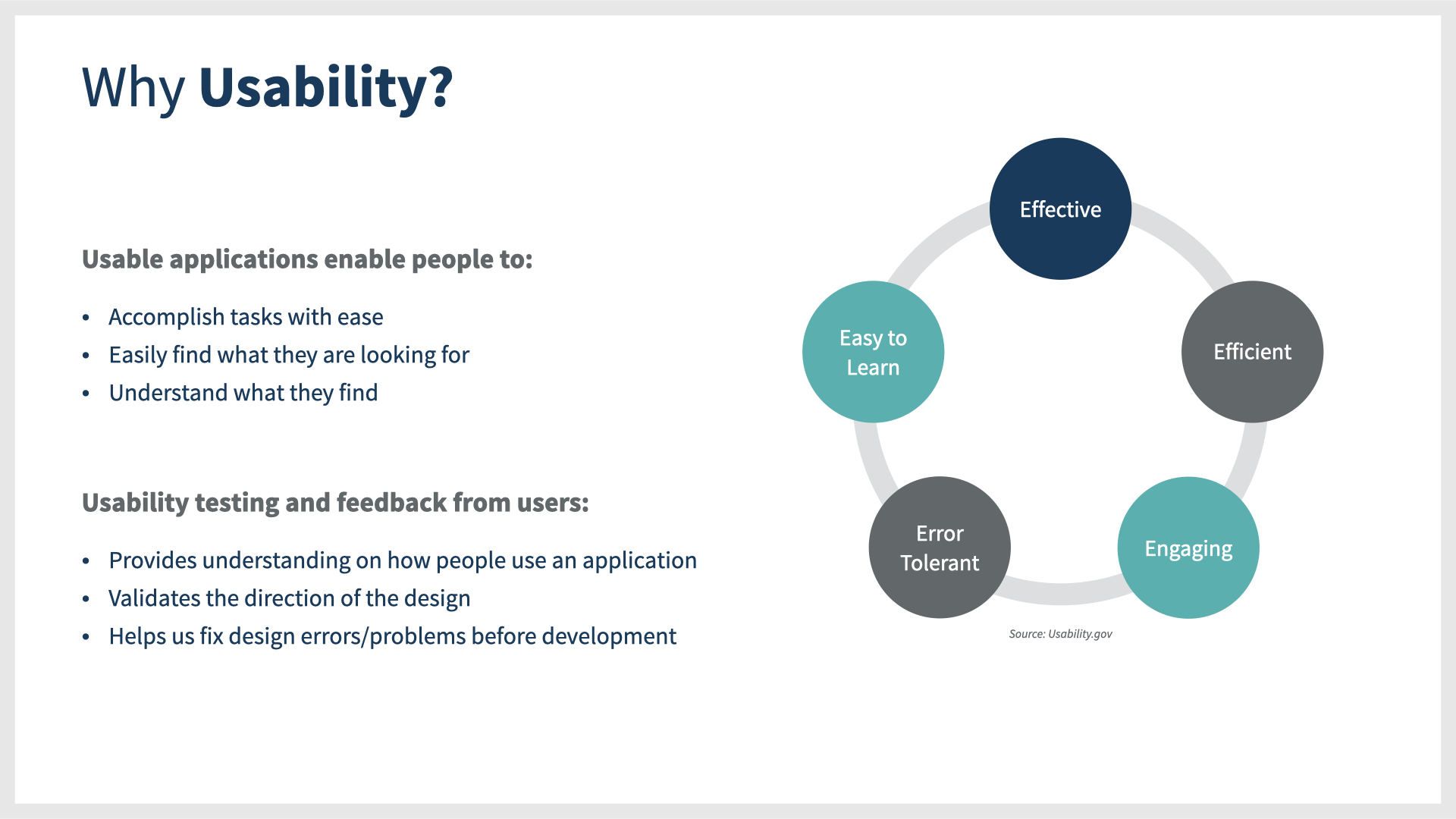
After the sessions, I combined all of my findings into a research report presentation, including information about why usability is important and background details about the group I met with. The final report consisted of 30 slides. A portion of the final slides are pictured.
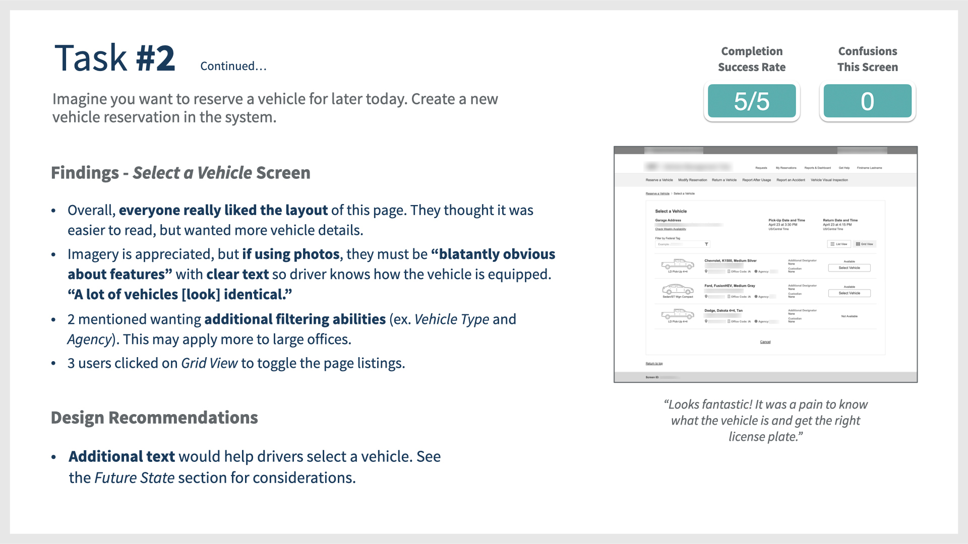
Looks fantastic! It was a pain to know what the vehicle is and get the right license plate.
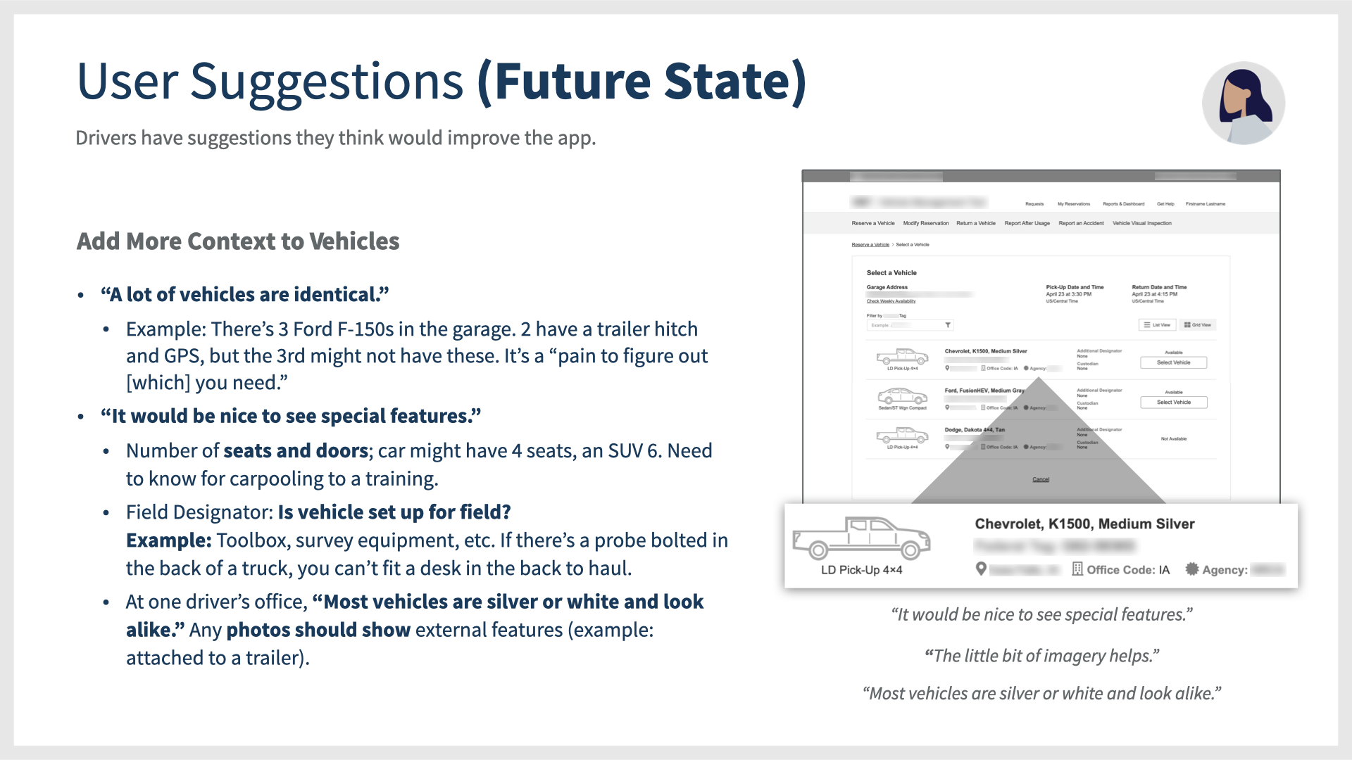
It would be nice to see special features. Most vehicles are white or silver and look alike.
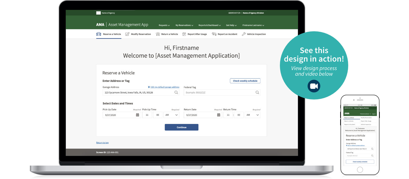
 High Fidelity Interactive Prototyping
The interface design of this application was unique in that the organization already had an existing and robust design system with code ready for our developers. The beauty of having a universal design system ensures there is a consistent design style for all applications in the ecosystem. In the final design prototype, I stayed true to the system and interpreted the existing design elements into the structure of the application design.
See it in action! Watch two quick videos below demonstrating the interactive prototype.
Desktop Application
Mobile Application
Metrics and Results
- Our team’s success measurement was for users to be able to reserve a vehicle in under 60 seconds and have the ability to drag and drop attachments in under 10 seconds.
- When testing the prototype, users consistently reserved a vehicle using the new design in less than 30 seconds on average. The drag and drop attachment feature was built to eliminate the need for browsing files on a computer, meeting the under 10 second goal.
- For Drivers using the application 5x per week, the estimated time on task was reduced by 133%. Amazing!
- After designing this product, the Program Increment quarter ended. My professional recommendation to the product team was to measure performance and reservation time again after launch, and iterate as part of future planning.
Stakeholder Testimonial
I like how it jumps right into the reservation; it has a private sector feel to it, like Travelocity. I’m pleasantly surprised at how you’ve simplified a convoluted process. I’m impressed with this!