eCommerce Customer Experience
SaaS eCommerce design that increased sales, organic search traffic, and overall customer growth.
NatureScapes.net eCommerce Store
Background
NatureScapes is the most comprehensive, longest running online resource for nature photographers. As the sole designer for 9 years, I developed the brand by designing the company’s entire online experience. The different design facets include website design, eCommerce, customer experience, email marketing, SEO, and analytics. Working on many different design problems presented the opportunity to not only improve the overall user experience for customers and clients, but also increase trust, organic traffic, revenue, and customer loyalty.
Design Driven by User Analytics
By designing with user feedback and data, I improve customer shopping experiences through visual design as well as implementing new processes, systems, and standards. As a company with close relationships to its customers, I gained a breadth of knowledge in every area of the business to create designs centered around the customer.
Below is the design process for the online store. Check out my email marketing portfolio for a sampling of customer journeys and how I grew email list sign-ups. Additionally, by focusing on the user’s search experience, I increased website traffic and conversion rate. View my SEO portfolio for examples.
Design Process for NatureScapes Store
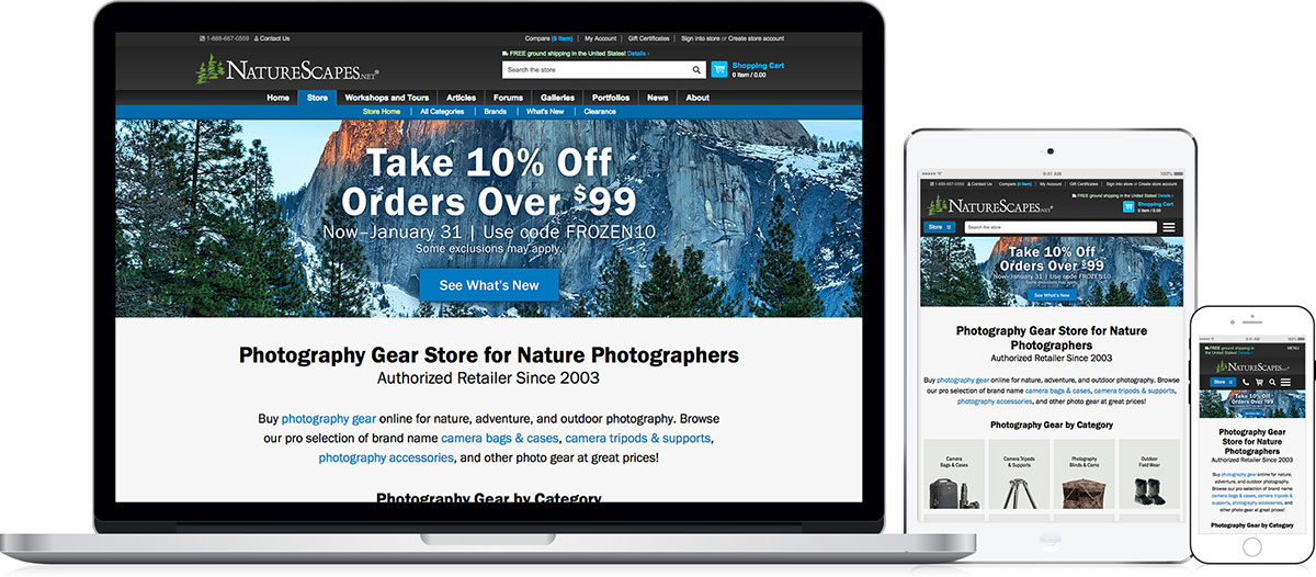
NatureScapes Store Analysis - v1
Version 1.0 - Initial Launch
Version 1.0 of the store went live with only the basics in place and the goal of making improvements. After launch, I observed patterns to determine what to strengthen first to improve important areas like navigation, conversion rate, and organic traffic.
 Analysis of Version 1.0
The process of preparing pages to receive customers was an undertaking for our small team. To launch, Version 1.0 of the store went live with the basics in place and the goal of making continuous improvements.
Version 1.0 Observations
After launch and gaining traction, I analyzed sale and traffic patterns across product categories to determine what to strengthen first to improve conversion rate and organic traffic, keyword rankings, ease of use, and customer satisfaction.
Featured Problem: Traffic Flow Issues
- The Clearance category attracted more traffic than others, diverting away from categories with higher-value items.
- The home page’s “sea of products” wasn’t effective at giving customers direction.
- The Special Offers category wasn’t attracting traffic, indicating it was difficult to find.
Design Approach
My first goal was to improve user flow from the landing page with an approach that would help customers find what they are looking for while placing higher value categories front and center.
NatureScapes Store - Research, SEO Strategy, & Content
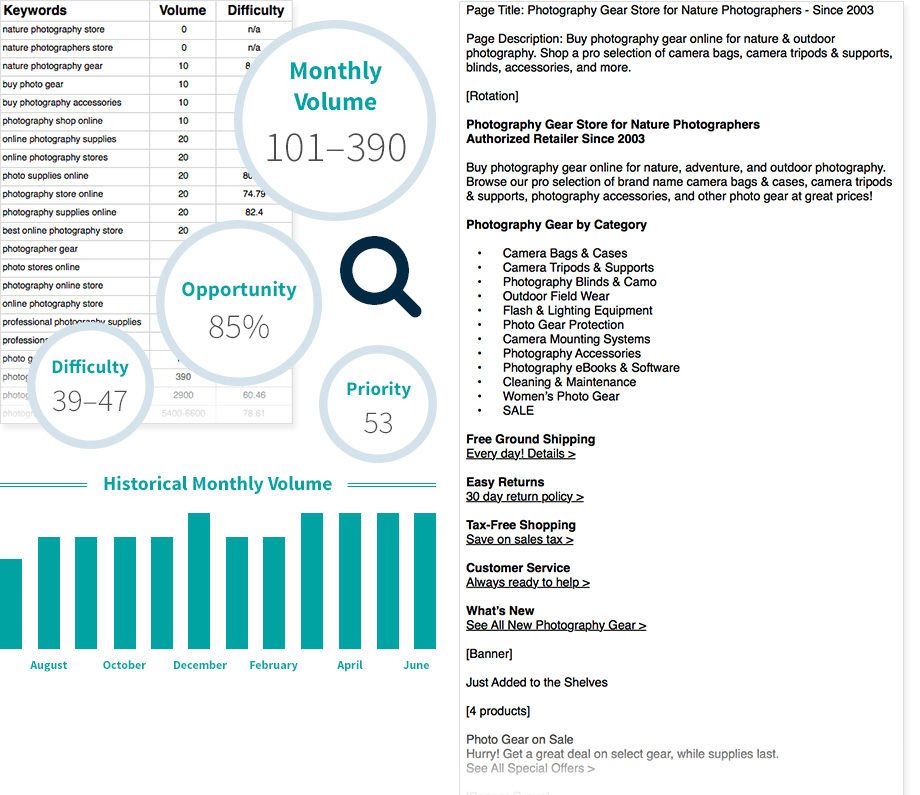
Research and Content for eCommerce
When writing content for store product pages and categories I always perform keyword and competitor research to determine action that helps customers. Volume, opportunity, and difficulty are all considered.
 Research, SEO Strategy, & Content
To improve user flow, I researched to learn how customers were using the website. I also wanted to understand how big box stores and direct competitors were organizing similar categories, presenting products, and how they compared.
Customer & Competitor Research
- Examined results from customer surveys, feedback, and customer service inquiries.
- Observed user behavior flow in Google Analytics.
- Researched keywords competitors were/weren’t optimizing.
- Assessed all data to discover growth opportunities.
Landing Pages Based on Search Intent
- Researched keywords centered around user search intent to increase visibility and help customers find what they are looking for.
- For categories like Tripods and Supports, I also researched keywords to support the customer shopping journey.
- Utilized target keywords to create an outline and wrote optimized page content.
- Incorporate content onto pages to help customers and Google’s web crawlers.
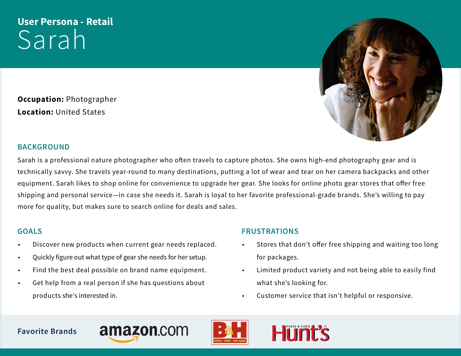
Sample User Persona for a Retail Customer
Above is a persona for a unique customer in the online store based on customer feedback. When designing web features, emails, and promotions I think about customers like Sarah.
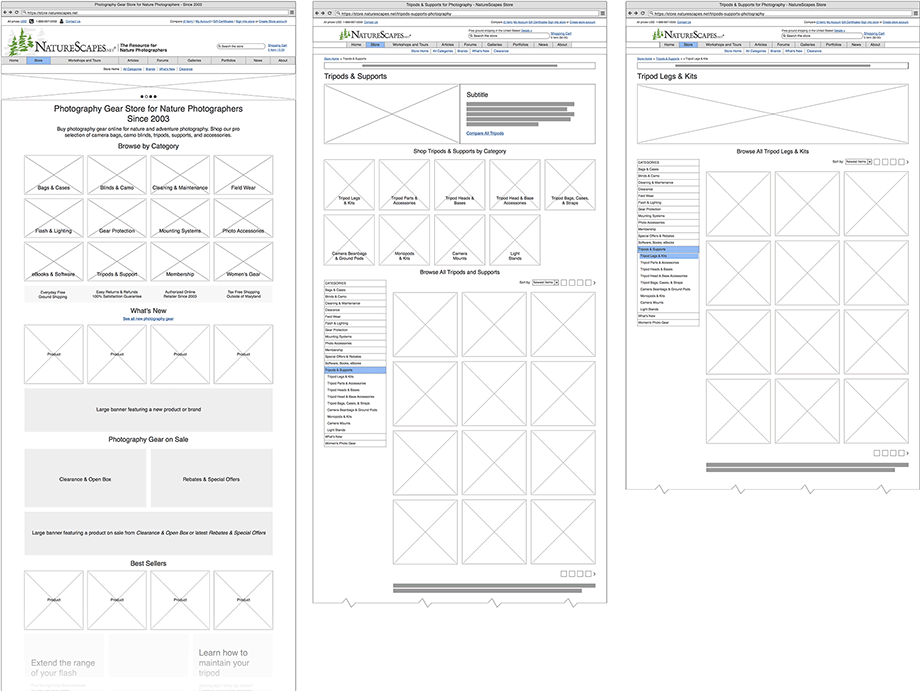
Wireframes for Updated Landing and Category
Pictured are a few wireframes showing updates for the main landing page as well as improvements to main and sub categories.
 Wireframes
Once a strategic plan was in place, I created wireframes to communicate it visually to my team.
Understanding Technical Foundations
First, I examined the BigCommerce theme to learn how the template was set up and how to make modifications to the underlying code. That way I understood what changes were possible and the limitations.
Content and Ideas
Using written content and a list of ideas, I created wireframes for the store home and category pages and explained my analysis and suggested approach. I was sure to include some reusable elements for consistency and development speed.
Afterwards, a few modifications were implemented before approval and starting the visual design.
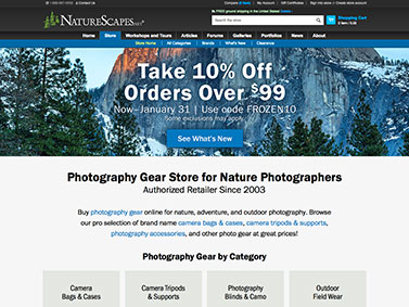
NatureScapes Store - Home Page
Store Home Page
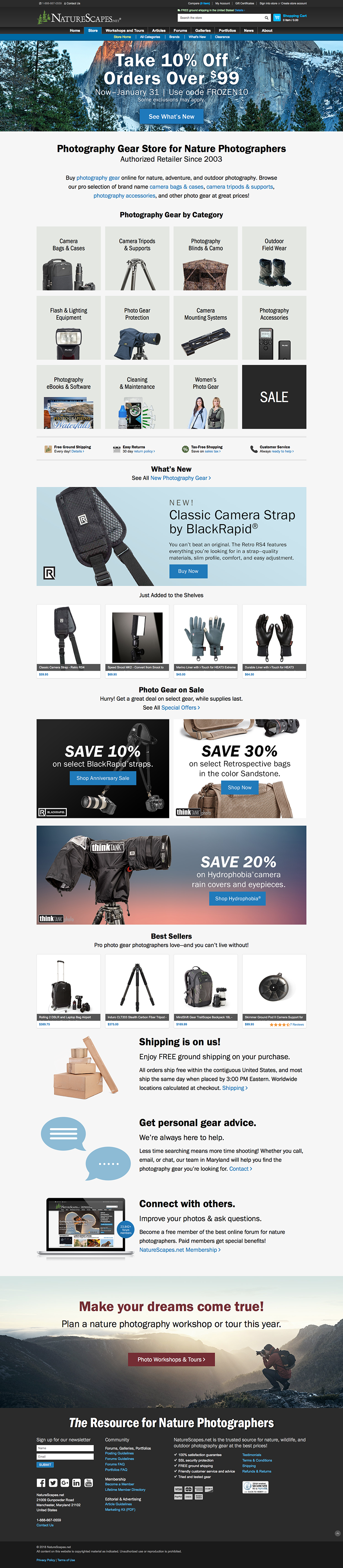
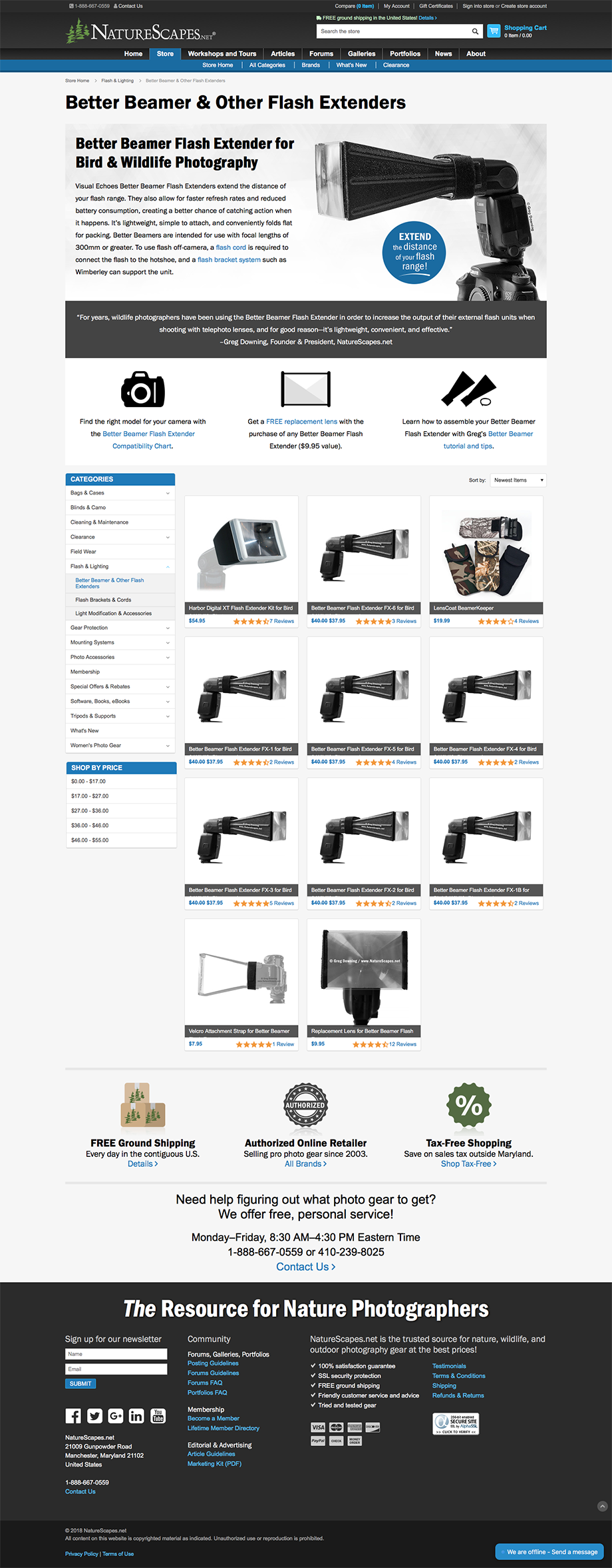
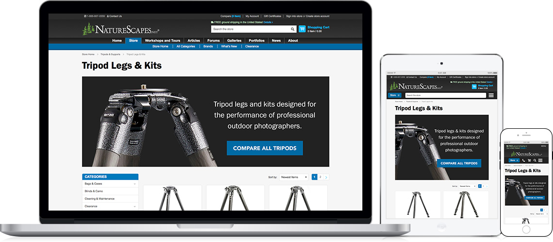
NatureScapes Store - Category Landing Page
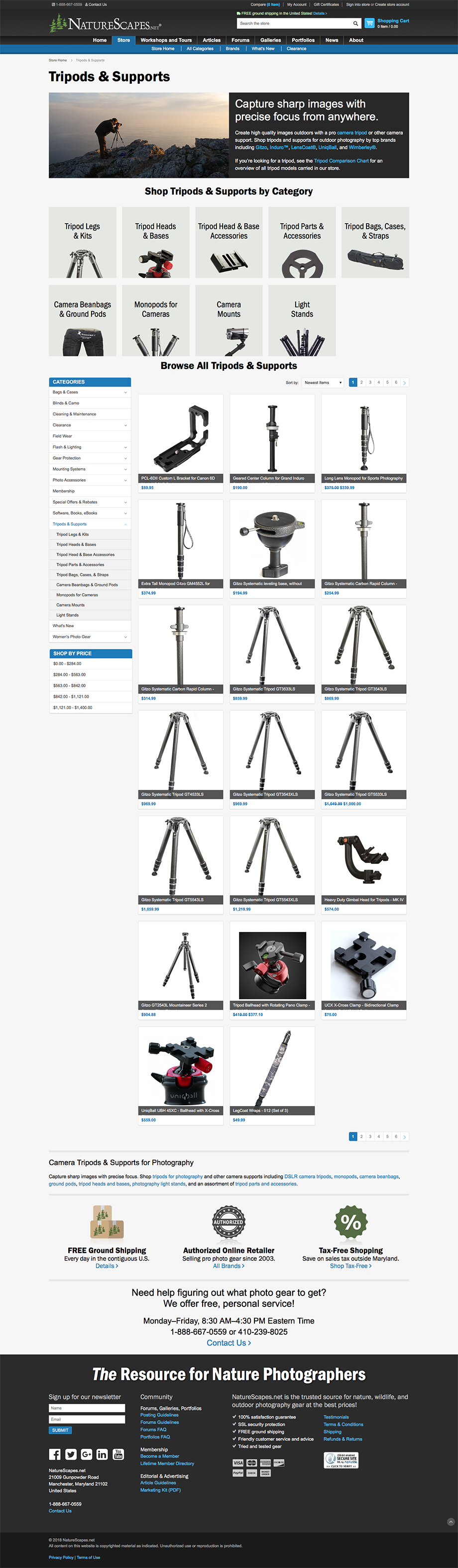
Category Landing Page
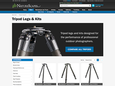
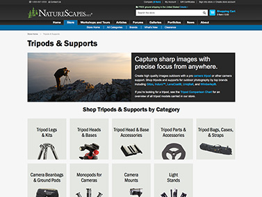
NatureScapes Store - Subcategory Landing Page
Subcategory Landing Page
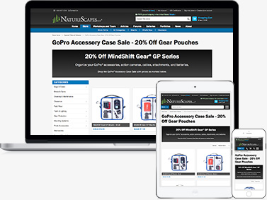
NatureScapes Store - Campaign Landing Page
Campaign Landing Page
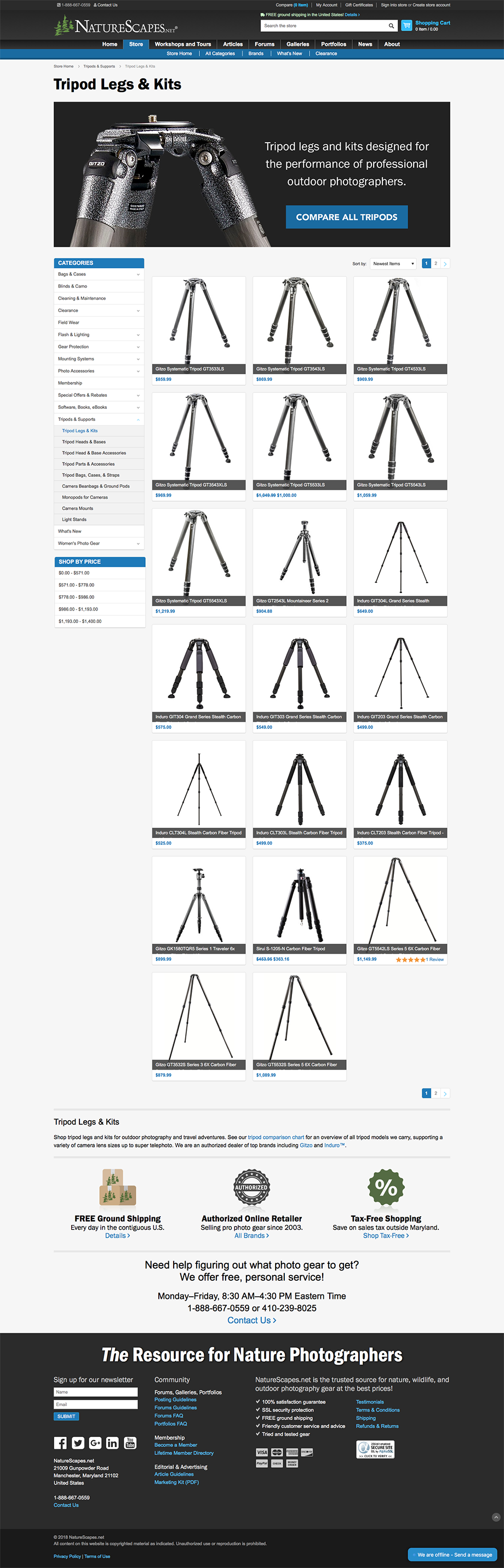
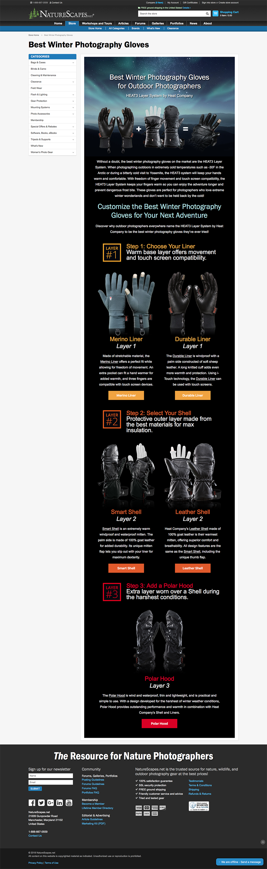
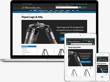
NatureScapes Store - Product Line Landing Page
Product Line Landing Page
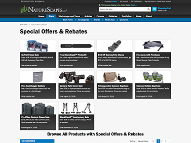
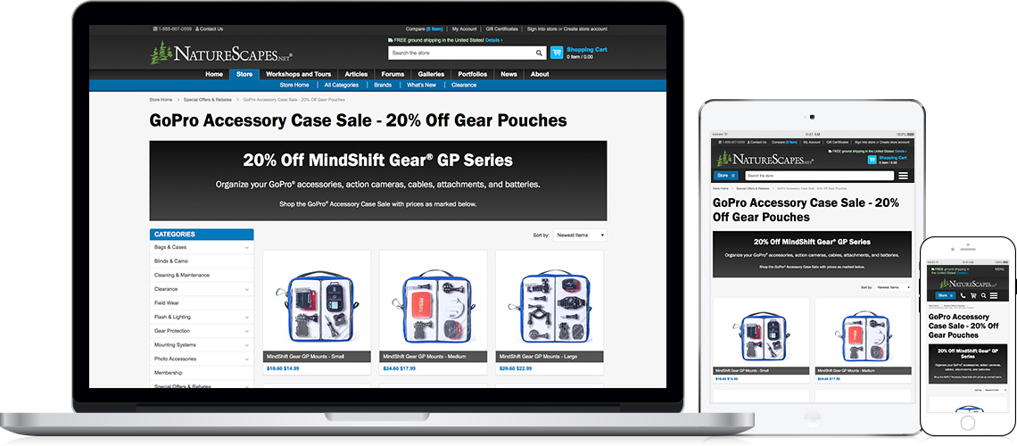
NatureScapes Store - Special Offers Landing Page
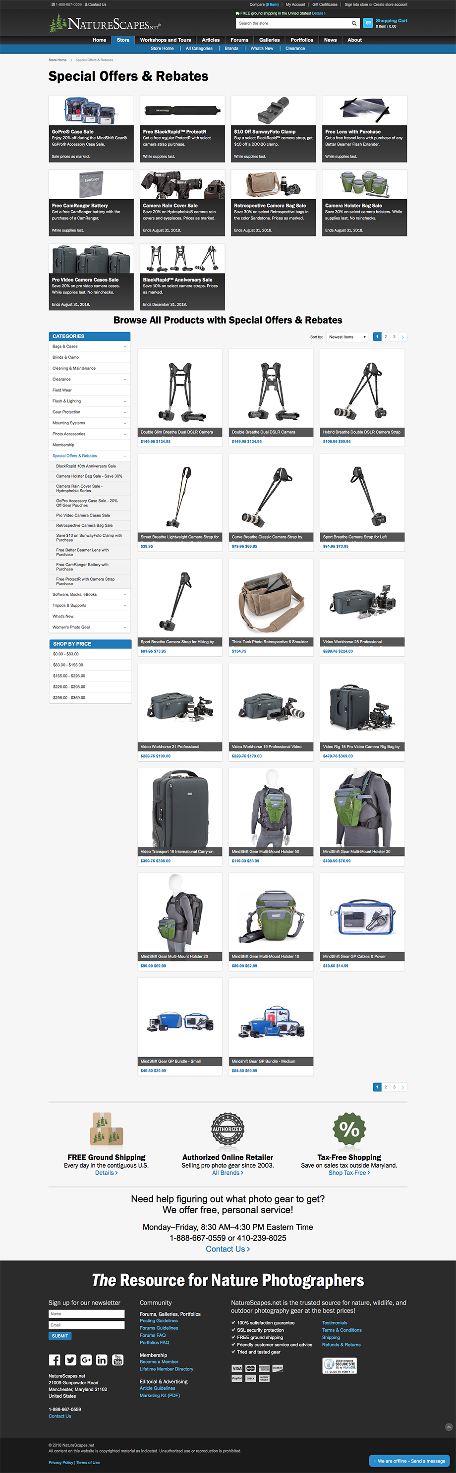
Special Offers Landing Page
 Design, Develop, & Optimize
Using the wireframes as a blueprint, I designed the interface of the new pages focusing on simplicity.
From Wireframes to Design
My intent was to present all pages without distractions in an easy to understand and clear format. Strong graphic elements and a stylized web font are present throughout for branding consistency.
- Uses the foundation of a BigCommerce theme where I developed and integrated design improvements.
- Implemented art-directed banners that respond to viewport size. By default, images simply shrank which adversely affected readability. Introducing 3 different sizes enables customers to comfortably read images.
- Wrote and optimized page content and tags to match the copy and customer search intent with matching campaign landing pages.
- Added keywords to the tracking system for measuring historical data and progress.
- As part of an ongoing process, special landing pages were designed and developed as part of SEO strategy.
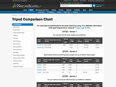
NatureScapes Store - Product Chart Page
Comparison Chart
NatureScapes Store - Art Directed Banners
Art-Directed Banners
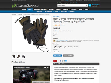
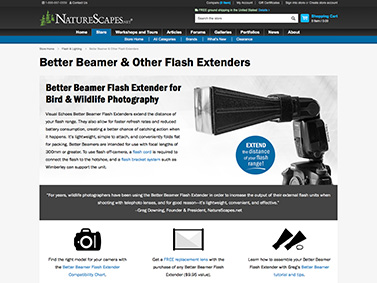
NatureScapes Store - Product Page
Product Page Optimizations
NatureScapes Store - Text Banners
Text Banners
 Measurement & Iterations
Using SerpStat and Google Analytics, I tracked and monitored overall traffic flow, user behavior, and keyword rankings.
Less than 2 Months Later…
- Store landing page updates improved traffic flow direction.
- Excitedly, the highest value category, Tripods and Supports, became the #1 traffic magnet consistently each month while also seeing a significant increase in organic traffic.
- This one observation shows tremendous opportunity, giving insight and direction on which page improvements should come next and in what order.
Iterations
- With the Tripods and Supports section showing much opportunity for growth, iterations were made to design and optimize the entire Tripods and Supports section.
- Strengthened helpful information like a comparison chart to assist customers in figuring out what tripod to buy.
- I also researched and optimized product pages in need of improvement, while rewriting and organizing page content tailored to the audience.
Website Goals
- Improve traffic flow by implementing visual categories front and center from the landing page to help customers easily find what products they are looking for.
- Increase organic traffic to attract new customers and decrease ad spending.
- Improve product pages by writing and optimizing descriptions, imagery, and supporting assets.
- Observe user behavior flow and incorporate changes to improve conversion rate. Make it easy for customers to find the latest sales by implementing a designated, optimized section that can also be linked to from email promotions.
- Implement a lead magnet to grow email list and increase number of transactions using offer.
- Interlink the store with other parts of the site like Workshops and Tours to encourage community networking.
Results Achieved
- After creating visual categories, I was able to see which areas began receiving the most traffic. The highest value category, Tripods and Supports, became the #1 traffic draw each month from organic sources.
- 129% increase in organic traffic over 2 years, with some keyword targets reaching page #1 on Google Search.
- 58% increase in revenue from organic traffic over 2 years; 9% increase in organic conversion rate and 23% increase in transactions.
- 53% increase in overall conversion rate from implementing special offers, offering helpful information, and improving page content and category organization.
- 447% increase in email list growth over 6 months by offering special incentives and opt-in at checkout.
- Promoting welcome offer increased campaign conversion rate by 23% with 3x as many transactions in 6 months.
- 21% increase in traffic to Workshops and Tours, improving familiarity with other segments of the company.
As always, thank you for bringing us such a great store and website!