Customer Onboarding Service Software
Revolutionizing how a global retail corporation onboards hundreds of vendors and contracting firms each year for partnership.
A major international retail corporation needed to modernize the process for onboarding general vendors and contractors who perform work for them. Their existing process required a lot of manual work through spreadsheets, email, third party software, and phone communication to fully onboard a vendor, taking 3-4 months total.
Vision
By creating a new interactive experience, our team simplified and modernized the onboarding process for new vendors and corporate sponsors. The new application provides visibility at every step, offers excellent service to vendors, and makes the business easy to work with as the world’s most convenient retailer.
Goals
- Decrease the amount of time it takes to onboard a vendor to 2 weeks or less
- Streamline communication and improve organization between sponsors, vendors, and internal corporate teams
- Automate workflows and tasks to improve efficiency
- Centralize processes and documentation while reducing manual work
- Eliminate the need for email, PDFs, spreadsheets, Word documents, and third party tools
- Give a positive first impression to new vendors in an interface that’s easy to use and visually represents the brand
UX Design Process
Sample Presentation Slides
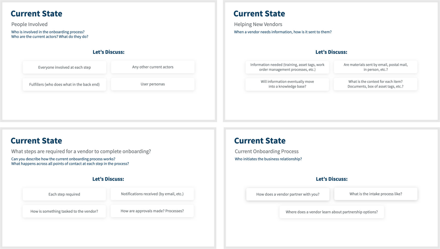
For our requirements session, I wrote and assembled a presentation consisting of 90 questions across user, business, and technical requirements.
 Discovery Working Sessions
To start this project, our team held three working sessions with the client to understand their existing onboarding processes. To prepare, I wrote and assembled a presentation consisting of 90 questions across user, business, and technical requirements to help guide the conversation. With input from our group, I organized the presentation into different sections: Current Experience, Pain Points, Personas, Business Requirements, User Requirements, Metrics, Future State, and Technical Requirements.
Layers of Processes and People Make it Happen
As UX Designer, I wanted to gain a holistic understanding of the many people, systems, and services in place that contribute to the overall onboarding experience. Our team wanted to understand all of the actors and personas involved, their pain points, and what happens at specific interactions throughout the process.
 Service Blueprint
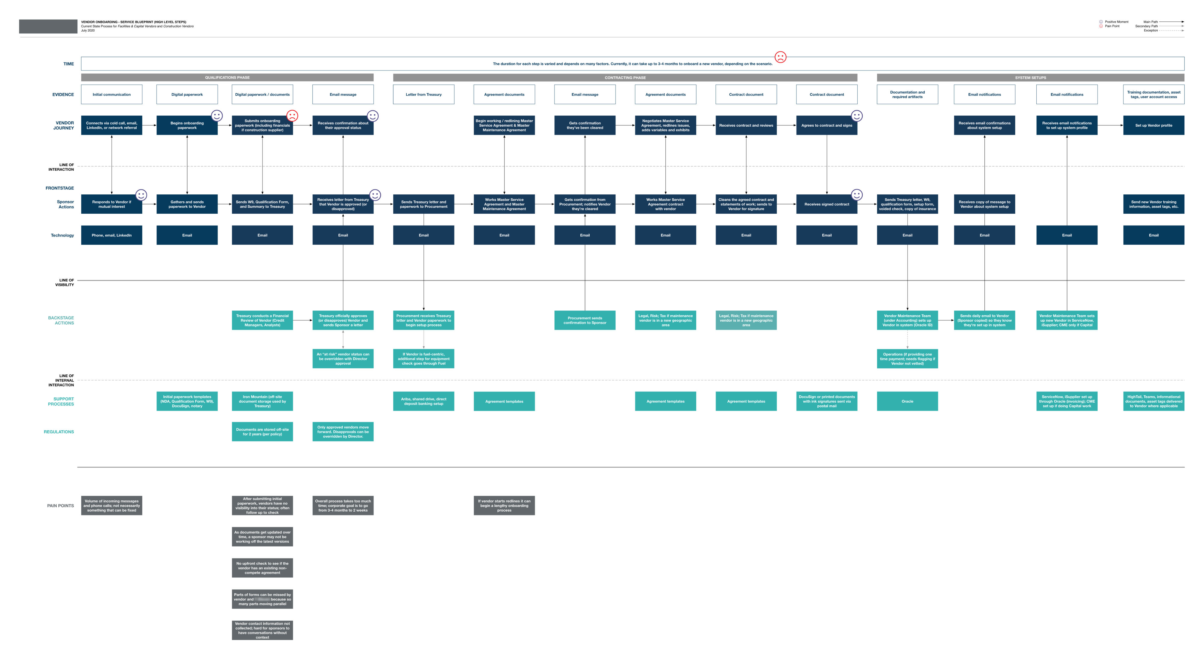
The first thing I created from our discovery sessions was a service blueprint to map out and communicate the existing process. The service blueprint depicts the vendor’s journey, sponsor actions, technology involved, evidence, backstage actions, supporting processes, and regulations. Compared to a traditional blueprint, I also added pain points for specific areas. The blueprint is organized into three phases over a duration of 3–4 months. The partner software company we collaborated with created a process flow for the backend processes.
This is awesome! We have nothing like this today in our organization.
 Experience Brief
The discovery sessions were very fruitful. We learned so much about the people, departments, technology, and processes involved throughout every onboarding step. In a few pages, I outlined our findings from the working sessions to document current state, UX goals, pain points, success metrics, wins, and design requirements.
Biggest Wins
- Clearly communicate to vendors what is needed from them to decrease errors
- Efficiently collect information and materials to save time for corporate departments
- Have an effective, automated workflow to route information to the right people
- Visibility into who is working on what at the corporate office, and where the vendor is in the process
- Capturing vendor labor rates during onboarding so they are set up after approval
- Vendor being completely set up in the system at the end
Design Requirements
- Create an interface that’s easy for everyone to use
- Proactively set expectations and tell vendors what they need before starting
- Minimum touch experience that simplifies, automates, and notifies
- Provide everyone with visibility into stages, states, and statuses
- Enable mobile flexibility so vendors can work and stay current from anywhere
Sample Presentation Slides
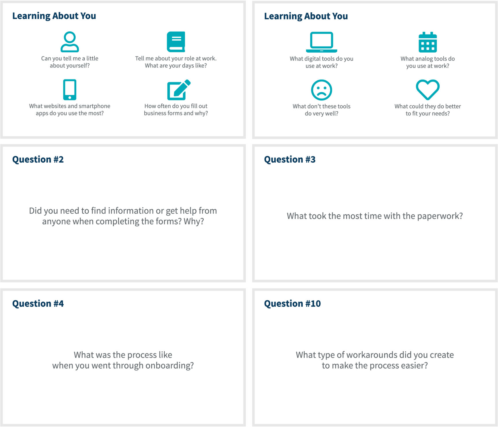
Talking to stakeholders only gives UX designers one view. By interviewing vendors who had recently gone through onboarding, I gained insight into the current experience.
 User Interviews
Our discovery sessions were excellent at understanding how the sponsor and corporate teams work together internally. To dig deeper, I conducted user interviews with new vendors to learn their perspective on the existing process.
I created a presentation of about 20 questions to help focus and guide our conversation organically. Using this information, I created two key personas.
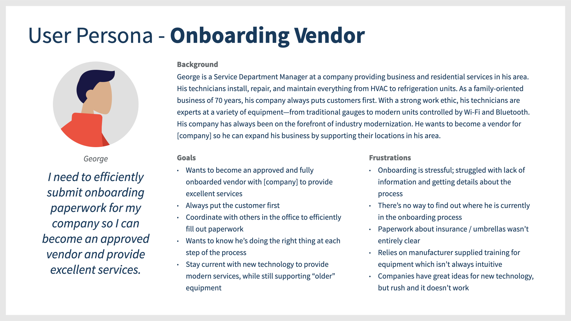
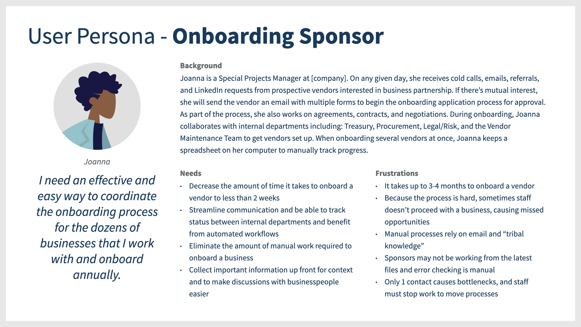
User Personas
The Onboarding Vendor and Onboarding Sponsor are the two primary user personas.
 Persona Creation
This application was the second of three connected applications we designed for the company. Using the personas I developed from the first application as a reference point, this round of user interviews focused on two new personas specific to onboarding.
After gathering and analyzing notes from our working sessions and user interviews, I crafted two key personas for the application: Onboarding Vendor and Onboarding Sponsor.
This was a great tool to document their backgrounds, goals, and frustrations. When presenting wireframes and designs, I referenced these throughout the project.
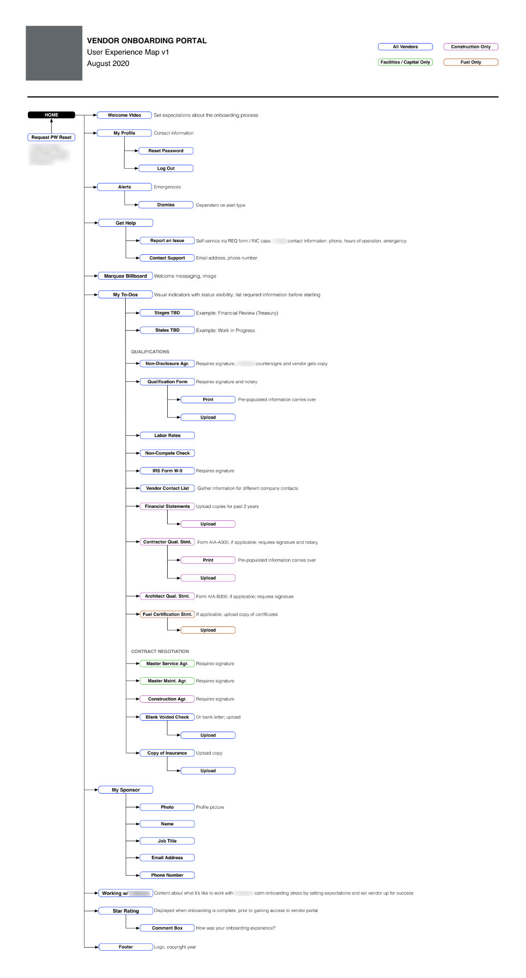
Feature Map
 Feature Map
To document core requirements and assist our Solution Architect, I created a feature map outlining the different sections of content to account for in the portal. Using the feature map, the Solution Architect began writing user stories and readying technical requirements. Feature maps are used to account for the high-level experience we are building for the client.
 Low Fidelity Sketches
Using the feature map as a reference, I created some low fidelity sketches with InVision Freehand to depict a possible onboarding flow. The Solution Architect and I met to review and work together to make a few minor iterations to the sketches before moving into the interactive wireframing phase.
Sketching the User Flow
Using InVision Freehand, I created a series of rough sketches to collaborate with our Solution Architect. We talked through various platform functionality and design possibilities.
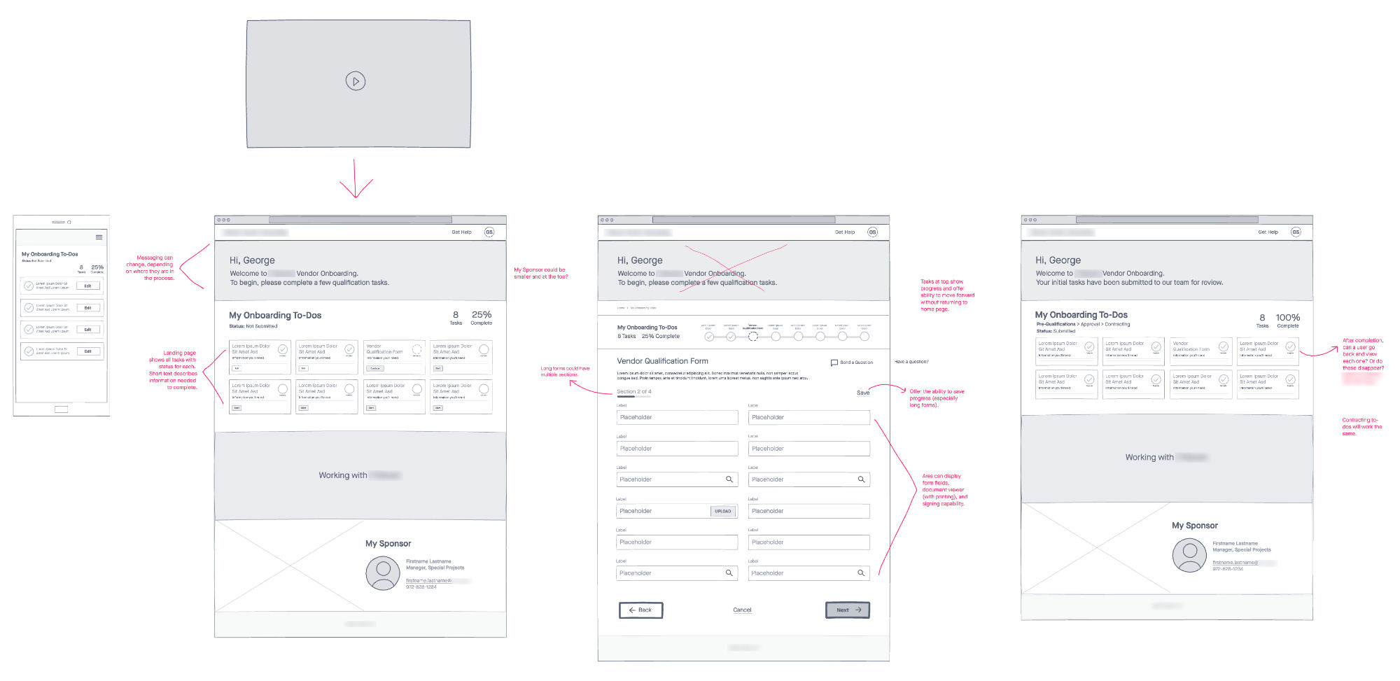
 Interactive Wireframes
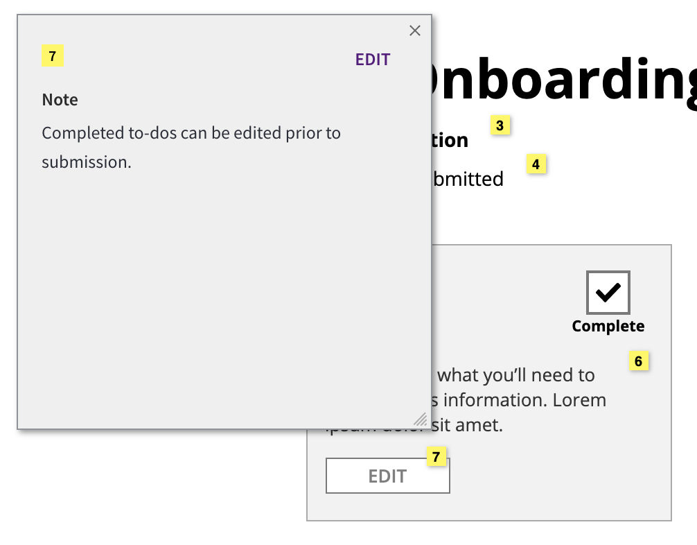
Based on the low fidelity sketches, I created interactive wireframes to show the entire onboarding user flow and process to completion for a vendor. These wireframes featured annotations to communicate and document design functionality.
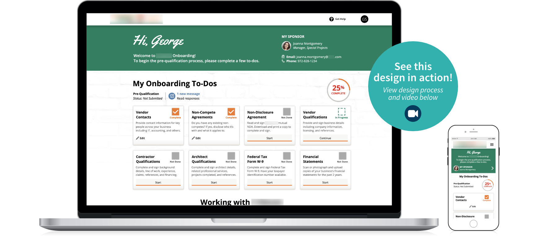
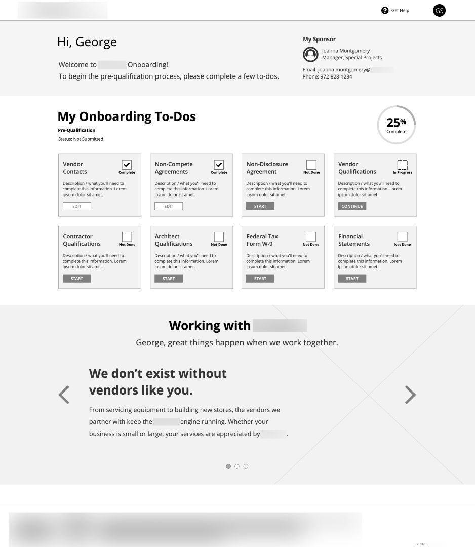
The experience begins with a welcoming email message containing the vendor’s temporary log in details. Upon log in, the user is greeted with a welcome message and their onboarding to-dos. Each item shows a status of whether it’s not done, in progress, or complete. An overall percentage calculator is featured to encourage timely completion. At the bottom of the page there is a small feature about what to expect when working with the corporation.
Evolving Requirements
After the wireframes were complete, we found out the digital document signature feature would not be incorporated due to licensing. Going paperless and eliminating the need for users to print, sign, and upload copies of their documents would have gone a long way for usability and user efficiency. In fact, one user interviewee mentioned his favorite systems are those where he can digitally sign.
Usability
There was every intention of conducting usability testing on these wireframes, however the development schedule was aggressive and meeting with users was cut. Since this application was part of a series, usability testing had already been conducted on a connected system, which was helpful insight to have as a baseline but wish I had the opportunity to do more.
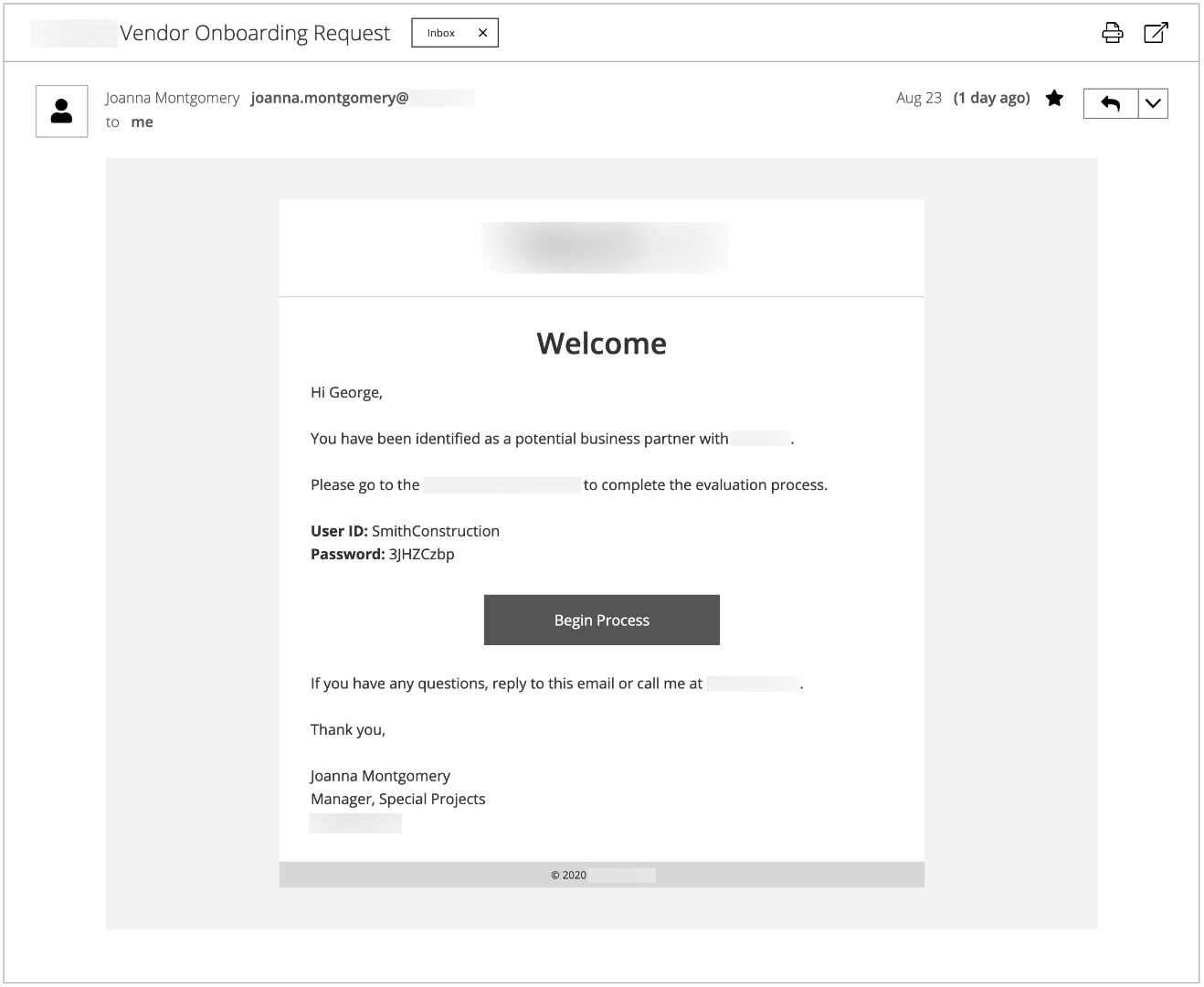
Email Invitation
If a sponsor would like to pursue partnership, an email invitation is triggered to begin the process of submitting information.
Wireframe Annotations
These wireframes featured annotations to communicate and document design functionality to stakeholders and platform engineers.
Landing Page
The landing page of the application for a user with to-dos in progress.
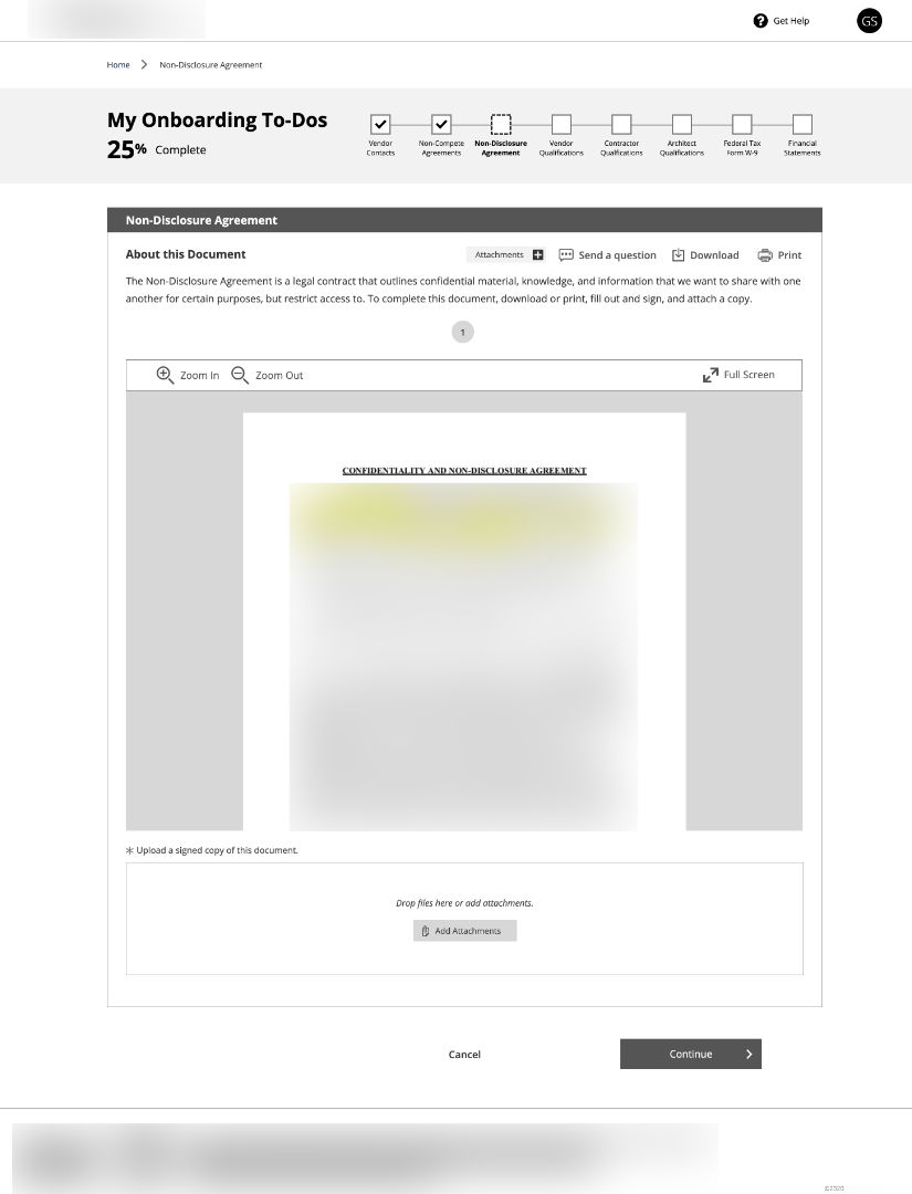
Document Viewer
Document viewer functionality was developed for displaying agreements and contracts.
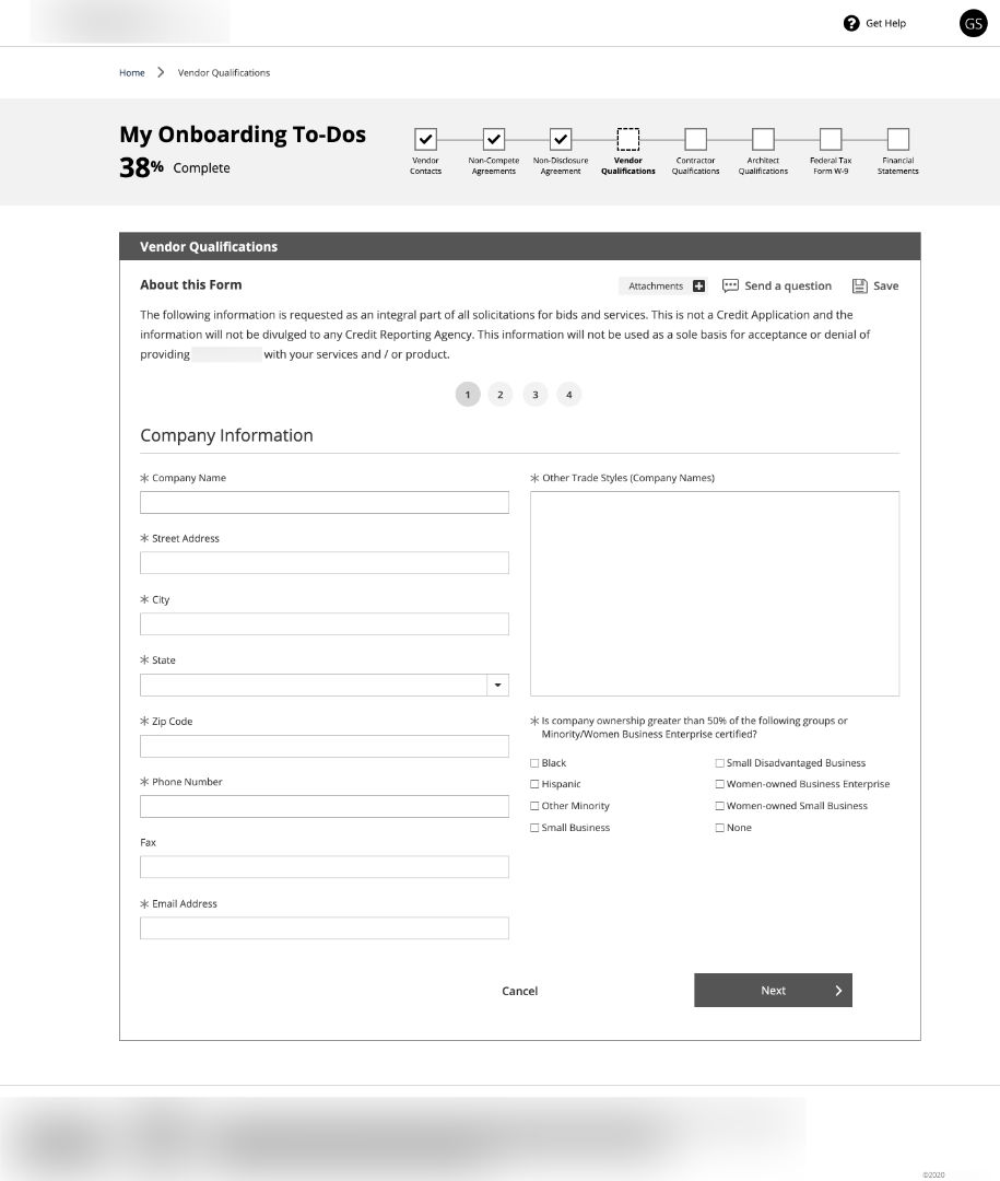
Information Form
Various forms were built to collect information. Using a multi-step design, I organized lengthy information into smaller sections for the user.
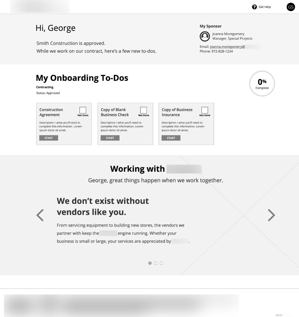
Approved State
When a vendor is approved, their state and status changes in the application with a few more items for them to complete the process. Corresponding notifications are sent to support sponsor and vendor communication.
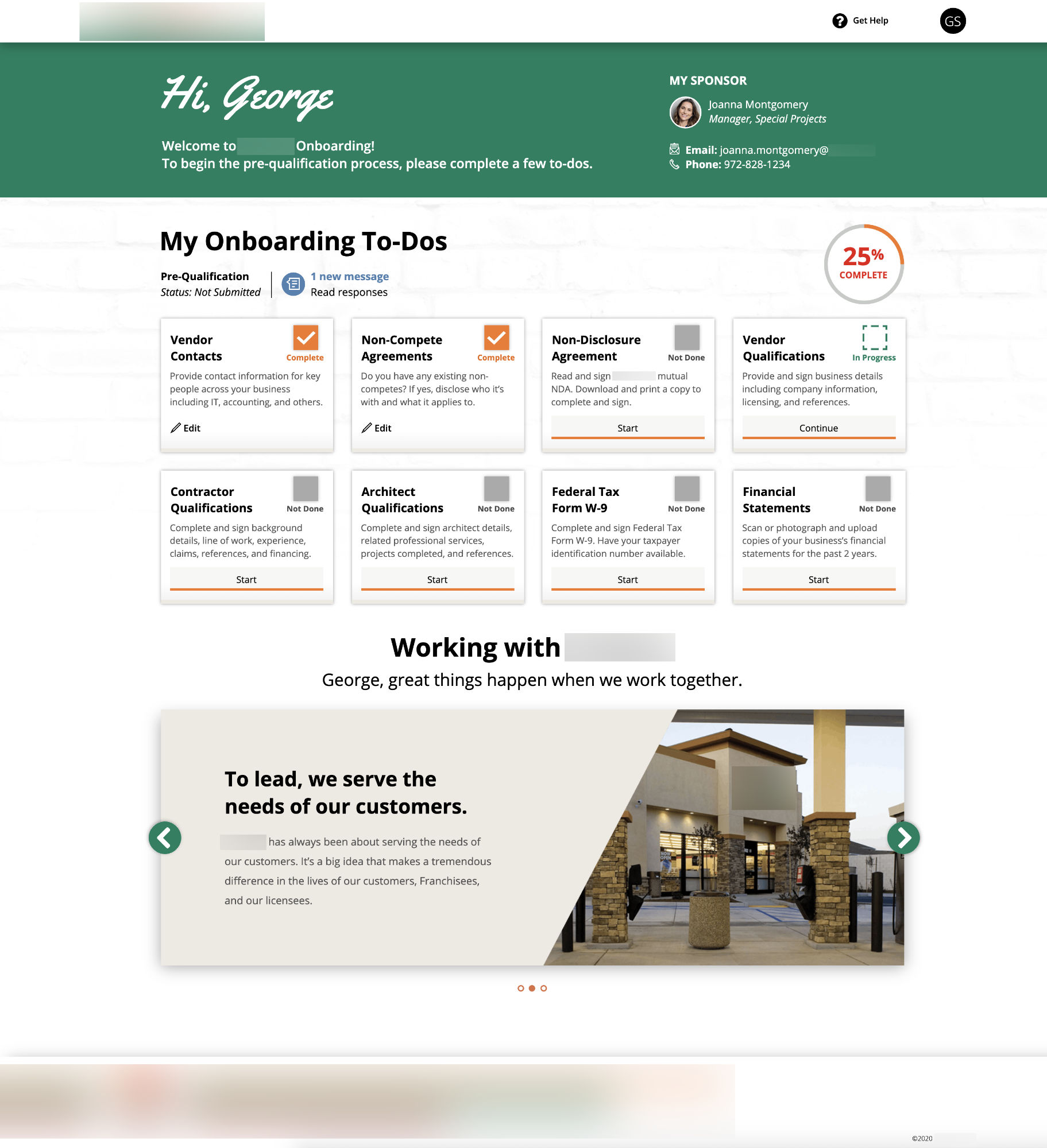
Landing Page Design
The landing page shows the current to-dos, state, stage, and messages for the vendor.
 High Fidelity Interactive Prototyping
After a few edits were made to the wireframes, I created an interactive UI design prototype to show how the onboarding portal works. The design uses the corporation’s existing branding and was designed to match another connected interface.
During development, I worked with our platform engineers to ensure quality production.
To see this design in action, watch the videos below demonstrating prototypes for desktop and mobile.
Desktop Application
Mobile Application
Metrics and Results
- As of this writing the portal was recently launched. The #1 metric is time reduction from 3–4 months to 2 weeks. That’s an 87% reduction in time! I am confident this application will help to achieve that goal.
- With a new workflow management system in place, the business can now measure and track this goal to establish a baseline and make changes over time.
- As part of continuous improvement, I designed an in-app survey that appears when a vendor is fully onboarded for them to provide feedback on their experience. Over time, this enables the corporation’s internal departments to evaluate feedback and make incremental changes.
Stakeholder Testimonial
I just wanted to share some positive feedback about Jamie. Aside from her phenomenal work, she is very clear and a great communicator which has been extremely beneficial in the demos to understand the development that has been performed. I’m happy she’s part of the team.
I am beyond impressed with this work! You are helping us change our business and relationships. Thank you!
This is absolutely incredible and will completely change the way we do business.